Doggone Internet Gone to the Dogs
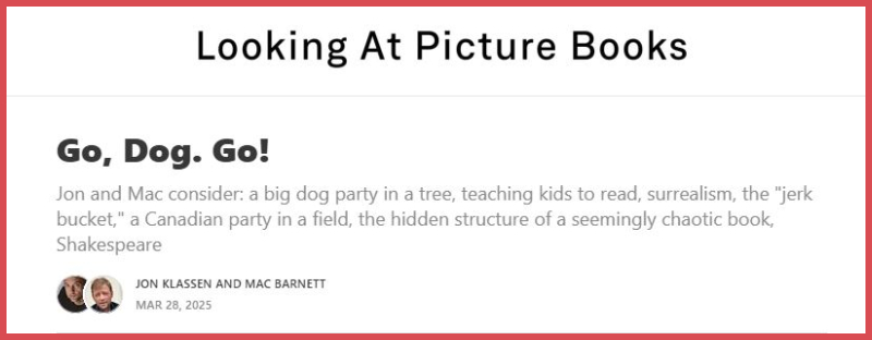
Over on Looking at Picture Books Mac Barnett and Jon Klassen do a deep dive into P. D. Eastman’s GO, DOG. GO!
It’s a joyous and erudite discussion that makes for a fun read in and of itself (even if I’m more of a Roy McKie TEN APPLES UP ON TOP man), but it also brought to mind a blog post I read years ago that I remembered as being a tongue in cheek appreciation of the same book. An Open Letter to the Female Hat-Wearing Dog from “Go Dog, Go” is exactly that, but it also touches on the issue of chauvinism (the book was published in 1961) by noting that most of the dogs in the book are male. It, too, is a fun read:
Visiting that site made me think of some of those blog posts that, for some reason or other, have just stuck around the corners of my mind. Another dog related post that I often think of is this one by Mattias Adolfsson.
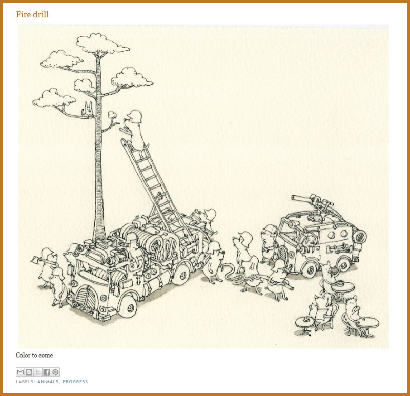
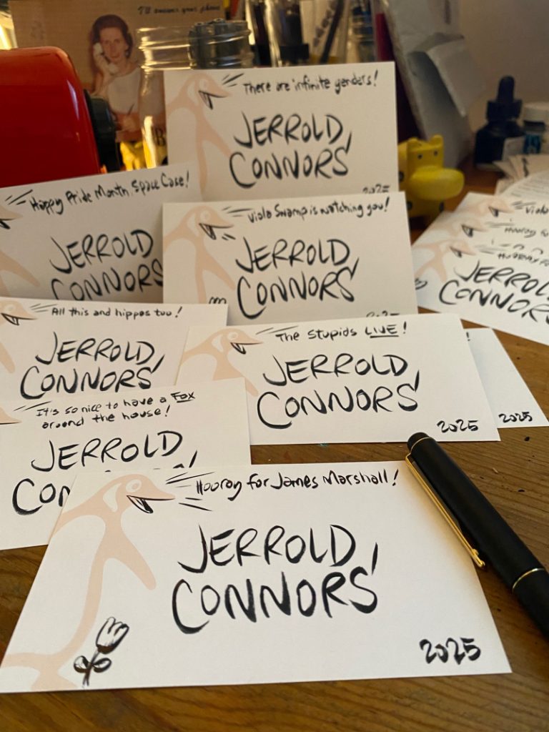
I’ve bought two of Mattias’ sketchbooks and I love flipping through them but I find myself returning to his old blog just to enjoy his illustrations. I’ve been glad, though, to have the physical sketchbooks because lately I’ve been wondering how long blogs and all that are going to be around. The internet has been slowly dying for years and a few old favorite blogs (including some that I used for research on my James Marshall biography) are already lost to time. But now we’re seeing a type of digital book burning as content from federal websites are being scrubbed.
That’s a bit of a tangent, but a good reflection of where my mind spins to these days. Anyway, all I really wanted to say was I’m going to enjoy as much of the old, weird internet as I can while I can. Starting with this appreciation of the new Heathcliff comics.
I mean, honestly, where else except the internet are you going to get Dadaist deconstructions of Heathcliff? Except here. And here too.
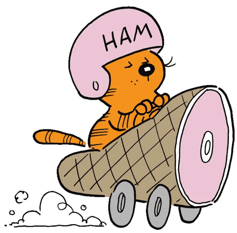
I really do love the old internet.
Doggone Internet Gone to the Dogs Read More »