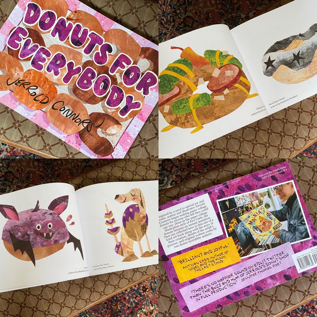
Dozen Days o’ Donuts: COVER REVEAL!

Given the uneven rollout of these Dozen Days and the fact that the book is out and has been plastered all over social media lately (to my great delight, thank you everyone for posting your pictures!!), calling this a cover reveal is probably a bit misleading. Let’s call it a cover review.

Note: the following is copied from my Kickstarter updates, posted on August 17, 2023

Cover reveals are exciting, no doubt, but they also feel fraught to me. They’re your book’s first introduction to the world and you hope it makes a good impression. But forget even a “good” impression, at the most basic level you have to start with knowing what impression it is you want to make.

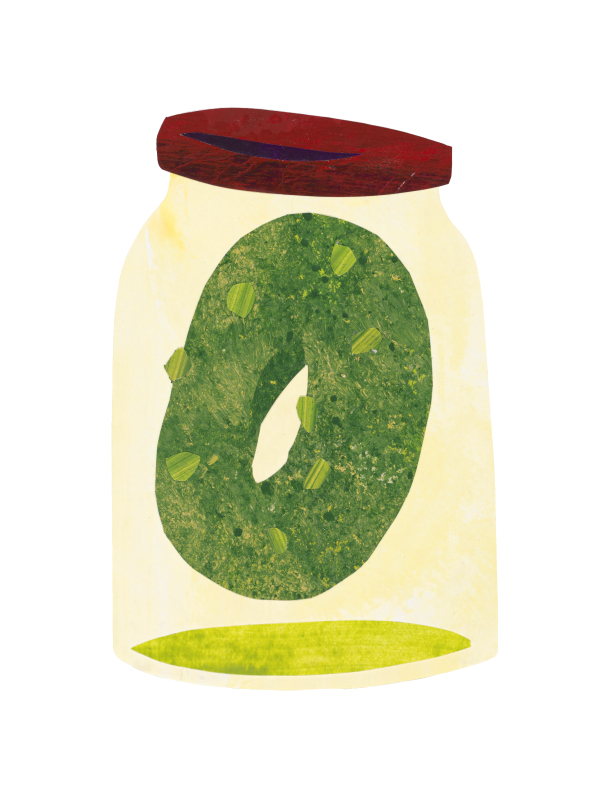
I had this idea I wanted to do something with a donut-shaped planet. It would be our Earth floating in the empty vastness of space, but we’d be together, safe, united by our love for warm obloid pastry. I was pretty certain this is the vibe I wanted and I made the following donut, intending to paste it against a starry background.

It’s cute but it wasn’t doing it for me. Not in a cynical “the world is more of a burnt Pop-Tart” sense, mind you, just in that this concept didn’t match the content of the book. Despite the pink-frosting clouds (which I love), the energy in the piece felt kind of low. The book, I believe, is more exciting than what this cover promises.

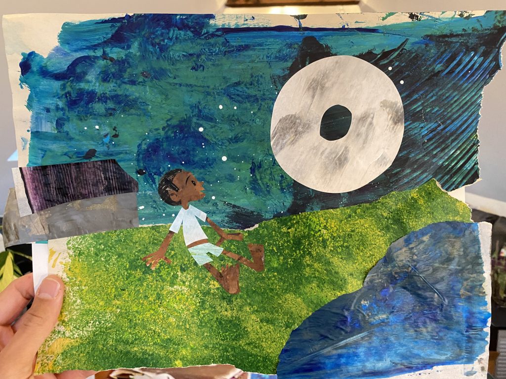
As I thought about it, my mind kept going back to this image, a collage I did with a group of fourth graders five and a half years ago.

Shrekfast is the Most Important Meal of the Day (Ms. Galvez’s class, 2018)

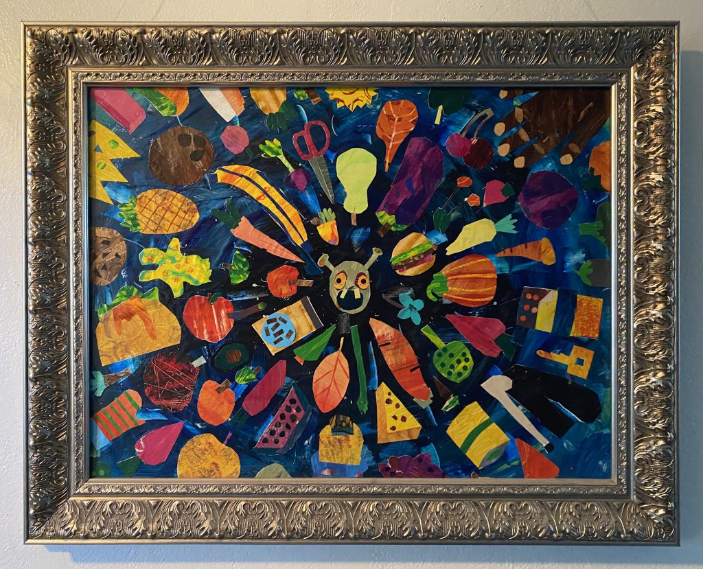
I love the energy in this piece and I could imagine an explosion of donuts (and words) working as an exciting cover. I did a sketch:

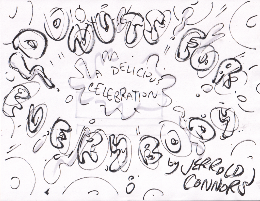
I liked this and appreciated that it felt connected to one of my favorite donuts in the book (Galaxy Donut). Not to mention the Big Bang metaphor felt appropriate as this whole project grew out of something very small (a tweet). Still, I couldn’t bring myself to move on the final art. I might have been dispirited by my first failed attempt, or maybe I knew there was a better idea waiting. Whatever it was, I did another sketch.

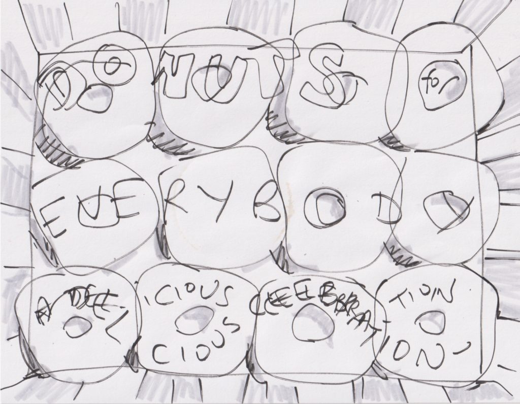
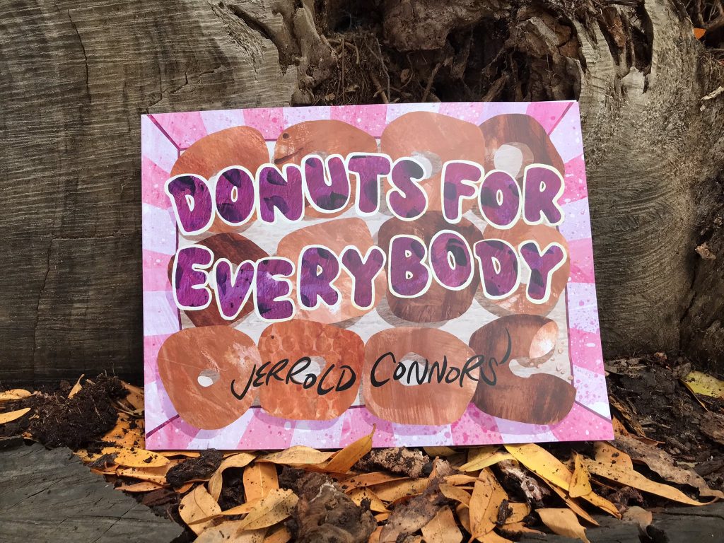
Now THIS… I knew this was exactly the direction I wanted to go. A box, a gift. Surprises within. It’s also a direct reference to the start of the project, the original dozen donuts I bought on that fateful morning last June. My mind was set.

It would take me a short while to figure out how best to execute the illustration. In the end, I composed the picture digitally. These are all my original painted papers but I scanned them as full sheets and collaged them digitally. This is the only piece in the whole book created that way and I did miss working with knives and glue but I knew I had so many elements going on in this image that I needed the flexibility of an adjustable image. Each element (title, donuts, box, background) exists on its own layer and can be edited individually. Here’s a week or more of of that process condensed into half a minute.

Totally worth it. I mean that honestly, no snark. I couldn’t be happier with how this turned out and I hope you are too.

Want to hold this cover in your hands? Pick up your own copy of DONUTS FOR EVERYBODY here!

Dozen Days o’ Donuts: Hard Headed, Soft Hearted

We’re picking up where we left off on the third last day of the pre-launch extravaganza! Where have I been all month, you ask? Well, there was a hiccup with the printer that resulted in a three week production delay. It was disappointing to have the Dozen Days interrupted and my concocted-on-the-fly plans put into limbo, but all in all it was a positive thing—the three week delay gave me space to slow down and look at my to-do list and catch up with some unfulfilled donut rewards and (gulp!) untallied campaign receipts. But that’s old news! We’re back on track, books have been rolling out and people have been receiving them. Twitter and Instagram are a-buzz with pictures of books in homes across the US (and as of tonight, Canada), so let’s jump back to the matter at hand.

If you remember the original schedule, the plan for today’s post was a discussion about some of the practical decisions that went into printing my book.

I decided early on that I wanted my book to be printed in an environmentally sustainable way. This meant, for me, not just the highest grade recycled paper and least toxic inks, but a company that is as local to my area as possible. Fortunately, I have this option in Greenerprinter, an eco-conscious print house located a mere forty minutes from my front door. They do good work. The paper stock is an 80% post-consumer recycled paper that has the warmest matte feel. The colors, printed in soy-based inks, do great justice to the originals (color fidelity was, in fact, my number one printing concern). I honestly couldn’t be happier with the final product.

photo by Abraham Schroeder

I mean, look how good these look!!!

photo by Savannah Elmore

I thought I might talk about my decision to go with softcover, there’s something to be said about how publishers in other countries often print paperback editions first, then, if there’s demand, issue a special edition hard cover and how maybe, ultimately, going with hardcover is a vanity thing. I don’t know enough to know if that’s true across all creators, publishers, and countries. I can say for myself personally, I had been hoping to go with a hardcover book.

photo by complex.com

From the first moment I decided to make the donut book I planned to do it in the style of CHARLIE HARPER’S ANIMAL KINGDOM. That book is a massive 288-page, 12 by 18 inch coffee table tome. I was willing to make DONUTS FOR EVERYBODY a bit more modest in size and scale (I aimed for 144 pages and 9 x 12 inches) but I wanted to stick with hardcover. This is where things got a little complicated. Greenerprinter doesn’t offer hardcover, and places that did, don’t offer the best recycled paper choices. The difference in cost, as it turns out, wasn’t all that great. The decision would come down to the paper I wanted to use.

photo by Steena Hernandez

As you can see in the picture above, DONUTS FOR EVERYBODY is to be held close and appreciated in the way you’d hold close and appreciate a warm donut. I wanted the book to feel as good as it looks and I didn’t want any crinkly, plasticky, coated papers. Don’t get me wrong, I still liked the idea of having a hardcover book, both for my ego and for the book’s durability (I also hope the book is something people return to when they feel the need for a creative pick-me-up). But only after a short battle between my hard head (and vanity) and my soft heart (and love of trees and kids), I made up my mind. I decided to go with softcover.

No regrets. Because, honestly, doesn’t this book look good?

photo by Stephanie V.W. Lucianovic

Want to know what this paper feels like? You can order your own copy here!

Drummer Hoff/Mutiny on the Bounty

I was listening to Fuse Eight and Kate’s latest podcast and pulled out my copy of DRUMMER HOFF (a highly recommended practice, reading along if you can) and think I saw a picture book-movie connection. General Border looks like a caricature of Charles Laughton.

all in the cheekbones and lips

I can generally spot caricatures and self-inserts in picture books but the intentionality of this one is harder to figure out. None of the other military personnel look like anyone. I’m guessing Emberley was drawing from memory, and was maybe influenced by cartoons where the Charles Laughton character made several cameos.

Suddenly I’m in the mood for hossenpfeffer.

Dozen Days o’ Donuts: BLURB-A-RAMA!

DONUTS FOR EVERYBODY is, truly, a collaborative project. It came to be at the writing community’s (once) favorite water cooler, Twitter, and it’s no exaggeration to say all these donuts would not existed without that forum. I acknowledge Twitter’s inseverable connection to the project in the book’s opening (in the telling of the #DonutsForEverybody origin story) and also in its epilogue. Looking back at this time (June-December 2022), I feel like these donuts happened a thousand years ago. And in terms of a social media life cycle, they did. Still, I wanted to capture some of the excitement of the moment and I thought a good way to do that would be to use tweets from that time for the back cover blurbs.

The first tweet came from Antwan Eady (yep, it was Antwan who suggested I edit INTERVIEW WITH A DONUT) and I knew immediately that I wanted to use it. I’ve been a fan of Antwan’s for a while now—I admire his writing and respect his opinion (most recently, this)—and I’ve been floored by his generosity in boosting my donuts. Antwan’s the very embodiment of community and celebration, and I knew he saw the project the way I did. In fact, in some ways he saw it more clearly, so I was thrilled when he signed off on his blurb.

Quick aside: it was Katie McEnaney’s SHEL SILVERSTEIN DONUT that inspired me to start the picture book donut series, but it was NIGEL AND THE MOON that inspired me to make the pieces as big as I wanted.

The second blurb comes from a tweet by Canadian poet, Jennifer Thomas, who offers her own gifts to the community in her “Words That Make Me Smile” series. Jennifer is another person who understood the scope of my project and the tweet of hers that I chose captured, with two well chosen words, the energy I felt every time I sat down to make these donuts. Words that make me smile, indeed, Jennifer.

I also owe thanks to Jennifer for agreeing to proofread and copyedit DONUTS FOR EVERYBODY. Particularly for her point of view on the epilogue I mentioned above. Before Jennifer’s thoughtful input, it was more of a eulogy, really. And a sour one at that. This change, which wouldn’t have happened without Jennifer’s perspective, I believe saved the book.

It’s remarkable, really, to share a project publicly in this way. On one hand it’s just me in my attic with a pair of scissors, a cutting blade, and stacks and stacks of paper. But, really, it’s so much more. It wouldn’t be the same without Antwan and Jennifer and it wouldn’t even be without all of you. My thanks to everybody.

Alright, enough mush! I’m taking the weekend off and returning after Labor Day with the final push towards the launch. I’ll see you then.

Wait… so what are these tweets? What do the blurbs say?

As usual, you’ll have to get the book to find out. 😉

The Most Movie-like Picture Book

I was burning my way through a pile of picture books trying to complete a challenge I set for myself at the start of the summer when I came across THE LISZTS by Kyo Maclear and Júlia Sardà. It reminded me that I meant to write about it on here.

When I watched Wes Anderson’s THE FRENCH DISPATCH last year one of my strongest impressions was that this was the most picture book-like movie I’d ever seen. That made me wonder what the most movie-like picture book is. THE LISZTS immediately to mind but now that I’m looking at it, I just think it’s the most Wes Anderson-like picture book. I mean…

It’s also got the LIFE AQUATIC soundtrack.

So, if THE LISZTS isn’t the most overall movie-like picture book, what is? I think some people might see a Jon Klassen connection in EVERYTHING, EVERYWHERE, ALL AT ONCE. It’s there, for sure, but maybe only in the rock scene.

And I’m not sure the inverse is true.

What do you think? What picture books feel cinematic to you?

Scroll to Top