These Books Kill Fascists

I picked up this book last week.

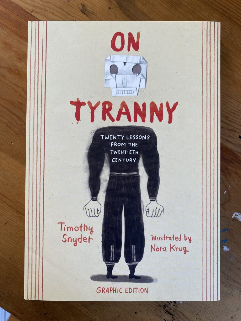
It’s an illustrated adaptation of Snyder’s ON TYRANNY: TWENTY LESSONS FROM THE TWENTIETH CENTURY and I’m thinking it should be required reading in middle school. We’re living in worrying times and in children’s books specifically, we’re in pretty dark territory. At a time when you think you’d want kids to have all the information they can have to navigate life, book banning has gone off the charts. The American Library Association reports that there were 1,269 attempted bans in 2022 (a 74% increase over 2021). I’ll admit I don’t know enough to know what happens behinds the scenes at publishing houses when the industry is faced with such a huge number of bans. In a time like this, do publishers shy away from controversial books? Do they capitulate (eg. Texas textbooks)? Or do they double down?

I would hope publishers would double down. Books are always a product of their time—the Environmental movement produced books like Bill Peet’s THE WUMP WORLD (1970) and Dr. Seuss’ THE LORAX (1971)—and in times like these I would love to see more books that straight up call out fascism. This made me wonder what picture books exist that could be called anti-fascist. I looked through my collection to see what I could find.

YERTLE THE TURTLE AND OTHER STORIES by Dr. Seuss (1958)

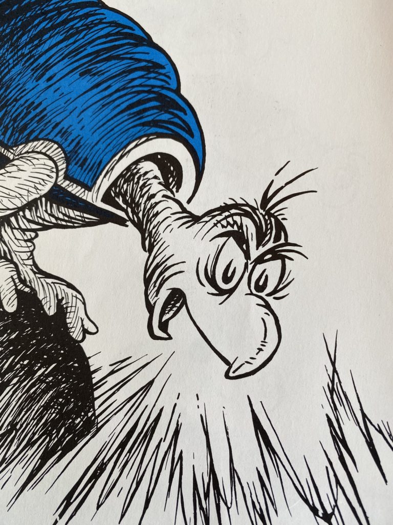
There’s Yertle, of course, the turtle tyrant who’s unseated by a burping commoner. Seuss did a number of anti-fascist editorial cartoons so his politics are pretty clear even without a Hitler mustache on Yertle (which, apparently, existed in an early draft).

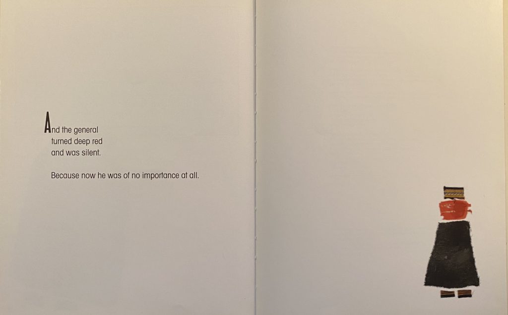
THE BOMB AND THE GENERAL by Umberto Eco and Euginio Carmi (1989)

This book is probably more anti-war (or anti-bomb, if you consider the date) than anti-fascist, but the General in the story gets a comeuppance like Yertle. Maybe a 2/5 on the anti-fascist scale I just made up.

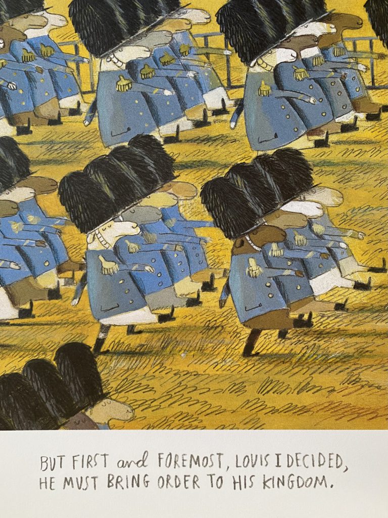
LOUIS I KING OF THE SHEEP by Olivier Tallec (2015)

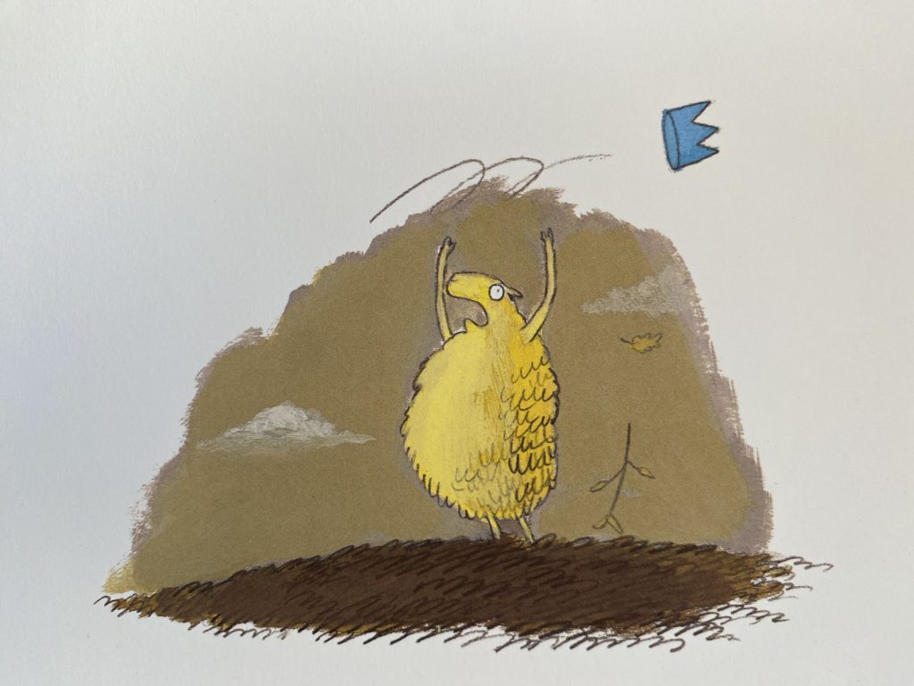
Tallec’s LOUIS I KING OF THE SHEEP is definitely more anti-fascist. I mean:

It’s a mere gust of wind that brings about Louis’ downfall, not an uprising of oppressed sheep (or even just one burping sheep). The story shows that fascist rule can be fleeting, which is a comfort, but it also ends on a dark note. The crown lands on a wolf, who approaches the herd in the final spread. Lesson: don’t normalize fascist rule, even if it’s just a sheep with delusions of grandeur.

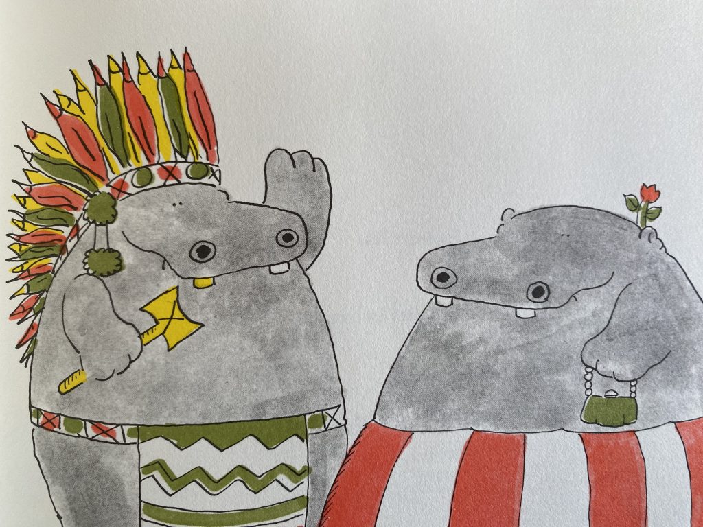
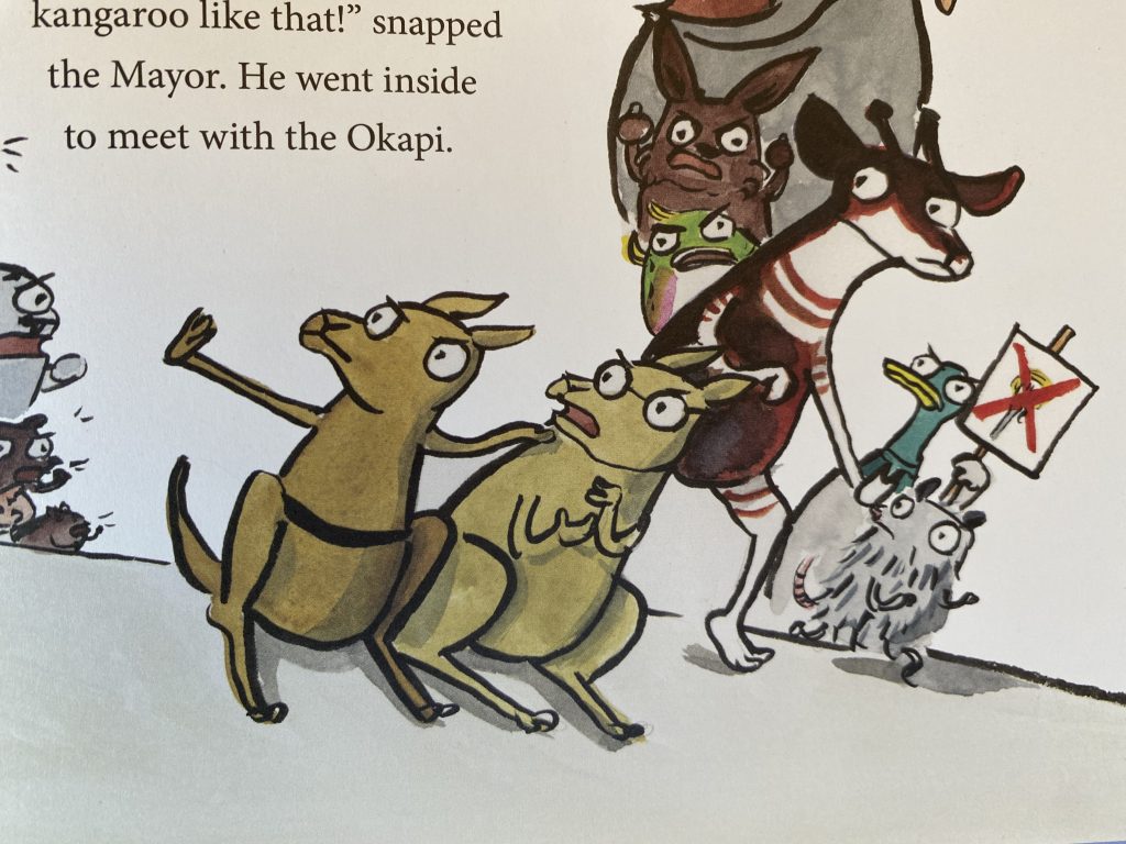
NOODLEPHANT (2019) and OKAPI TALE (2020) by Jacob Kramer and K-Fai Steele

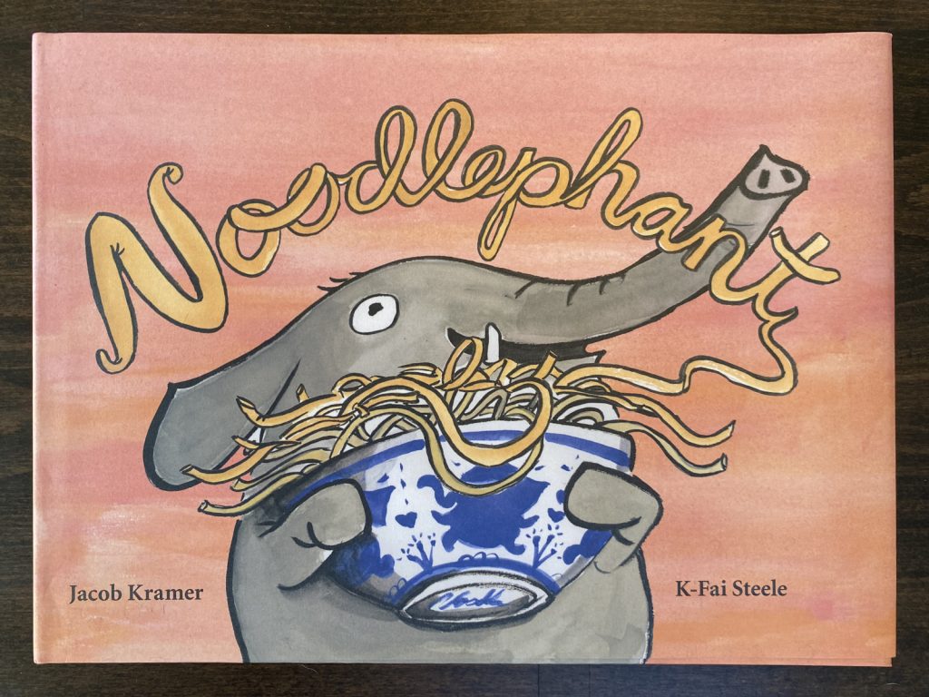
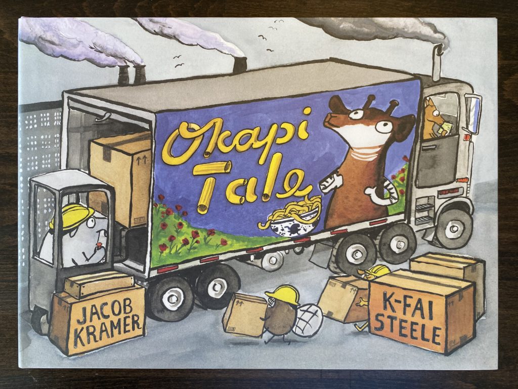
These two! NOODLEPHANT is abolitionist, OKAPI tale is anti-capitalist, but both have elements of anti-fascism. The fascists, in this case, are kangaroos who consider themselves a special class of citizen in Rooville. At the end of NOODLEPHANT, the ruling kangaroos’ book of laws is turned into a tray of lasagna which is shared with all the citizens of the town. The kangaroos are are welcomed in good faith into the animals’ new utopia and they seem content enough (it’s a really good lasagna*). But the happy ending is short lived. OKAPI TALE opens with the kangaroos missing their privilege and collaborating with an okapi(talist) to reestablish their rule.

LOUIS I KING OF THE SHEEP tells us fascism is fleeting, NOODLEPHANT and OKAPI TALE tell us it’s freedom that’s fleeting.

*side note: I read NOODLEPHANT to several second grade classrooms a few years back and WITHOUT FAIL a couple kids would say “Mr. Jerrold, I’m hungry” after the description of Noodlephant’s special lasagna. The book had the same effect on me. Every. Damn. Time. Speaking of food:

ALICE’S RESTAURANT by Arlo Guthrie and Marvin Glass (1966)

This is definitely one of the more anti-fascist books I have in my collection. Granted, it isn’t really a kid’s picture book (just look at that cover), but except for some explicit language, it works like one.

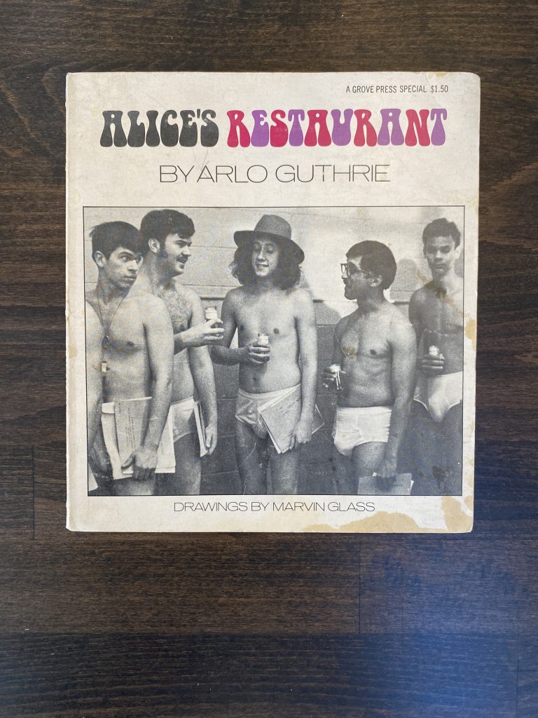
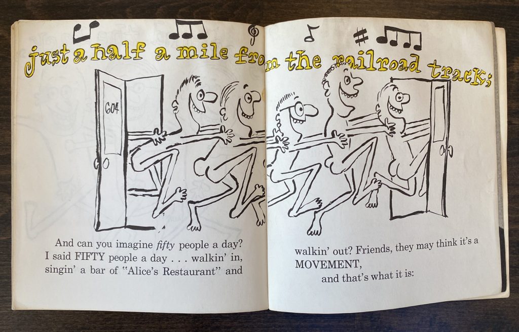
What makes ALICE’S RESTAURANT so anti-fascist? Well, it describes the dangers of living in a police state, under the expectations and demands of an arbitrarily violent government.

The bureaucracy in the story is dehumanizing and is so familiar that it barely feels like satire. Thankfully, ALICE’S RESTAURANT does prescribe a salvation from fascism: get friends, get naked and dance your way out of it.

And finally, the last book:

KEEDLE, THE GREAT by Deirdre and William Conselman, Jr and Fred L. Fox adapted by Jack Zipes (2020)

KEEDLE, THE GREAT is a recent adaptation of a book written about 80 years ago. From the book’s notes:

In 1940, two young people decided to publish a strange book with the title Keedle to give Americans hope that the world can overcome dictatorships. To them, Keedle represented more than Hitler. Indeed, he represented all the dictators in the world then and now. This book is a reminder that we have always ridiculed authoritarian regimes. When we keep the power to laugh in their faces, the bullies will shrink away as we retain our integrity and humanity.

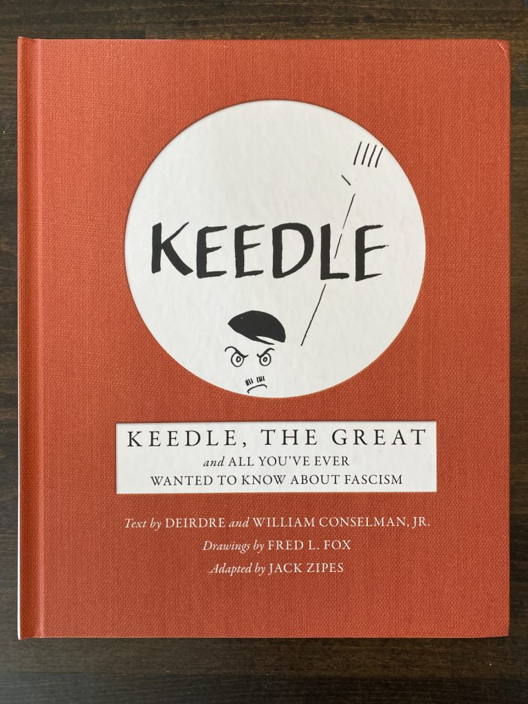
In the story, a little sociopath named Keedle rises to greater and greater power until the world decides to laugh at him. At which point:

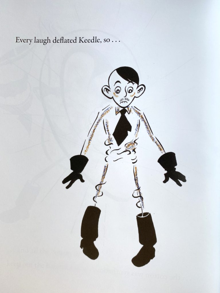
He begins to grow smaller:

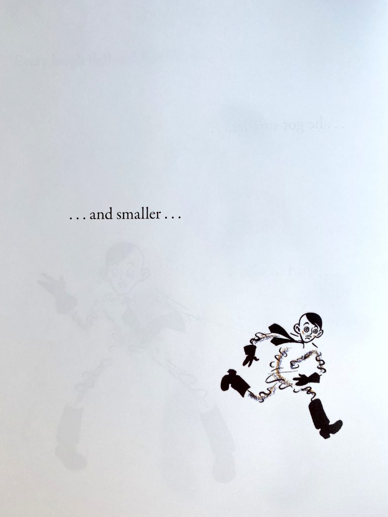
Until he can be squished like a flea:

The message in Keedle: you have to take the threat of fascism seriously, but what you don’t have to do is treat a fascist with any kind of respect. Pow!

OTHER BOOKS

I suppose you could make the argument that any picture book with a subversive protagonist is antifascist and that kids, already tuned into an unjust world, will catch on. Maybe. But, personally, feeling more and more that kids are inheriting a much worse world than the one I grew up in, I’m kind of done with subtlety. I was watching HISTORY OF THE WORLD: PART II and Mel Brooks gets it right. In a skit about Hitler, the writers go to great lengths to remind you what a disgusting pile of shit Hitler was. It’s a lot harder to say “disgusting pile of shit” in a picture book, but maybe there’s a way to say book banners, climate deniers, transphobes and all those other bad actors who are hell bent on making our world worse with every passing day are, like fascists, extremely poopy.

I’ll hold on to the hope that publishers are presently making these antifascist books and look forward to them coming out in the near future. You know, before all libraries and public schools lose all their books and are shuttered permanently.

a group of children’s book authors and illustrators heading to the library

The Cricket in Times… Rectangle?

On the topic of updating classic works (see James Marshall post) I wanted to talk about this one:

When I tell you I’m a big fan of THE CRICKET IN TIMES SQUARE, please believe me. I’m a big fan of THE CRICKET IN TIMES SQUARE. One of my prized kidlit possessions is a copy of the book (tenth printing, 1966) signed by George Selden.

I read it first as a student in Mrs. Boehlke’s third grade classroom at Jakarta International School and it made a big impression on me. The book painted New York as magical, of course, but it also cemented Connecticut as a place I desperately wanted to visit (never mind that I had access to coral reefs and rainforests in Indonesia, I wanted to see a bubbling brook in a Connecticut field). The descriptions of music left me tracking down the various overtures and arias that made up Chester’s repertoire and the animal’s feasts inspired a life-long love of liverwurst (it’s still one of my favorite sandwiches). Looking back, though, I wonder if what made me fall in love with the story was that it’s the first one I ever read where I saw myself in the protagonist. Like Mario, I was a lonely kid who loved animals.

me around the time I read the book

I don’t remember feeling any particular way about the representation of Sai Fong, the older Chinese gentleman who plays a part in several chapters, but I do recall finding having to swap the Ls and Rs in his dialogue a bit tedious (Selden swaps the letters in that familiar way, “Velly good” and “most honalable” etc). It’s tedious and annoying and, or course, insensitive. If the book has a saving grace, it’s that the Chinese characters are sympathetic. Sai Fong (and his friend, another Chinese gentleman) help Mario and Chester early in the story and then return towards the book’s end and get to share in Chester’s triumphant final concert.

The portrayal of Asian characters in THE CRICKET IN TIMES SQUARE isn’t BREAKFAST AT TIFFANY’S level obnoxious, far from it, but I would agree that the book (given its status as a perennial classic) could use an update. I was excited to learn last year that there was a revised and updated version in the works and, naturally, picked it up as quickly as I could.

I might have expected the only revision to be the removal of Sai Fong’s broken English but there are a few other changes. Sai Fong’s Emporium (a bric-a-brac and novelty store) is now a music shop, which makes sense given the themes of the book, but Chester, who is a natural musician is now referred to as first a fighting cricket and then a poet. The legend of Hsi Shuai is gone, I’m assuming this is because Selden’s version is probably not accurate or maybe it’s not his story tell. But if the book is updated and the revisions are credited to an Asian author, couldn’t you say that part of the story belongs to them? I’m not sure why the legend was removed, but I kind of miss it. I feel a bit of the magic is gone. It’s a tough assignment, keeping Chinatown an particularly unique destination (Mario, a born and bred New Yorker had never traveled there) without relegating it and Sai Fong to a “magical minority” role.

But I’m not writing about any of that. My concern with the reissue is that the book’s producers have completely messed up the art. I’m going to share some scans from the 1973 Dell Yearling edition (pictured on the left) and the 2022 revised and updated edition (pictured on the right). I’ve scanned then at the same resolution, how you see them is how they would look side by side.

1973 Dell Yearling edition
2022 revised edition

You’ll notice the original has a lot of blank space at the top and bottom of the page. The art in the new edition has been set to “stretch to fill” (a command that will have an image asset stretch vertically and horizontally to eliminate empty areas on the page) and as a result, the image is distorted. It’s not such a big deal if the object is stretching proportionally along both axes. But if you’re stretching a lot only in one direction, then you get something like this:

1973 Dell Yearling edition
2022 revised edition

Most of the images in the new edition have suffered some distortion but the majority are only scaled a little. The illustration of Chester, Harry and Tucker celebrating a farewell dinner (which also serves as the book’s cover) is scaled around 7% taller. I doubt most readers without a side-by-side would notice any difference.

1973 Dell Yearling edition
2022 revised edition

But the difference is there. I’ve overlaid them at the same scale so you can see how much it’s stretched (cyan lines added to show there’s no horizontal scaling).

Twelve years ago Phil Nel wrote about an updated version of James Marshall’s THE THREE LITTLE PIGS in a blog post titled Vandalizing James Marshall. Would I call this Vandalizing Garth Williams? I don’t know. Marshall’s book had its trim size changed to fit a mass market model. That was unfortunate (as was the use of Edmunds as the book’s new typeface). With the updated edition of THE CRICKET IN TIMES SQUARE, I feel like the art issue is carelessness more than anything. If the white space surrounding the art was a concern, the easiest fix would have been to fill it with those text descriptors you see in older chapter books. Something like this:

2022 edition, “corrected” image with subtitle added by Jerrold

Then again, I can’t help but think the illustrations were enlarged to target a younger audience. Maybe there’s a feeling third graders these days aren’t interested in reading about talking animals (ugh). If that’s the root of these art and layout changes, that would seem to be an editorial decision not in keeping with the book’s original intent and I’d be inclined to call it vandalism. If the revised edition goes into reprint, maybe they could return the art to its original aspect ratio. How do we make that happen?

Cowboy Hegemony and Casual Cultural Racism As It Pertains to Texan Humorists With a Special Focus On the Works of Tex Avery and James Marshall

I was scrolling through the Fuse 8 n’ Kate archives to see if they had done a book I hope to recommend when I noticed I missed a recent episode. It was the one following their review of The Stupids Step Out and if you listen to it to the end, you’ll hear Betsy refer to an email she received which talked about James Marshall and his frequent use of Native American headdresses as a costume for his characters. That email came from me, and that topic—what was Marshall thinking when he drew those headdresses?—is something I’ve meant to write about for a while. It wasn’t until February 26th of this year that my thoughts came together and I compiled them in a follow-up email to Betsy. So, if you heard the letters segment of the Laughing Latkes episode and was left wondering what exactly my incendiary thoughts were, this post is for you.

Why did my thoughts click on February 26th? February 26th is Tex Avery’s birthday. Tex Avery, in case you didn’t know, is the famed Looney Tunes director and creator of Bugs Bunny (though he’d became more famous later in his career for Droopy and his work for MGM) and if you’ve ever watched one of his cartoons, you’ll notice they come with more gags per minute than any other cartoon director’s work. A number, perhaps unsurprisingly, are problematic but he was by all accounts a highly sensitive and empathic person and I’ve often wondered about that disconnect: how did Avery view those gags? What blinders did he have on? And then I read a review of one of his shorts by SWAN BOY cartoonist Branson Reese:

This part:

One of the problems with making a gag a second cartoon in the early fifties if you aren’t an especially sensitive man is that some f***** up racial and cultural stereotypes get in there. You can almost imagine Tex Avery directing his own direction here: a man shoveling every joke he can get his hands on into a furnace. He pauses and looks down at his shovel to see a blackface joke. He looks up at the camera and shrugs before throwing it into the short. I don’t think it was malicious, just indifferent. But I also don’t think that’s better.

https://letterboxd.com/film/magical-maestro/

I think Reese put his finger on it here. Avery was mostly indifferent. A gag is a gag is a gag and he’s cramming as many as he can into the 600 feet of film that make up one of his cartoons.

Now, that said… Tex Avery has this one cartoon set in an Native American village (BIG HEEL WATHA, 1944) and it opens with the main character looking at the audience and saying “Hello, all you happy tax payers”. This is a play on Droopy cartoons where Droopy always opens with “Hello, all you happy people” but it very clearly points to a political opinion which (except for Hitler-bashing) is a rare thing in a Tex Avery cartoon.

Where this connects to Marshall? Marshall, like Avery, was a born and bred Texan and I think Native Americans, in his day in Texas, were a visible minority in a way they weren’t in other states (except maybe Arizona and New Mexico). I have no doubt both he and Tex Avery grew up surrounded by strong prejudices against their respective local tribes. How could they have not? I, myself, in third grade in Jakarta, Indonesia, half a world and a generation away, went as an “Indian Brave” for Hallowe’en, wearing the costume my older brother was given for his performance as “Lonesome Polecat” in a high school production of LIL’ ABNER.

I think the argument can be made that, like Tex Avery, Marshall was first and foremost concerned with gags. An efficient storyteller, Marshall relied on a number visual shorthand devices. The headdress, ultimately, was one of those—a convenient costume, a quick way to say “this character is playing dress up”. That he landed on the headdress and not, say, a pirate’s eye patch or a real estate tycoon’s top hat, is no accident. But like Reese in his appraisal of Avery, I don’t think it was malicious. Just indifferent. And I agree there as well, that this doesn’t makes it any better.

To me, the question of whether James Marshall was racist or not is immaterial. On the balance of intent versus impact, the impact of Marshall’s choices clearly outweighs his intent. This iconography remains harmful and I think acknowledging that is important. Beyond that, though, I don’t know. Frank Asch’s Bear received an update (as described in Debbie Reese’s blog here), maybe George and Martha could use one. If the question comes down to “would Jim himself approve of the change?”, I can only offer that Marshall, also like Avery, is remembered as a kind and extremely sensitive person. When I interviewed Marshall’s agent for the biography, he said Jim was one of the two kindest people he had ever worked with in all his years in publishing (click through for the other person). You take that, Marshall’s great respect for his young audience, and the fact that the man liked having his books out there (and loved) and you probably have a pretty convincing argument for updating any future editions of the books.

And if you’ve read this far and you have the inclination, rights and means to produce an updated version… (ahem) I do a pretty good Marshall.

UPDATE: a big thank you to Betsy Bird for suggesting the title for this article, a much better alternative to mine (sung to the tune of that Gene Autry song): The Hippos Wear Feathers in Their Hair (clap clap clap clap) Deep In the Heart of Texas.

Daily Watercolor Day 6

Learning: I’ve never liked when watercolors leave an opaque film over black lines. Not being a watercolorist, I’ve never had to deal with this. But now that I’m practicing, jeeeeeez. Bugs the heck out of me. In the dragon’s mouth above, you can see where the line looks slightly gray. I tried diluting the yellow overlaying the ink, but then the color in the dragon’s face got washed out.

The same thing happened along the dragon’s back. The yellow covered the scales, I attempted to dilute it but ended up making the ink (which I thought was dry) bleed. You can see a slight gray wash there.

I noticed this effect is most pronounced with yellows. Not just that it’s the brightest color but I think there’s something chemical in the pigment that reacts differently over ink. The yellows seem to pool over the black, blues almost avoid it, like there’s a some sort of repellant charge in the pigment’s ions. I’m sure I’ll figure it out. And I am having fun, even if I’m sure my face while painting looked something like this:

Pun Valley Serenade, Now with Extra Wildebeest

Sometime ago, over on Twitter (yes, it’s my first #FromTwitter post!), @FuseEight posted this:

I responded with:

Now, that’s an old pun. I read it in a kids joke book years ago and it’s been hanging around in my head since then. I had enough characters leftover in my tweet to credit it to “traditional” but I thought doing so would diminish the joke. But posting it without credit and leaving the implied possibility that this was my own creation left me feeling icky. So, I did what any other masochist would do, I gave myself a penance: write enough original Chattanooga Choo Choo puns to prove I could have written that one. So, I followed up immediately with:

That felt better. Nougat is great. “Chew-Chews” is charming albeit a bit obvious. So, I pushed it further. This one comes in the form of a fable:

Wait for it…

So, at this point, I’m actually feeling well enough to let it go and a wiser head (@SteveJankousky) gently suggests some prudent bud nipping is in order. Betsy, however, senses there’s yet untapped potential in the phrase.

So I follow with:

You’ll notice a large break between Chatty Newt and Crabby Nudist. Believe it or not, I spent a good portion of those three hours wondering if this next variation was something I wanted to post. It came to me before Crabby Nudist, in fact, but I sat on it for a bit. Here it is:

See, the opening line to Chattanooga Choo Choo is “Pardon me, boy” and I know that “boy” is incredibly loaded. It’s a problematic term, obviously, but in the song, it refers specifically to Pullman Porters. In the late 1800s, George Pullman, head of the Pullman Palace Car Company, hired Black men (and only Black men) to be porters, the stewards of his luxury railway cars. Most of these men were recruited from former slave states in the South and I believe the job was a coveted one. It was a proud position. Being a Pullman Porter gave these men a rare opportunity for employment (and travel). Despite that, the fact that their professional position was called “boy” proves some pretty heavy racism followed them into their new positions.

I wondered if replacing “boy” with “Roy” was disrespectful to the history of Pullman Porters, then I wondered if one can ever reclaim problematic histories with humor (not that this one is mine to reclaim), then I wondered if there’s a measure by which one can (a trauma versus humor graph) and then I finally wondered if I wasn’t just overthinking the whole thing. In the end, I posted it but I felt like the tweet needed an asterisk. So here I am, seventeen months later, adding it.

With your permission, let’s move on.

The next one is the worst of the batch. It requires a very specific type of pop culture knowledge (newspaper comic strips from the 80s) and a very specific cultural experience (cutting out newspaper features and sticking them with magnet to fridges). It piggybacks off the previous pun (reintroducing Roy and newspapers for no good reason) but messes up the premise—why am I rewarding the paper thieving Roy by giving him solid gold fridge magnets?

You could argue that in gags like this, you can reach a saturation point where the stupider the joke, the funnier it becomes (see Norm MacDonald’s Moth joke). But in this case I don’t think it’s dumb enough to be called a good dumb joke. It’s just clumsy. I regret few things in my life but I regret Cathy Nuggets. It did, however, give inspiration for the next pun which might be one of my favorites:

“Soy” felt okay to me, maybe because it’s so far removed from the original, and I really like Catatonic Tofu. I felt this was as good a place as any to wrap it up but not long after logging off, I had one final idea. The next morning, I posted it:

Before I give you that last pun, let’s reflect. What lesson or lessons have we learned today? Well, besides that I’ll take any opportunity to pun it up (the title of this post itself is in reference to the movie that introduced Chattanooga Choo Choo, SUN VALLEY SERENADE), and that I’ll take any opportunity to interrogate a single word’s meaning six ways from Sunday, there’s this: the best part of these jokes, for me, is the set up. Yes, there’s a lot of satisfaction in finding the right alliteration and rhyme to make the pun work but for me the true joy is in the journey. I like the premise that there’s a dating scene for frogs, that there’s a bunch of naked people having their picnic thwarted not by ants or wasps but by a nearby field of blooming flowers, and that there’s a vet somewhere in my neighborhood who sees castrating African megafauna as a routine procedure.

A common piece of advice given to people writing in rhyme is that the rhyme must serve the story (we can talk about whether or not I agree with this in a separate post). I think the same should be said of humor in general and wordplay in particular. So there you go. Today’s lesson: give your puns porpoise.

I wasn’t sure how to end this post. I wanted to write one last Chattanooga pun that would drive the message home but none sprung to mind. I might have had more time to come up with something, but I spent a large part of this weekend at a synagogue with a close Jewish friend. It was lovely but as I observed the services, I was surprised to see in attendance a large number of worshippers who had only recently converted to Judaism. I had expected the congregants to be long-time members and I whispered as much to my friend. Little did I know the rabbi was standing right behind us! I was mortified. But the rabbi smiled kindly and motioned for me to come closer. I leaned in and heard him say, “Pardon me, Goy. Shabbat is now a time for new Jews.”

I’ll be here all week.

#FromTwitter

One of the reasons I wanted to start up this blog was to find a more permanent home for my art and writing. Twitter has been my main social media platform for the last three years (despite having had an account for the last 13) and it’s been fun, a lot of fun. Twitter’s short format and ephemeral nature. It lends itself to the kind of improvisation I enjoy. That said… the short format, the ephemeral nature. It’s resulted in a body of work—even it it’s just thoughts and ideas—that exists in fragments in a digital never-never, accessible only by scrolling through the archives of a site that is meant to be experienced in the moment.

Phooey on that.

Then, too, there’s the idea that Twitter may suddenly (finally?) implode and in its death throes take with it all those thoughts and ideas. What then? Where shall I go when I want to remember how funny I was on a particular Summer day in 2020? My sweet, sweet witticisms. I will make a home for them here on my blog.

So, to that end, I’m going to drag some things out of Twitter and post them here. When I do, I’ll tag it with #FromTwitter. And so this blog doesn’t just become one big clip show or some kind of sad, nostalgia driven “@JerroldConnors’ Greatest Hits”, I’ll be sure to throw in some extra context.

I also want to say… I’m what? Five posts into this? I’m loving it. I forgot how much I enjoyed blogging back when I did. The ownership of your intellectual property feels different. I like this a lot better. I will admit, looking for and then realizing I’m not getting any like or retweet validation was a shock at first. But now? I like how freeing this feels.

Scroll to Top