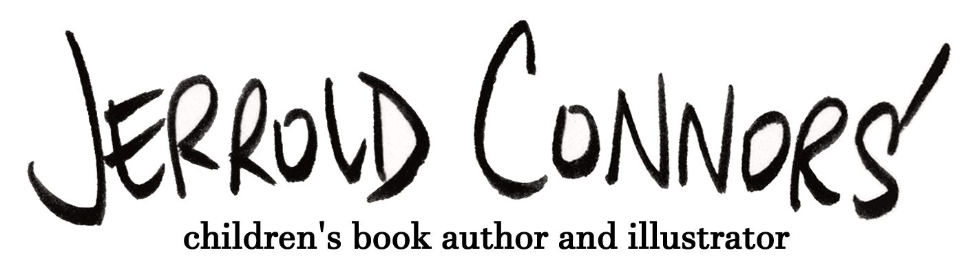
That’s Jen de Oliveira’s REGGIE, KID PENGUIN. Jen is a friend and someone I consider to be a true cartoonist, a person who works in the tradition of the best classic newspaper comics. She co-founded the SUNDAY HAHA comics newsletter and knows her way around the three panel format. I see some PEANUTS in REGGIE, and a lot of NANCY. If you know comic strips, you’ll know that’s high praise and I think it’s fully deserved. I surprised Jen with this reveal at a bookstore visit where we were lucky to find a stack of Reggie’s on display. I’m very happy he could make an appearance in JIM!
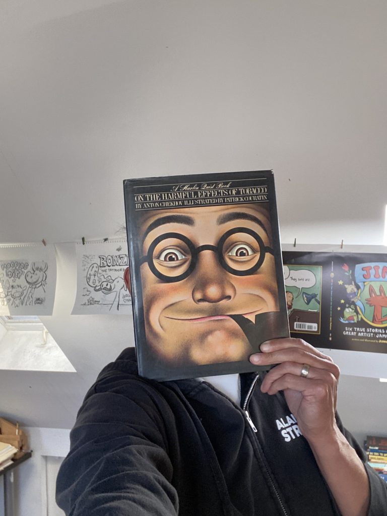
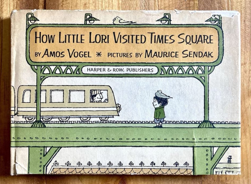
I received for my birthday this year a copy of THE LOWBROW READER, purchased for me because of Maurice Sendak’s name being featured on the cover.
As it turns out, the article in question is titled “Sendak’s Comic B-Sides” and it’s about two of Sendak’s books, WHERE THE WILD THINGS ARE and HOW LITTLE LORI VISITED TIMES SQUARE (written by Amos Vogel, illustrated by Sendak) which came out within a year of each other. Jay Ruttenberg (the author of the article) likens this notion of two books coming out back to back to two songs being released on the same 45. The featured song will take top billing, the second song, usually a strong contender in itself, will go on the B-side where it might be overshadowed by the popularity of the first*. There’s some truth to this, after all, WILD THINGS is ubiquitous and I had never even heard of LITTLE LORI.
my favorite Sendak is pen and ink Sendak
So, I find myself thinking about this whole B-sides thing because my second book BIG RHINOCEROS, LITTLE RHINOCEROS was slated to come out a mere two weeks after JIM! and I wondered if the books could be compared in this way. Thing is, the books are so vastly different. JIM! is an 80 page biography, RHINO is a lift the flap book. If anything, this would be like a 45 with Dvorak’s New World Symphony on the first side and Spike Jones’ Cocktails for Two on the reverse. I can’t really relate. There is a person, however, who is living this reality* right now…
ignore the tbr piles all over the floor
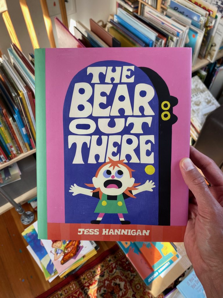
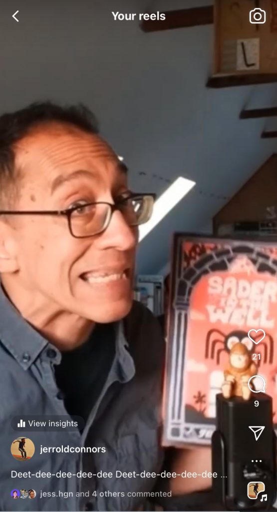
I received an advance copy of Jess Hannigan’s THE BEAR OUT THERE and immediately thought about it and THE SPIDER IN THE WELL in the context of 45s and B-sides. I’m a big fan of SPIDER IN THE WELL, it was one of my favorite books of 2024. I said as much in this Instagram reel.
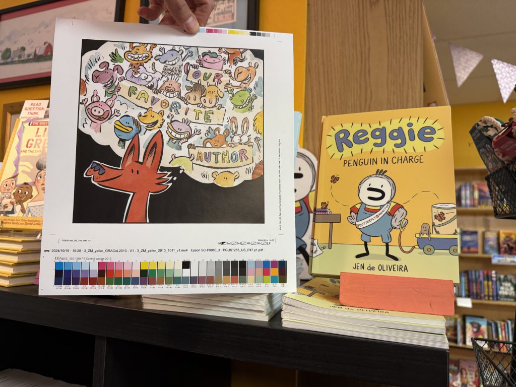
The face of a man who wants you to know how much he likes a book.
An author’s debut book will always get a special type of attention. This alone would designate SPIDER as the A-side and BEAR, by default, the B. Am I saying THE BEAR OUT THERE is a lesser book? Heck no. I think SPIDER might be the more sophisticated story, but BEAR could be the more sophisticated picture book. There’s a different kind of engagement for the reader. I mentioned in my reel that THE SPIDER IN THE WELL feels like my favorite timeless (fractured) fairy tales. THE BEAR OUT THERE, on the other hand, feels immediate and vital. This feeling’s in the story as much as it is in the art (the illustrations are more obviously cut from paper and just feel… grittier).
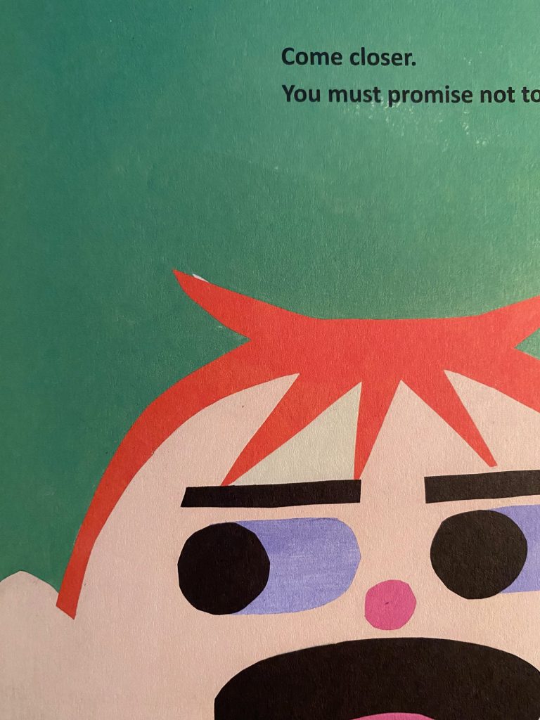
I love that spot of white at the end of the kid’s cowlick.
Am I picking a favorite? Also, heck no**. But I’ll say this, here’s a Reddit thread about records where the B-side is better than the A-side.
The bottom line, there’s definitely a vibe to B-sides. And I think that vibe resonates with a certain kind of independent spirit. Anti-establishment underdog rooters, if you take my meaning. Punks. Never thought I’ll call myself a punk, but here we are.
*only kinda, SPIDER came out March 19, 2024. BEAR comes out in a week on April 29, 2025. Preorder your copy here!
**I definitely can’t pick a favorite of the two, they are both strong works, and they appeal equally to the part of me that wants to curl up with a good story and the part of me that wants to yell “I SEE THE BEAR!!!” at the top of my lungs.
“Hey, Jerrold!” you holler, “What are your marketing plans for your James Marshall biography?”
“You’re a marketing genius,” you continue, “and so very considerate of your time and efforts. You must have some terrific scheme in the works!”
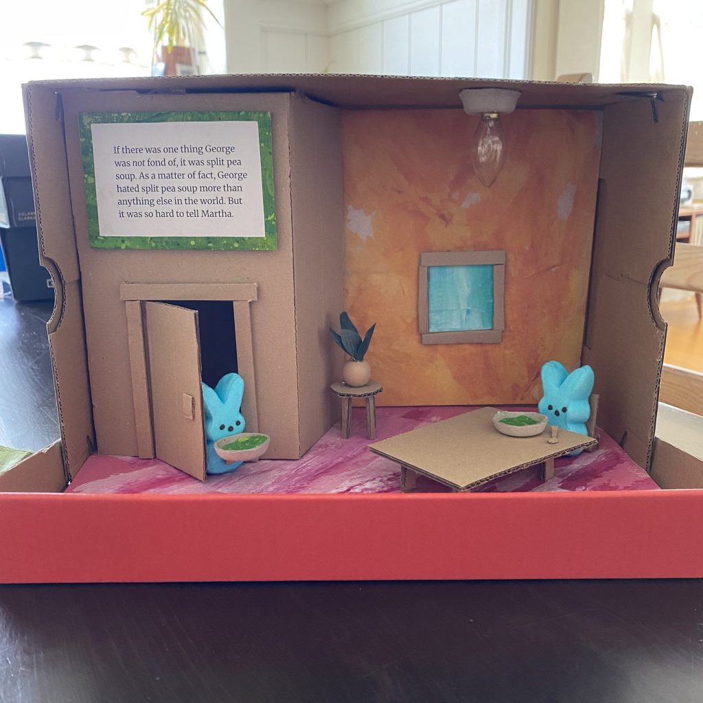
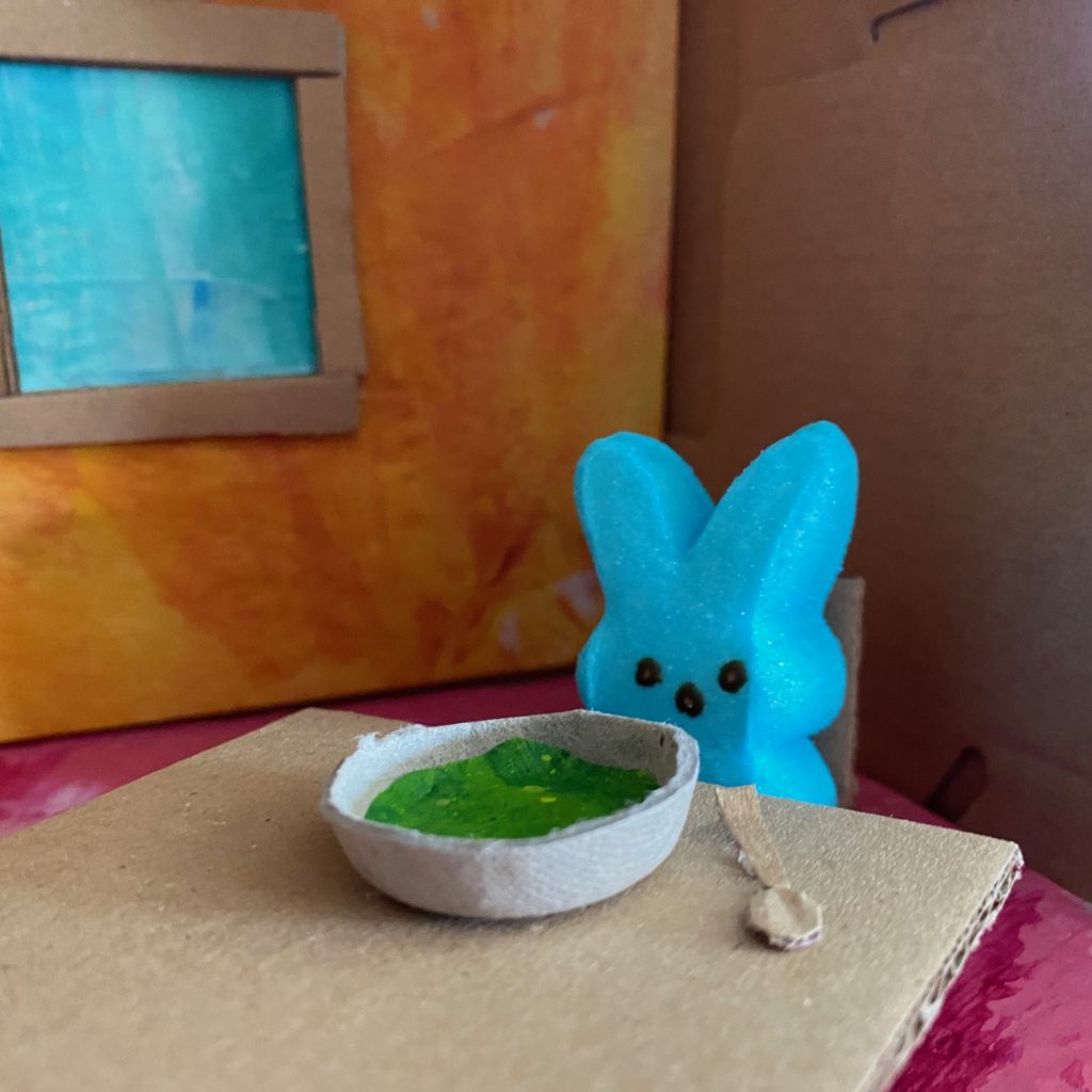
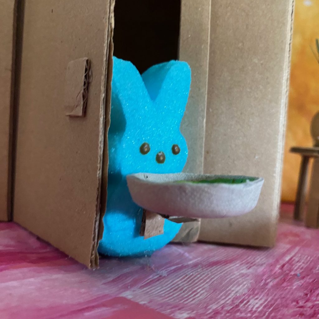
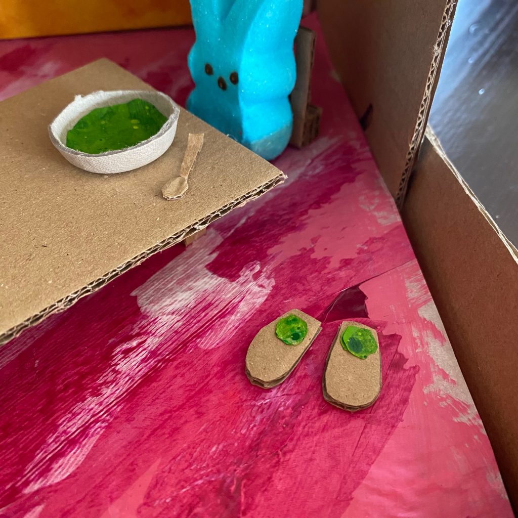
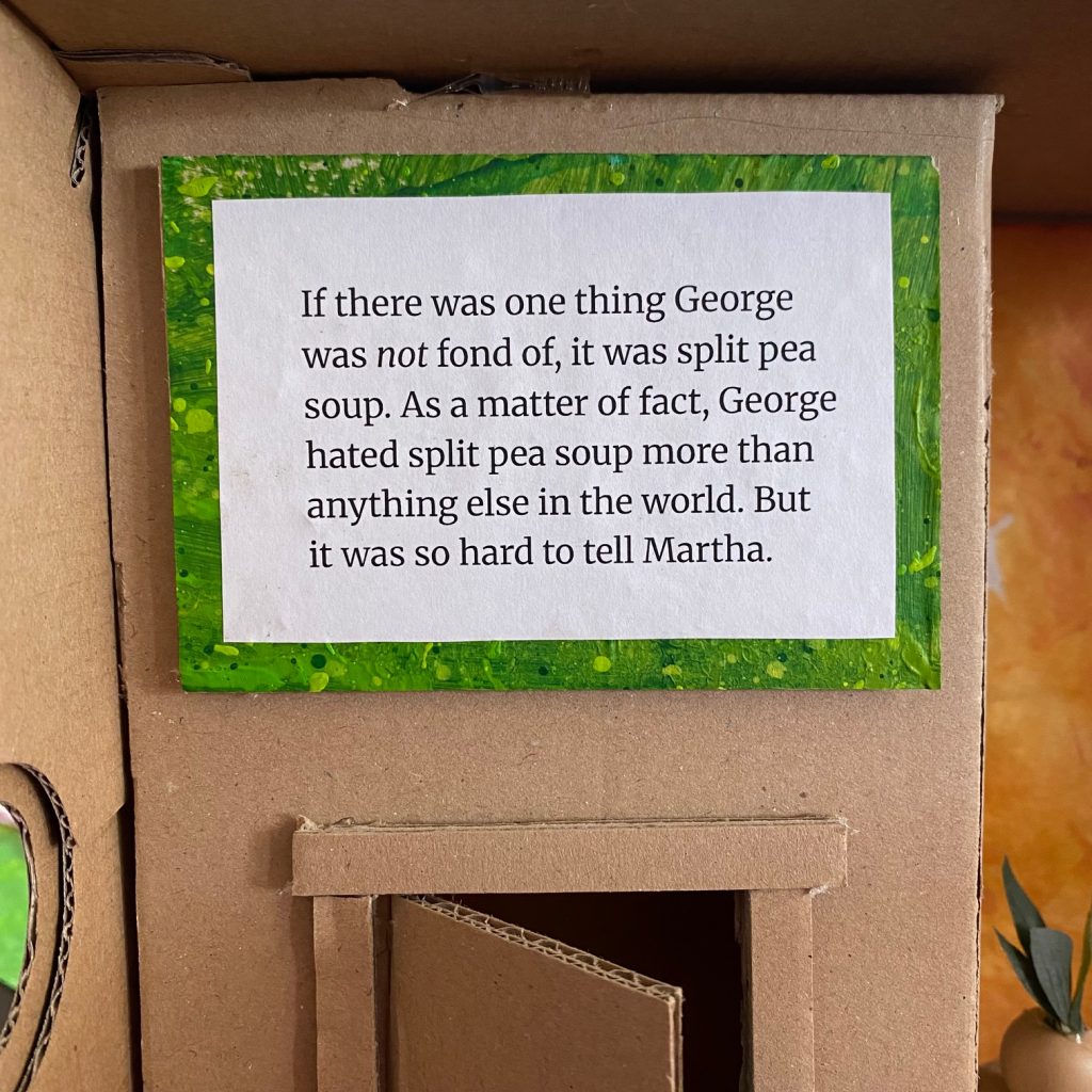
I made a George and Martha diorama for my local library’s Easter PEEP diorama contest.
The plan is this: I win my local competition, get entered in the regionals, win that, advance to State, win THAT, place final in Nationals and THEN, at my awards acceptance speech, say “This is truly an honor, be sure to buy my James Marshall biography, JIM! Six True Stories About One Great Artist. Preorder at Mr. Mopps!“
In all seriousness, I’ve meant to take part in this competition for the last 18 years but never quite got around to it. I do, should be no surprise to you, love dioramas. However, my scattered schooling during my elementary school age days meant that I only ever got to take part in a diorama project once (seventh grade, I did a WRINKLE IN TIME diorama). I’ve made plenty of miniatures since then (a lot of gnome scaled stuff) but this is the first proper diorama I’ve made in a couple decades. It was a lot of fun.
JIM! just earned its third starred review (to be shared publicly on May 1st) and it has me feeling like things are quickly going to start going very quickly. It also has me thinking about how far the project has come. How far, you ask? Well…
Four years and three months later (a mere thirty-nine days from today) I will finally be able to share the book! Looking forward to it.
Found out today that Paul Fierlinger passed away. Though you may not recognize the name, if you’re a TV baby of a certain age, you will for sure know one of his most famous creations. “Ladies and gentlemen, the Teeny Little Super Guy…”
As part of my research for JIM!, I conducted a very short email interview with Paul Fierlinger who directed the animated cartoon adaptation of Marshall’s IT’S SO NICE TO HAVE A WOLF AROUND THE HOUSE. Fierlinger didn’t have any contact with Jim and, in fact, when he wanted to talk to Jim about the ending of the story (of which he didn’t approve), was told by the series producer “don’t worry about it”.
Though the interview didn’t come to much for the biography, Paul was generous with his time and even shared a (at the time) work in progress, KING OF THE REST. I’m grateful for that.
A thorough retrospective of Paul Fierlinger’s career and works can be found at the Cartoon Brew blog.
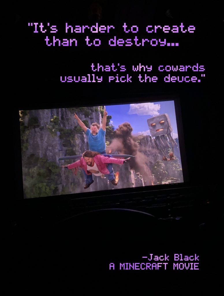
Saw A MINECRAFT MOVIE at a late show over the weekend (when the Chicken Jockey reaction was still in its joyously raucous stage) and really enjoyed it. Bizarre and surreal and weirdly endearing. I read a great review that looked at the phenomena of modern movie going and how kids absorb media (spoiler: sometimes through a second-hand experience, where you perceive your own viewing not as its own thing, but as part of a shared meme). It made me realize that as much as I enjoyed the movie as a whole and the ridiculously over-the-top elytra flight scene in particular, I wasn’t so present that I didn’t pull out my phone to take a picture of said scene.
Anyway, that picture gives me a good background for this quote from the ending of the movie, which I found relevant in these artist versus AI days.
“It’s harder to create than to destroy, that’s why cowards usually pick the deuce.” Jack Black, A MINECRAFT MOVIE