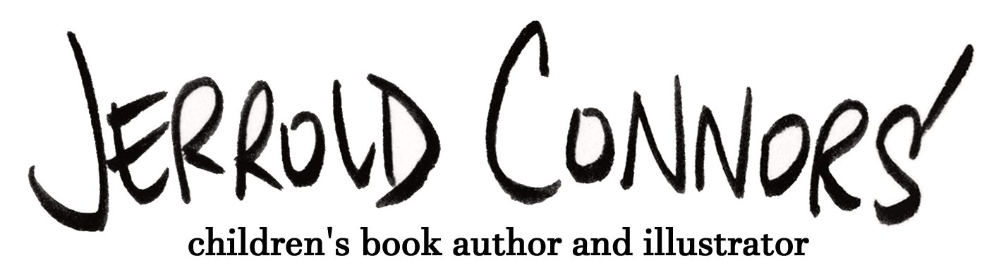
I tend to post on my other socials then follow up here but today I’m going to mix it up. Here’s an exclusive look at a new drawing I made to promote my two launch events (for best effect, pair it with this music).
Oh, those little rascals! Come meet them (and me!) at Linden Tree on June 1 and/or at Books Inc. on June 7.
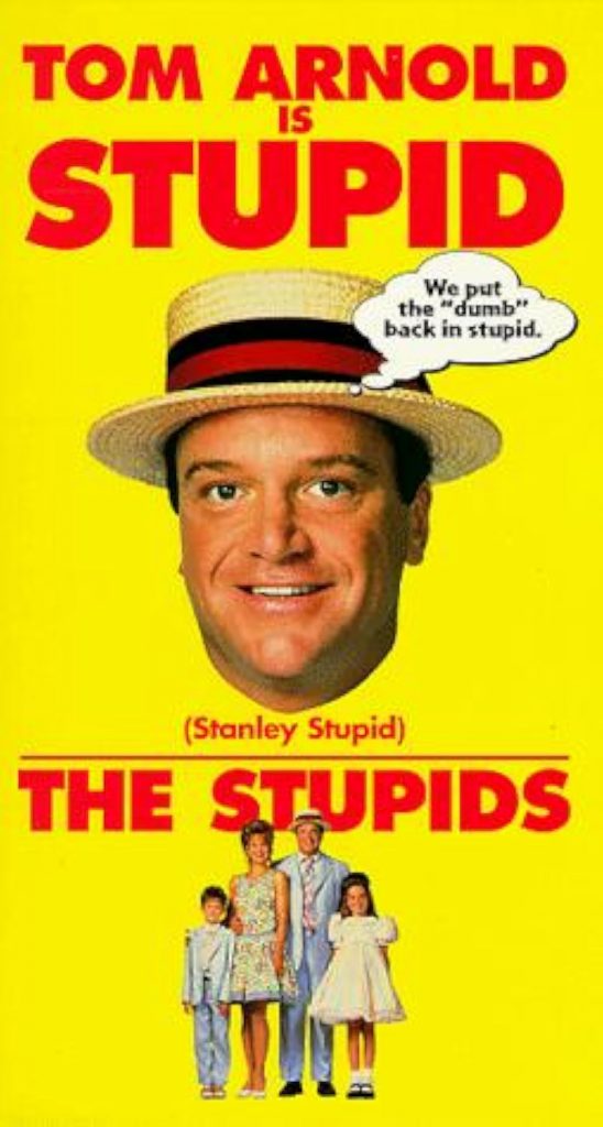
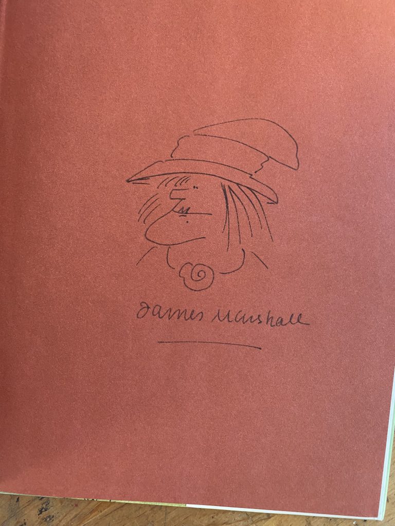
I’m not speaking about the easter eggs in JIM! No, I’m speaking about this!
I went on Cameo to get Tom Arnold, who played Stanley Q. Stupid in 1996’s THE STUPIDS movie to give me a congratulations.
And, boy, did he ever come through. The fact that he calls me “Jared”… perfectly stupid, I watched it five times in a row and laughed every time. It’s so good. I love his energy level in the video and I love the adlib at the end (the bio COULD have been written from the vantage point of Stanley Stupid, in fact… what a great idea for a Harry Allard bio).
If you’re wondering why Tom says the Cameo is from “Edward”… I lied on my Cameo intake form. I ordered this from one of my burner accounts so I could claim it was from someone else. Not because I was embarrassed to self-promote, but because James Marshall himself wrote a few books under the pseudonym “Edward Marshall” who he claimed was his brother. I felt it made sense. I apologize, Tom, for the deception.
THE STUPIDS movie is available on YouTube. It’s widely panned (rated 21% on RottenTomatoes.com) which I think is unfair. It does verge on the surreal (the alien scene is wild), and not everyone is going to like it. But it’s simple and silly and there’s some really Marshall appropriate CGI animation of the Stupid’s pet dog and cat.
Anyway, that Cameo is awesome. I’m off to go write a Harry Allard biography now.
UPDATE:
No, not really. But if you want to learn more about Harry’s collaborations with James Marshall, you should read this article I wrote for the University of Connecticut.
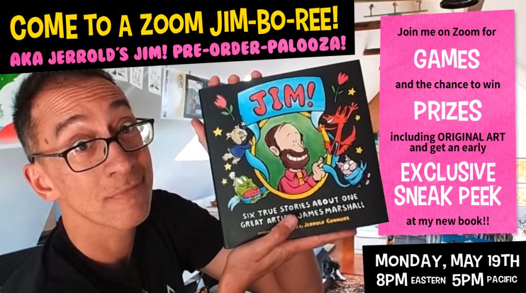
As far as James Marshall related puns go, that has to be up there. No wonder I saved it for the EVENT OF THE CENTURY!
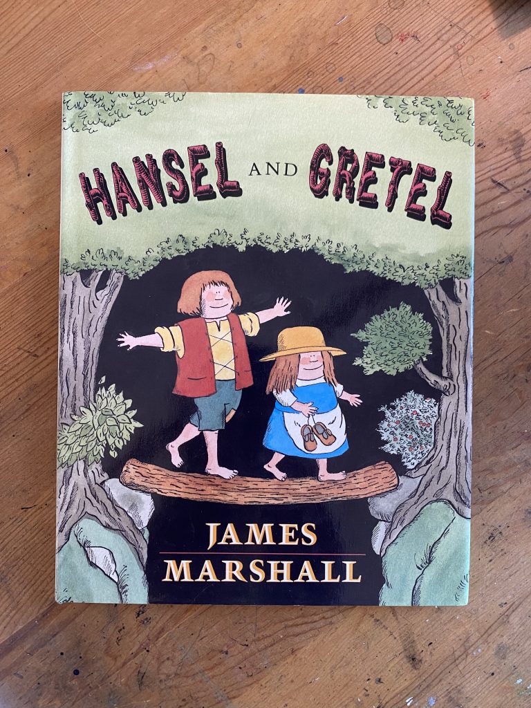
Yes! I’m hosting a pre-order party on Zoom in just over a week’s time. What’s a pre-order party? It’s a carnival-themed Zoom event. Earn points for answering trivia questions, playing games, and even simply just attending. Take those points and trade them in for prizes! The grand prize of all prizes? This copy of HANSEL AND GRETEL which is inscribed with a doodle by James Marshall himself!
I only have one of these and I haven’t given it a point value yet (although I’m thinking of just making it the door prize). I’ll have plenty of other goodies on hand—pins, original drawings, copies of JIM!, and even services—enough that I expect it to feel a bit like turning in your Skee-ball tickets for a reward. Hopefully, it won’t feel as disappointing as when you’re forced to take a green plastic army man home.
“Hey, Jerrold!” you holler, “What are your marketing plans for your James Marshall biography?”
“You’re a marketing genius,” you continue, “and so very considerate of your time and efforts. You must have some terrific scheme in the works!”
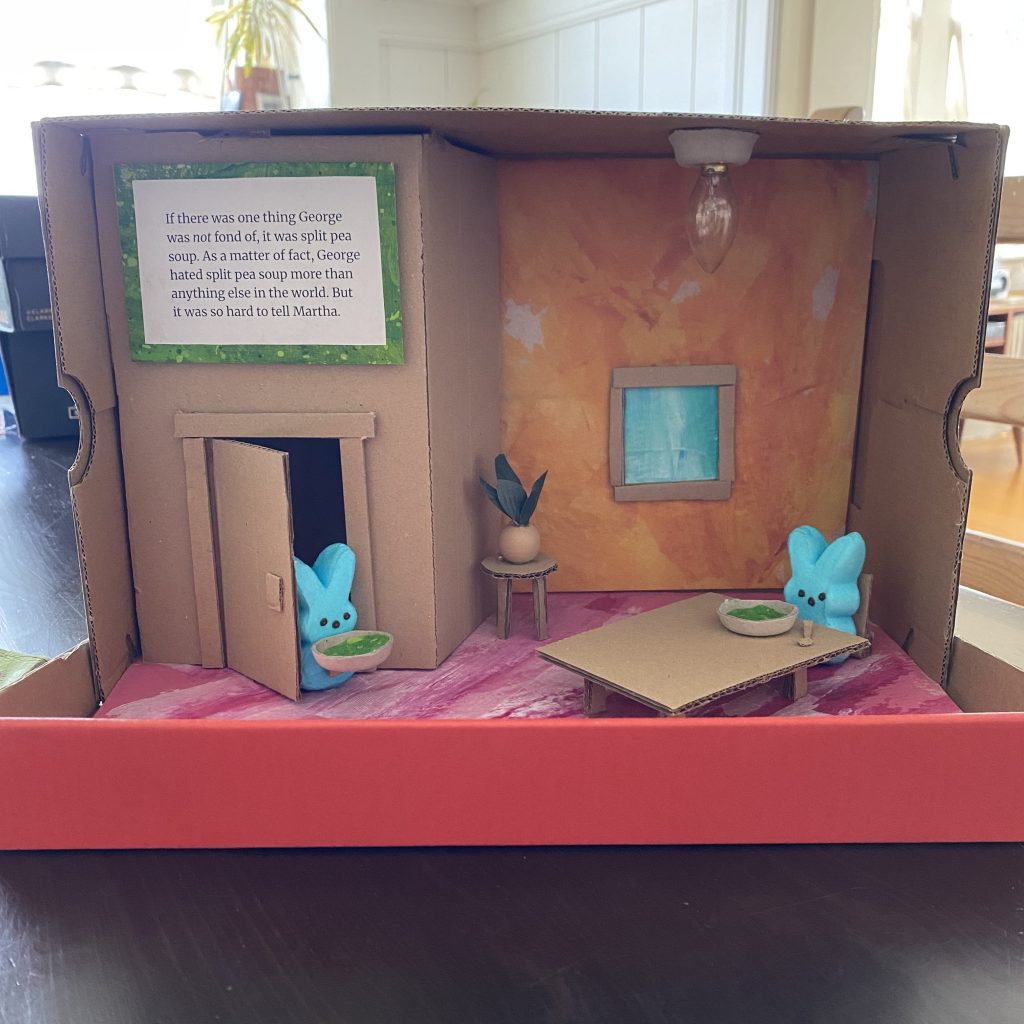
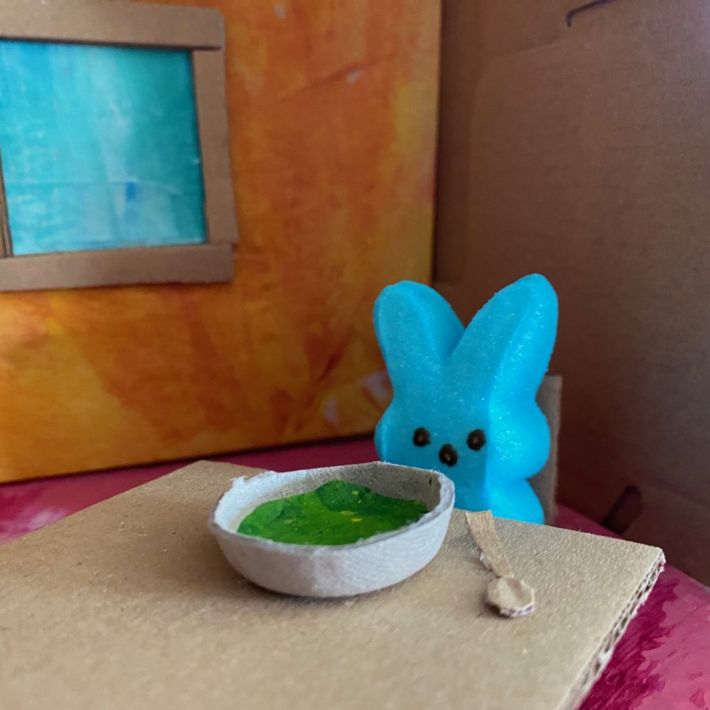
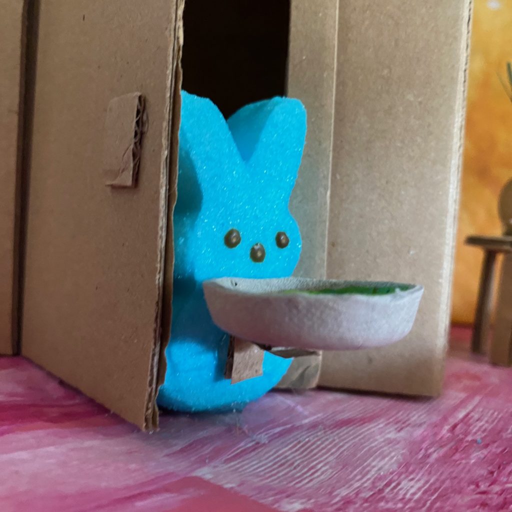
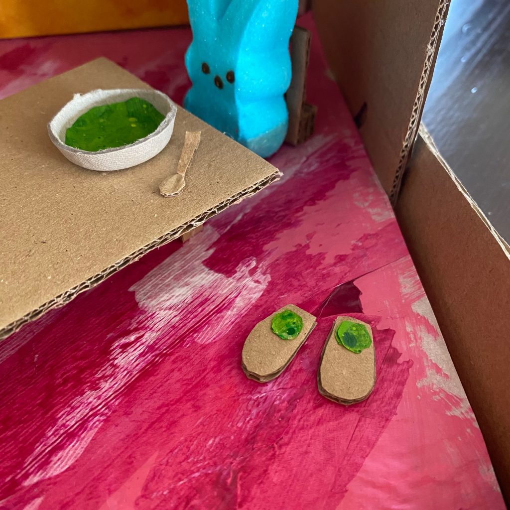
I made a George and Martha diorama for my local library’s Easter PEEP diorama contest.
The plan is this: I win my local competition, get entered in the regionals, win that, advance to State, win THAT, place final in Nationals and THEN, at my awards acceptance speech, say “This is truly an honor, be sure to buy my James Marshall biography, JIM! Six True Stories About One Great Artist. Preorder at Mr. Mopps!“
In all seriousness, I’ve meant to take part in this competition for the last 18 years but never quite got around to it. I do, should be no surprise to you, love dioramas. However, my scattered schooling during my elementary school age days meant that I only ever got to take part in a diorama project once (seventh grade, I did a WRINKLE IN TIME diorama). I’ve made plenty of miniatures since then (a lot of gnome scaled stuff) but this is the first proper diorama I’ve made in a couple decades. It was a lot of fun.
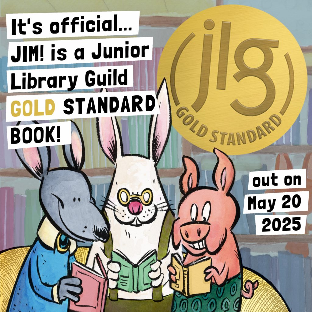
JIM! just earned its third starred review (to be shared publicly on May 1st) and it has me feeling like things are quickly going to start going very quickly. It also has me thinking about how far the project has come. How far, you ask? Well…
Four years and three months later (a mere thirty-nine days from today) I will finally be able to share the book! Looking forward to it.
Found out today that Paul Fierlinger passed away. Though you may not recognize the name, if you’re a TV baby of a certain age, you will for sure know one of his most famous creations. “Ladies and gentlemen, the Teeny Little Super Guy…”
As part of my research for JIM!, I conducted a very short email interview with Paul Fierlinger who directed the animated cartoon adaptation of Marshall’s IT’S SO NICE TO HAVE A WOLF AROUND THE HOUSE. Fierlinger didn’t have any contact with Jim and, in fact, when he wanted to talk to Jim about the ending of the story (of which he didn’t approve), was told by the series producer “don’t worry about it”.
Though the interview didn’t come to much for the biography, Paul was generous with his time and even shared a (at the time) work in progress, KING OF THE REST. I’m grateful for that.
A thorough retrospective of Paul Fierlinger’s career and works can be found at the Cartoon Brew blog.
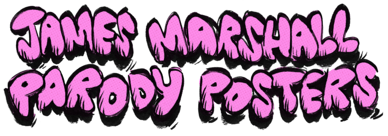
A couple of weeks ago Jess Hannigan and I were talking about what type of preorder goodies we were going to include with our upcoming releases. I had been thinking of doing a limited edition art print for JIM! Jess was thinking of doing (and did do) stickers for THE BEAR OUT THERE. As happens when I talk to immensely talented people, I got jealous and decided I wanted to do something like stickers (but not stickers because Jess, that immensely talented rat, has that market cornered). This got us talking about our favorite freebies to receive as kids. At the top of the list, naturally, stickers. In second place… those folded posters you used to get in the middle of your favorite magazines.
For some of you, this might have been the Teen Beat centerfold of Jonathan Taylor Thomas or maybe the gray wolf or snowy owl fold out from the center of Ranger Rick. For me, it was the inserts in Muppet Magazine (side note: when I was a kid living in Sumatra, I had a subscription to Muppet Magazine and even drew a picture of the Muppets for their monthly art contest but, sadly, never sent it in). Every issue came with a poster in the center spread. The Muppet Magazine posters were Muppet parodies of famous albums of the day (I remember most vividly a parody of John Cougar Mellencamp’s SCARECROW with Dr. Bunsen Honeydew as “John Cougar Melonhead”). I was always too chicken to remove the posters from the magazines (what if I tore the paper on the staples?!) but I always liked the idea of decorating my room with them. Jess enthusiasm and encouragement and this fond memory led to the brainwave that is (drumroll, please…)
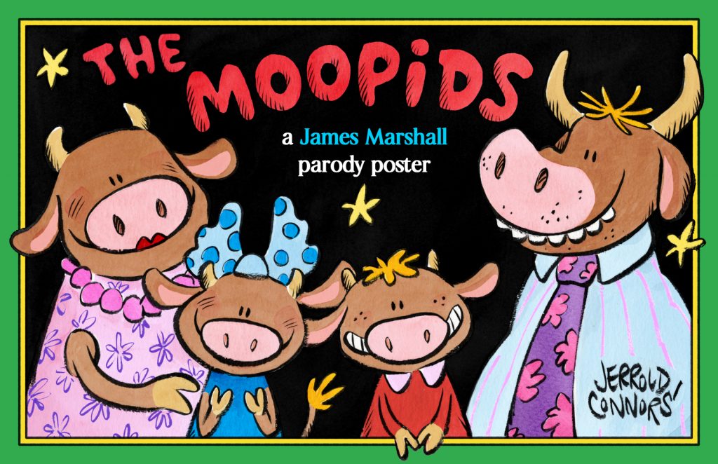
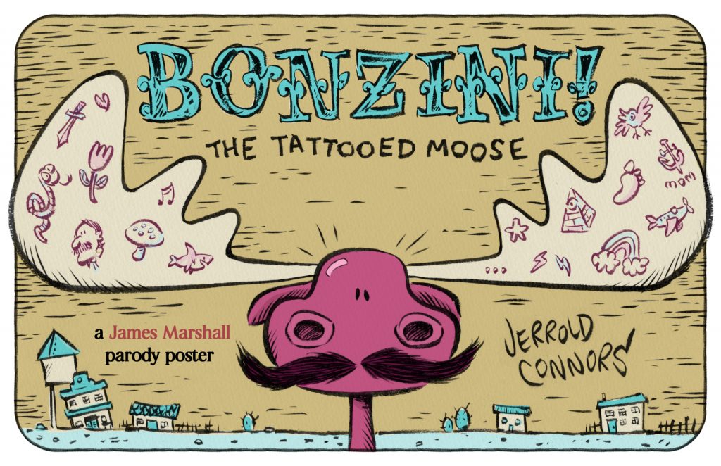
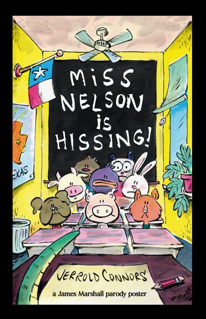
YES! Jim! is now available for preorder with one of three James Marshall-themed parody posters exclusively from Mr. Mopps. One of three? Heck, yeah, one of three! Check them out!
Your first option is my take on the infamously dim-witted Stupid family. As my book takes place in an all animal universe, I did the only logical thing:
The second design comes from a rarer Marshall title, the out of print BONZINI! THE TATTOOED MAN.
And last, but certainly not least, is my take on what is undoubtedly Marshall’s most famous story, the one that gave substitute teachers everywhere a bad name, MISS NELSON IS MISSING!
Each of these posters measure 11×17 inches and will be folded twice to fit into your book. I’m very happy with the designs and I hope your young James Marshall likes them enough to tape or thumbtack them on to their walls.
But wait! There’s more!
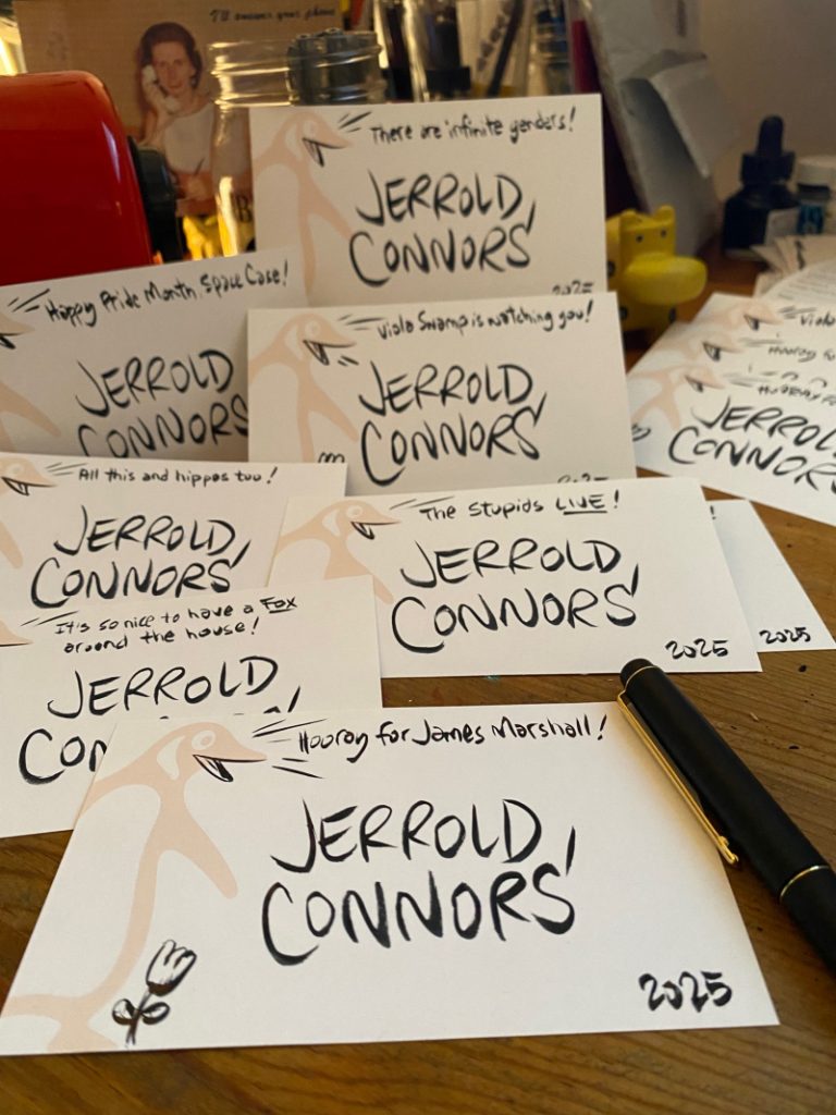
I can also sign the books (if you so wish) and will personalize your copy in (almost) any way your heart desires. Just leave a note on the order page with your preferred witticism, or leave it to chance. We like to live dangerously around here.
A big thank you to Mr. Mopps’ for hosting this pre-order campaign.
Alright! That’s it. And with that, I think the JIM! pre-launch festivities have officially begun.
Alright. You’ve met Emotional Jerrold. Get ready to meet Angry Jerrold.
You ready?
JIM! received a review in which my illustrations were described as “digitally enhanced ink and watercolor artwork” and when I tell you I bristled at that wording…
Yeah. I was livid. To me, the implication is that I passed an AI filter over my drawings and (deep breath, Jerrold) even typing that now brings a heavy, throbbing pressure to my neck. I can actually feel my blood pressure rising and in general I have been in a terribly distracted state since I read this review two weeks ago. I want to deal with my anger, so with your indulgence, I’m going to try and figure out just why it is I am as upset as I am. Let’s dig in!
To begin, I will own the fact that to some degree I brought this on myself. Included on the copyright page of JIM! is an art note. It reads:
The illustrations for this book were drawn with a Winsor and Newton Series 7 Kolinsky sable brush and colored with Kuretake Gansai Tambi watercolors. Digital enhancements were added in Procreate with the Adilson Farias watercolor brush set.
First of all, why include this? Well, it’s a convention I enjoy seeing in picture books. As a note, it’s small and unobtrusive enough that I don’t think it spoils any storytelling magic, but to an art nerd this little extra information adds a level of appreciation otherwise missing. In writing mine, I wanted to let the reader in on what I felt are the most important parts of my process. It’s simplified, of course, but a full description of these steps would be:
INK
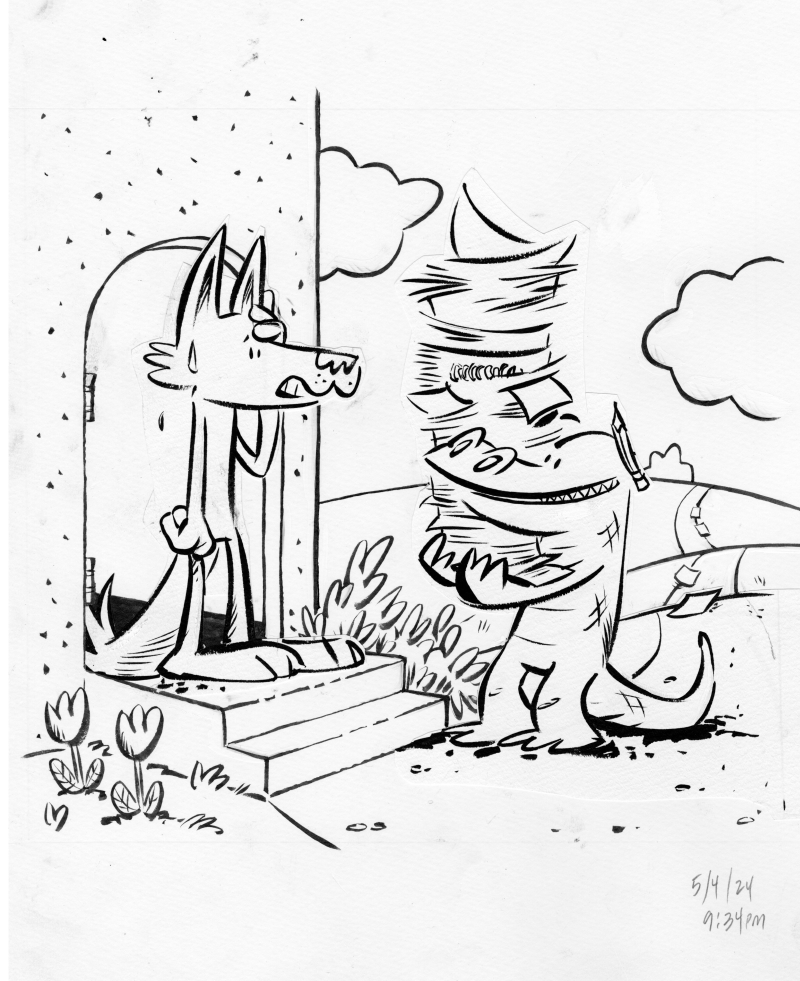
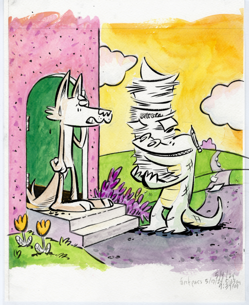
I think my greatest strength in illustration is my inking. I’m confident in my linework and have worked hard at becoming so. Here’s a piece from the first chapter of JIM! where Harry Allard is visiting Jim’s home to drop off his manuscript for Miss Nelson Is Missing!
One of the greatest challenges in inking is finding that place where you are using your rough sketch as a guide without deliberately tracing each and every pencil line—at its best, the ink drawing should have a life of its own. Sometimes, there will be a part of the drawing that didn’t quite, to my eye, meet that criteria. In those cases, I’d ink that piece on its own, cut it out and paste it to the illustration (you can see this with Jim’s head and with Harry’s entire body). It’s important to me to get the ink as final as possible, which is to say, I don’t like cutting and pasting on the computer. It really bothers me, for some reason, to have two “final” versions of an ink drawing. It’s silly and it’s immaterial, but I’ve always felt that way.
COLOR
I wish I had the confidence in watercolors that I do in inking, but I don’t. I am too hesitant (and, paradoxically, too impatient) to be a good watercolorist. I admire people who watercolor directly over their ink drawings. I don’t trust I won’t ruin the ink drawing so I trace the lines onto watercolor paper and then color it there.
A saving grace for this project was my late-in-the-game discovery of Kuretake Gansai Tambi watercolors. Watercolors, used properly, require a painting, drying, overpainting, drying, overpainting again technique that brings out the luminosity of the media. BUT, as I mentioned above, I’m way too impatient for all that. Gansai Tambi watercolors are somewhat like gouache (in that they are much thicker and don’t require so much layering), but they retain that watercolor “look”. They felt, to me, to be the perfect media to have a painterly quality but be reminiscent of Marshall’s own watercolor work.
As a side note, Marshall himself usually colored directly onto his ink drawings, though not always. For Nosey Mrs. Rat, he colored the back sides of his ink drawings. A very peculiar technique, unique, I think, to this one book. I’ll talk more about this on a future post.
from NOSEY MRS. RAT, photo from UCONN archives
MERGING THE TWO (not mentioned)
A step I left out of my pub-page art process blurb was “The ink and color drawings were scanned and composited in Clip Studio Paint”. I actually wanted to include this to throw a shout out to Clip Studio Paint, an app I adopted after abandoning PhotoShop and all Adobe products after Adobe’s acceptance of AI scraping. I didn’t list it, though, because it felt a bit too obvious (also, would I start listing every single step? drawing scanned with an Epson Expression 13000XL scanner, files uploaded to Drive etc etc etc). Anyway, here’s how they look merged:
I will say that Clip Studio Paint did come in clutch, though, because I was working with a lot of layers. If you notice that Jim and Harry aren’t colored (besides having a slight indications of shadows), that’s because I colored them separately. Elements that required special attention (eg. color consistency in the main characters) were usually colored on their own pieces of paper, scanned and imported individually into their own layers.
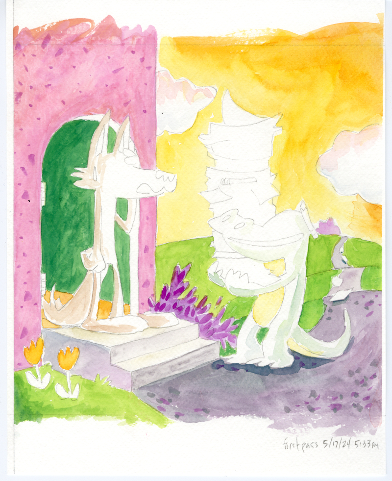
STARTING OVER (also not mentioned)
There’s a trick employed in animation where scenes are animated out of sequence so that if the art style morphs over time, that distortion becomes less apparent. It’s sort of insurance against having the main character slowly grow a foot taller between the start and the end of the movie. The scene of Harry at Jim’s door was the second illustration I did for JIM! and towards the end of the project, it became apparent I needed to redraw it. I hesitate to share it here because I want to keep it a surprise for the book’s release. However, I’m mentioning the step because it’s relevant to the next point.
DIGITAL (shudder) ENHANCEMENTS
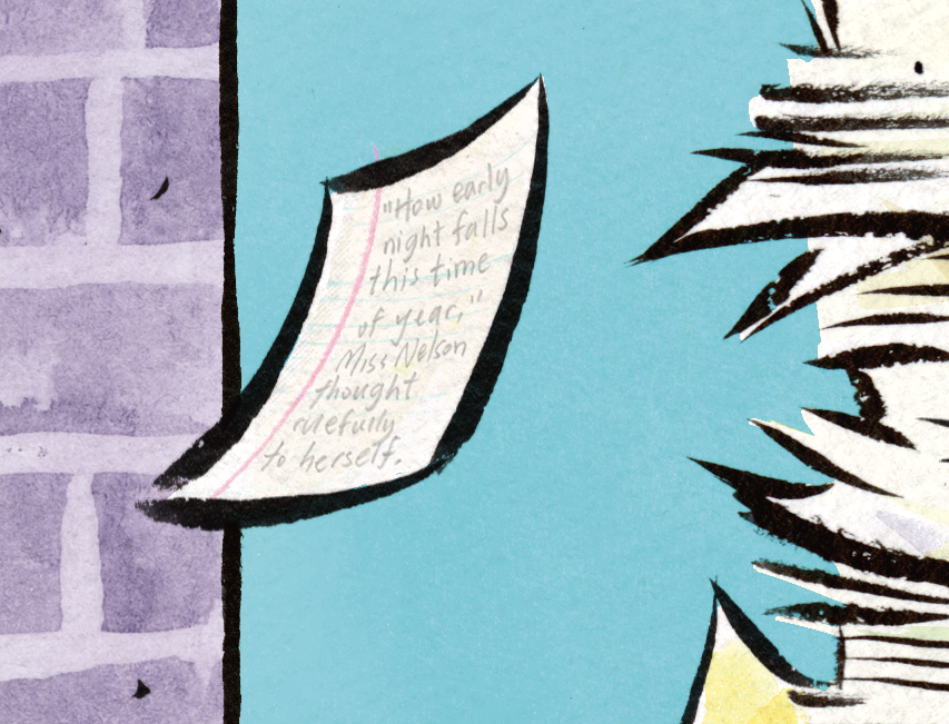
So, another—and the real—reason I didn’t include Clip Studio Paint in my art process is that as a step, it doesn’t really add anything new to the piece. It’s a merging of two existing drawings and if there was any change (say a clean up of misaligned edges), it would be subtractive. The reason Idid include Procreate as a step was because new elements were added to the drawing at this stage. For example:
That single sheet of falling loose leaf paper… I drew the lines on it in Procreate. There are small elements like this on many (probably all) the illustrations in the book. It might be a spot of blush on a character’s cheek, a shadow under a vase holding a single tulip, or a shine on a medallion. I think I could have called these embellishments instead of enhancements but I do think they add to the art and to the story. In the case of this note, it adds a detail that hints to Harry’s eccentric energy and gives a nod to Harry’s self-published fourth Miss Nelson book (I’m paraphrasing a line from that story, not that anyone would know).
As a step, this provides a set of unifying details across all the illustrations (see the above point about consistency). Could I have drawn these lines on paper and scanned them in? Sure. The writing on that page is. But, fact is, doing it directly in Procreate allowed for some of that spontaneity I described in the first step (eg. not tracing).
PROCESSING ALL OF THIS
Well, the throbbing in my neck has gone down (a little) and it’s apparent to me now why that “digital enhancements” hit me as hard as it did. It’s the erasure of the human element. When you’re in the process of making a book, or at least when I was in the process of making JIM!, you might not be fully aware of just how much work you’re putting into each and every drawing. At the same time, I’m not trying to paint myself (on several separate sheets of cold-press paper with Japanese watercolors) as a tortured artist. Each of these steps, even the most tedious, was a joy and there’s no point subjecting even the most steadfast art lover to a process note that reads:
The illustrations for this book were drawn with a Winsor and Newton Series 7 Kolinsky sable brush and traced with pencil onto three to four separate sheets of Strathmore cold press watercolor paper where they were colored with with Kuretake Gansai Tambi watercolors. The ink and color pieces were composited together in Clip Studio Paint, where any misaligned edges were cleaned up.Finer details and various highlights were drawn in Procreate with the Adilson Farias watercolor brush set.The creator took a lot of naps but nonetheless suffered two crises of confidence where he became bed bound for a total of four hours which may not sound like a lot but is actually a big deal to him. Oh yeah, he also had Covid at one point.
Although, I will admit, that might have been funny.
It’s also clear to me that much of my anger is fueled by the world right now and how the world’s richest, most obnoxious tech bros are constantly in my face insisting I employ AI assistance in every aspect of my life even as they dismantle everything I love, from National Parks to libraries. I’ve spoken out about rejecting AI art and I’ve lamented the disappearance of analog ephemera so to have “digital enhancements” attached to any part of my work, however it was intended, just felt like a particular kick in the teeth.