Process and Processing

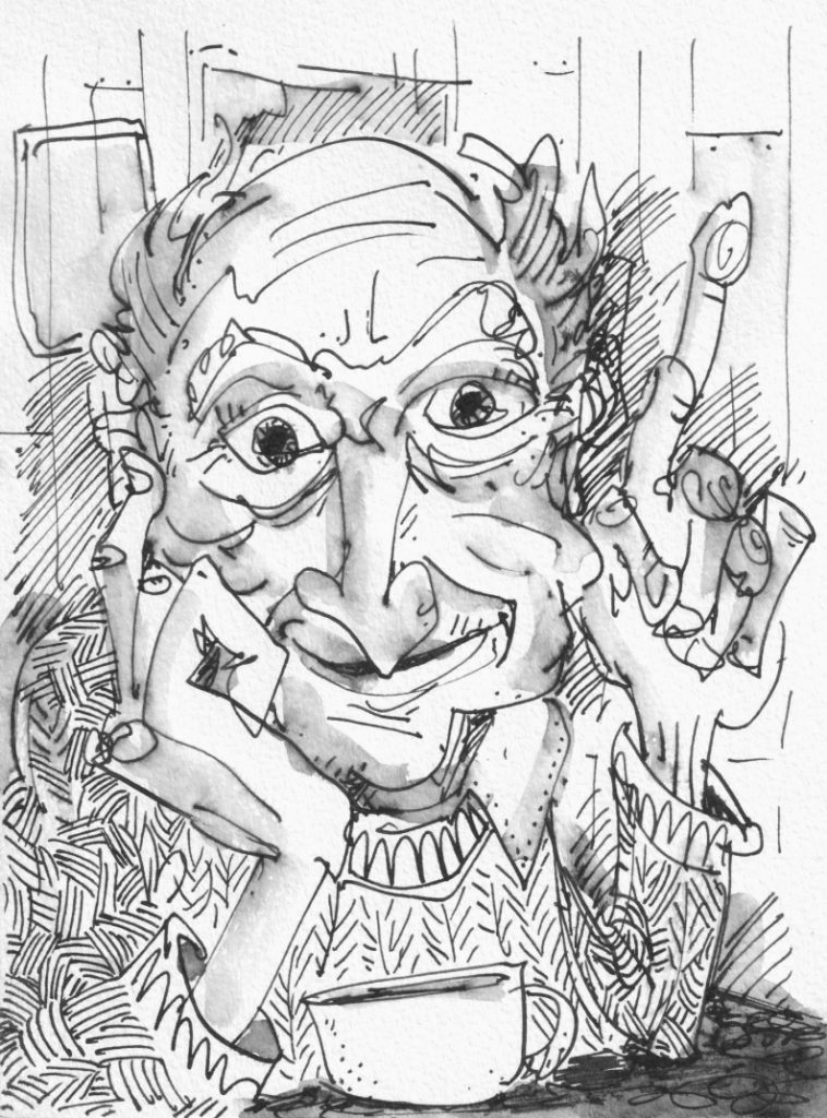
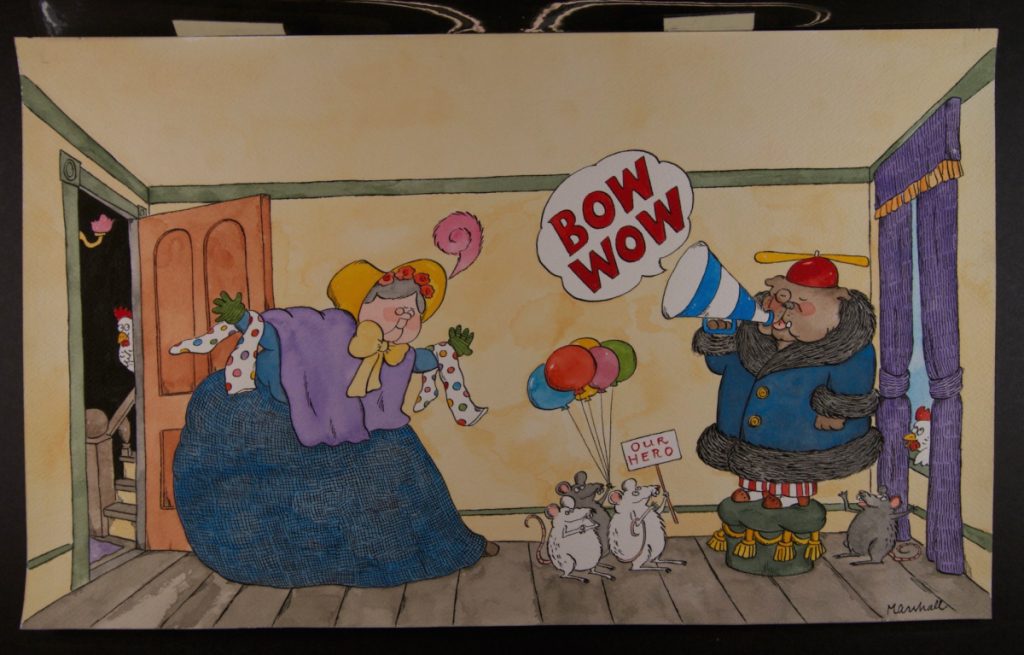
Alright. You’ve met Emotional Jerrold. Get ready to meet Angry Jerrold.

You ready?

JIM! received a review in which my illustrations were described as “digitally enhanced ink and watercolor artwork” and when I tell you I bristled at that wording…

Yeah. I was livid. To me, the implication is that I passed an AI filter over my drawings and (deep breath, Jerrold) even typing that now brings a heavy, throbbing pressure to my neck. I can actually feel my blood pressure rising and in general I have been in a terribly distracted state since I read this review two weeks ago. I want to deal with my anger, so with your indulgence, I’m going to try and figure out just why it is I am as upset as I am. Let’s dig in!

To begin, I will own the fact that to some degree I brought this on myself. Included on the copyright page of JIM! is an art note. It reads:

The illustrations for this book were drawn with a Winsor and Newton Series 7 Kolinsky sable brush and colored with Kuretake Gansai Tambi watercolors. Digital enhancements were added in Procreate with the Adilson Farias watercolor brush set.

First of all, why include this? Well, it’s a convention I enjoy seeing in picture books. As a note, it’s small and unobtrusive enough that I don’t think it spoils any storytelling magic, but to an art nerd this little extra information adds a level of appreciation otherwise missing. In writing mine, I wanted to let the reader in on what I felt are the most important parts of my process. It’s simplified, of course, but a full description of these steps would be:

INK

I think my greatest strength in illustration is my inking. I’m confident in my linework and have worked hard at becoming so. Here’s a piece from the first chapter of JIM! where Harry Allard is visiting Jim’s home to drop off his manuscript for Miss Nelson Is Missing!

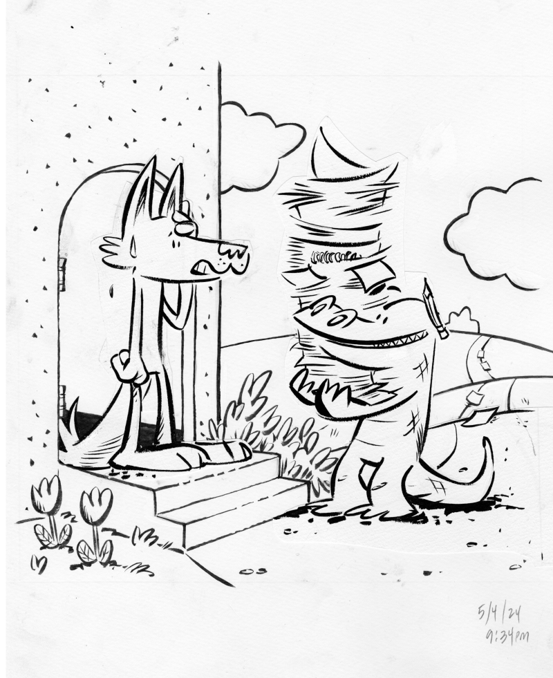
One of the greatest challenges in inking is finding that place where you are using your rough sketch as a guide without deliberately tracing each and every pencil line—at its best, the ink drawing should have a life of its own. Sometimes, there will be a part of the drawing that didn’t quite, to my eye, meet that criteria. In those cases, I’d ink that piece on its own, cut it out and paste it to the illustration (you can see this with Jim’s head and with Harry’s entire body). It’s important to me to get the ink as final as possible, which is to say, I don’t like cutting and pasting on the computer. It really bothers me, for some reason, to have two “final” versions of an ink drawing. It’s silly and it’s immaterial, but I’ve always felt that way.

COLOR

I wish I had the confidence in watercolors that I do in inking, but I don’t. I am too hesitant (and, paradoxically, too impatient) to be a good watercolorist. I admire people who watercolor directly over their ink drawings. I don’t trust I won’t ruin the ink drawing so I trace the lines onto watercolor paper and then color it there.

A saving grace for this project was my late-in-the-game discovery of Kuretake Gansai Tambi watercolors. Watercolors, used properly, require a painting, drying, overpainting, drying, overpainting again technique that brings out the luminosity of the media. BUT, as I mentioned above, I’m way too impatient for all that. Gansai Tambi watercolors are somewhat like gouache (in that they are much thicker and don’t require so much layering), but they retain that watercolor “look”. They felt, to me, to be the perfect media to have a painterly quality but be reminiscent of Marshall’s own watercolor work.

As a side note, Marshall himself usually colored directly onto his ink drawings, though not always. For Nosey Mrs. Rat, he colored the back sides of his ink drawings. A very peculiar technique, unique, I think, to this one book. I’ll talk more about this on a future post.

from NOSEY MRS. RAT, photo from UCONN archives

MERGING THE TWO (not mentioned)

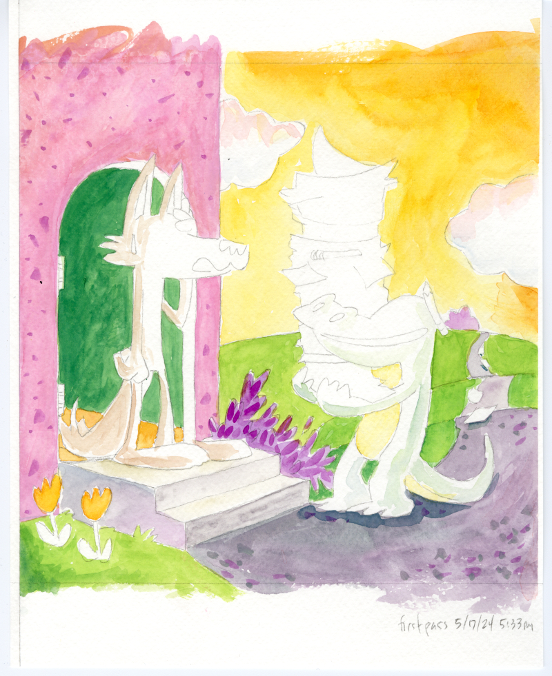
A step I left out of my pub-page art process blurb was “The ink and color drawings were scanned and composited in Clip Studio Paint”. I actually wanted to include this to throw a shout out to Clip Studio Paint, an app I adopted after abandoning PhotoShop and all Adobe products after Adobe’s acceptance of AI scraping. I didn’t list it, though, because it felt a bit too obvious (also, would I start listing every single step? drawing scanned with an Epson Expression 13000XL scanner, files uploaded to Drive etc etc etc). Anyway, here’s how they look merged:

I will say that Clip Studio Paint did come in clutch, though, because I was working with a lot of layers. If you notice that Jim and Harry aren’t colored (besides having a slight indications of shadows), that’s because I colored them separately. Elements that required special attention (eg. color consistency in the main characters) were usually colored on their own pieces of paper, scanned and imported individually into their own layers.

STARTING OVER (also not mentioned)

There’s a trick employed in animation where scenes are animated out of sequence so that if the art style morphs over time, that distortion becomes less apparent. It’s sort of insurance against having the main character slowly grow a foot taller between the start and the end of the movie. The scene of Harry at Jim’s door was the second illustration I did for JIM! and towards the end of the project, it became apparent I needed to redraw it. I hesitate to share it here because I want to keep it a surprise for the book’s release. However, I’m mentioning the step because it’s relevant to the next point.

DIGITAL (shudder) ENHANCEMENTS

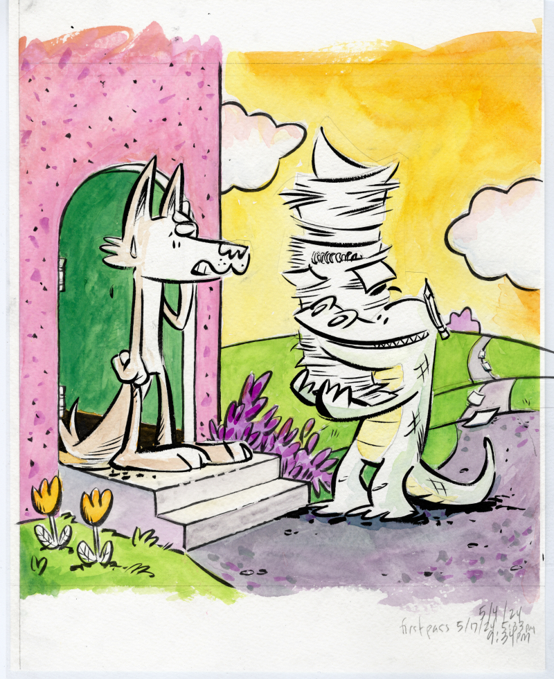
So, another—and the real—reason I didn’t include Clip Studio Paint in my art process is that as a step, it doesn’t really add anything new to the piece. It’s a merging of two existing drawings and if there was any change (say a clean up of misaligned edges), it would be subtractive. The reason I did include Procreate as a step was because new elements were added to the drawing at this stage. For example:

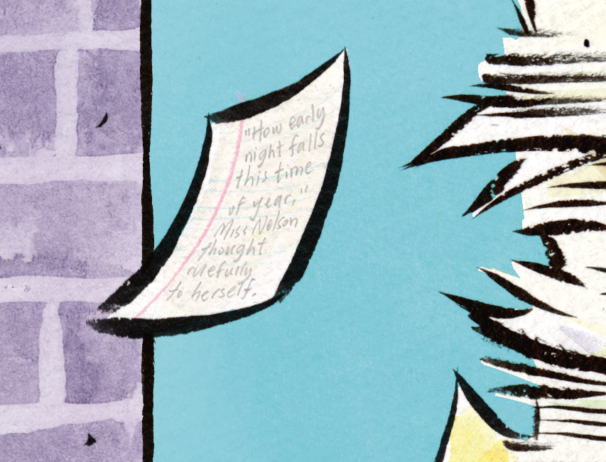
That single sheet of falling loose leaf paper… I drew the lines on it in Procreate. There are small elements like this on many (probably all) the illustrations in the book. It might be a spot of blush on a character’s cheek, a shadow under a vase holding a single tulip, or a shine on a medallion. I think I could have called these embellishments instead of enhancements but I do think they add to the art and to the story. In the case of this note, it adds a detail that hints to Harry’s eccentric energy and gives a nod to Harry’s self-published fourth Miss Nelson book (I’m paraphrasing a line from that story, not that anyone would know).

As a step, this provides a set of unifying details across all the illustrations (see the above point about consistency). Could I have drawn these lines on paper and scanned them in? Sure. The writing on that page is. But, fact is, doing it directly in Procreate allowed for some of that spontaneity I described in the first step (eg. not tracing).

PROCESSING ALL OF THIS

Well, the throbbing in my neck has gone down (a little) and it’s apparent to me now why that “digital enhancements” hit me as hard as it did. It’s the erasure of the human element. When you’re in the process of making a book, or at least when I was in the process of making JIM!, you might not be fully aware of just how much work you’re putting into each and every drawing. At the same time, I’m not trying to paint myself (on several separate sheets of cold-press paper with Japanese watercolors) as a tortured artist. Each of these steps, even the most tedious, was a joy and there’s no point subjecting even the most steadfast art lover to a process note that reads:

The illustrations for this book were drawn with a Winsor and Newton Series 7 Kolinsky sable brush and traced with pencil onto three to four separate sheets of Strathmore cold press watercolor paper where they were colored with with Kuretake Gansai Tambi watercolors. The ink and color pieces were composited together in Clip Studio Paint, where any misaligned edges were cleaned up. Finer details and various highlights were drawn in Procreate with the Adilson Farias watercolor brush set. The creator took a lot of naps but nonetheless suffered two crises of confidence where he became bed bound for a total of four hours which may not sound like a lot but is actually a big deal to him. Oh yeah, he also had Covid at one point.

Although, I will admit, that might have been funny.

It’s also clear to me that much of my anger is fueled by the world right now and how the world’s richest, most obnoxious tech bros are constantly in my face insisting I employ AI assistance in every aspect of my life even as they dismantle everything I love, from National Parks to libraries. I’ve spoken out about rejecting AI art and I’ve lamented the disappearance of analog ephemera so to have “digital enhancements” attached to any part of my work, however it was intended, just felt like a particular kick in the teeth.

Process and Processing Read More »

It’s the Music, Man!

Over on Rachel Michelle Wilson’s blog post from January 7th, she talks about following a breadcrumb of Sendak’s inspirations:

As I immerse myself in the Sendak world this week, I thought it would be fun to try out some of Sendak’s fountains of inspiration:

  • William Blake
  • Mozart
  • Emily Dickinson
  • Alice’s Adventures in Wonderland
  • And if I have the time, I’ll also check out Schubert, Hugo Wolfe, Palmer, Proust, Eliot, Middlemarch, Randolph Caldecott, George Cruikshank, Ludwig Richter, Wilhelm Busch, A. B. Frost, Edward Windsor Kemble, Ernst Kreidolf, Hans Fischer, André François, Watteau, Goya, Winslow Homer, Mahler, Beethoven, Wolf, Wagner, Verdi, Walt Disney, James, Stendhal, D. H. Lawrence, or Melville

This brought to mind my own attempt at the same with James Marshall. Not so much in the literary (goodness knows I am not a reader) but in music. I had the idea that maybe if I played Marshall’s favorite composers, the air in my studio would be imbued with an ethereal Marshall-ness that would manifest itself in the art I was making. A romantic thought, but in practice… not so great. Marshall was a classical music egghead (I say this with respect as a classical music geek), and his favorite of favorites, Shostakovich, just didn’t do it for me. Marshall’s tastes tended towards the grander, heavier symphonies and I just couldn’t get into those while drawing a cartoon fox motoring a speedboat up a river. I did, however, include this little detail in one of my illustrations:

So, what music got me through this project? Let’s start with Godspeed You! Black Emperor.

If you remember this post, there was a time, almost exactly a year ago, where I was feeling haunted by images coming out of Gaza. There was something in Storm that helped me find a place for my feelings of despair, and allowed me move ahead with the first final illustrations I did for JIM! In fact, I would turn to Godspeed again and again over the course of JIM! and I think it’s fair to say Lift Your Skinny Fists like Antennas to Heaven got me through the first half of this project.

There were times when my feelings of despair turned into anger, and in those moments I sought help from Bill Evans.

Speaking of “feelings in the ether” and all that sort of thing, it was important to me that the primary feeling surrounding JIM! was love. Peace Piece always managed to return me to a calmer place where I could check in with myself and see if I was meeting my goals.

The other feeling I wanted, and this is probably obvious, was joy. For that, I turned to the theme from the George and Martha cartoon, Perfidia, as performed by the Mambo All Stars.

The comment section to the above tells you a lot about how fondly Marshall properties are remembered.

Granted, those comments are about the George and Martha cartoon (produced after Marshall’s death) but they put me in mind of this notion of legacy, and what I hoped to accomplish with JIM! Somewhere during all this, my family went to a Belle & Sebastian concert. They played If She Wants Me and the line “If I could do just one near perfect thing I’d be happy” hit hard.

I would call If She Wants Me the anthem of the middle half of the project. I had found my stride and this song had the right mix of hope and purpose. The second half of the chorus goes: On second thoughts I’d rather hang around and be there with my best friend if she wants me.

Okay, we need to switch gears. So far everything has been loaded with meaning and intention. This next choice is a bit more lighthearted. There’s a scene in JIM! where Jim is signing books at a bookstore sometime, I imagine, in the late 70s/early 80s. I wanted to transport myself back to that era and I figured the best way was with muzak:

A lot of my late-night sessions were set to the soothing sounds of Ethiopian jazz:

While I usually prefer to curate my social media feeds by hand, I tend to let YouTube’s algorithm recommend (or auto play) my playlists. I was rewarded late last summer with and introduction me to Diamond Jubilee:

I had never heard of Cindy Lee but I became obsessed with this album and had it on repeat for probably the last third of JIM! Besides enjoying the music, I was inspired by Cindy Lee who released her album only on YouTube and who’s website is hosted on geocities. Be still, my old-internet lovin’ heart. There was something about the artistry of Cindy Lee’s project that kept me wanting to keep JIM! as authentic as possible. Here’s another easter egg from inside my book:

“To thine own self be true”

I’ll end by returning to classical music to tell you the one piece that did play a part in JIM! This was for the final chapter:

Clair de Lune accompanied the hospital scenes. I won’t say any more about that until after the book comes out. At which point you can tell me if I missed the mark entirely.

It’s the Music, Man! Read More »

Ahab Noodler Fountain Pen Test

I’ve been using my Ahab Noodler fountain pen to sketch out a graphic novel I’m collaborating on with a certain librarian but I noticed the pen is in need of some maintenance. I’m going to head out to Flax and buy a new nib so I can finish up these thumbnails. Until I get back, please enjoy this timelapse I made back when I was first test-running this pen:

Ahab Noodler Fountain Pen Test Read More »

“The Hungry Typewriter” or “A Dwindling Assortment of Visual Iconography”

Last year, over on Twitter, illustrator Lee Gatlin posted this sketch:

source: https://x.com/neilaglet/status/1754195214728597775

It made me think about a topic that’s been nagging at my mind in recent years. Namely, I have a worry that that young people’s visual literacy is dropping at an alarming rate. Why is this a concern to me? Let’s talk about CRT TVs.

Computer monitors (which essentially looked like CRT TVs) were a big staple in my early career as an illustrator. I worked mainly in kids educational media and was often called on to draw kids sitting around computers. These computers were big and bulky and hard to draw in an appealing way. I always kind of wished there was a better looking computer. And then came the candy colored iMacs.

It’s made of bubble gum and happiness.

That was an exciting moment. I actually remember the first time I drew one of those. They were fun, friendly, and gave me the hope that maybe we were entering a new golden age of design. Maybe we’d get back to things like this:

It’s made of alien technology and hope. photo credit

As an illustrator, you want to draw interestingly shaped and proportioned things. When you do this your imagination runs wild, and connections happen in the most unexpected ways. Could a TV double as a fish bowl? Maybe the TV is full of teeny tiny actors who put on shows just for you? Maybe the TV can be mixed with other types of electronic or mechanical gadgetry? The possibilities seemed endless.

Tex Avery got it.
Phil Lord and Christopher Miller did too

The educator in me thinks a lot about how illustrations help shape how kids see the world. At their best, picture books are gateways to imagined worlds and a kid who reads picture books can learn to create their own imagined worlds, and then their own real worlds. The artist in me wants to draw worlds rich in design and in meaning. I hope that these worlds inspire kids to make their own, better worlds. I might draw a bubbly computer, but maybe the next generation will draw a bubbly computer with wings, that works off solar energy and delivers educational programming to kids all over the world. Endless possiblity!

But, sadly, it was only a year or so later that the first iPhone came out and very soon all tech was designed to be a black rectangle. TVs? Black rectangle. Computers? Black rectangle. Telephones? Black rectangle. Digital books? Black rectangle. Everything is a black rectangle these days and it depresses me.

it depressed them too

One of the most magical things in the world to me when I was a kid was the toy store. San Francisco had a four story tall FAO Schwarz, San Mateo had the shorter (but wider!) Talbot’s Toyland. Both are gone. Do they make sense in books anymore? Would a young reader understand what a toy store is? 3 Magic Balls was one of my nephew’s favorite stories. I read it to him dozens of times.

3 Magic Balls (2000)

When kids today grow up and become illustrators themselves, what will they draw? The toy aisle at Walmart?

Okay, I just said “kids today”. It’s totally possible I’m indulging in Boomer Doomerism—after all, Corduroy took place in a department store—maybe none of this is a big deal but I can’t help but think that it is.

Corduroy (1968)

Other things that are going extinct that makes our world poorer:

Bus drivers

Last Stop On Market Street (2015)

Newspapers and paperboys

The Paperboy (1996)

Paper maps

Everything I Know About Pirates (2000)

Colorful elders

The Frank Show (2012)

And anything Richard Scarry drew.

One time my nephew and I were watching old cartoons and we saw an old Mickey Mouse short in which Mickey and Donald ate corn on the cob. They did it like all good cartoon characters did, thus:

tika-tika-tika-ding!

My nephew said “Why are they eating like that?” I explained they were mimicking the action of an old typewriter. His reaction: “Oh.” It didn’t diminish his enjoyment of the gag that he didn’t know what a Remington was. And his curiosity was fired up for a moment so I dunno, maybe none of this is such a big deal. But, still, those damn black rectangles.

Tek (2016)

So… is there a point to any of this? So much of what I’m describing is out of our control. Apple isn’t going to suddenly make cartoonishly round iPhones again and Toys R Us has long ago declared bankruptcy. I guess what it comes down to is that the job of the children’s book illustrator has become more important than ever. Sounds dour and dire (and maybe self-aggrandizing) but it’s entirely possible picture books have become the best last stand against the death of imagination. So let us fill our books with the richest, most beautifully imagined worlds we can conjure. The fate of the world may depend on it.

“The Hungry Typewriter” or “A Dwindling Assortment of Visual Iconography” Read More »

James Marshall Week Day 2: Gorey Details

Alright, I asked you yesterday which Edward inspired James Marshall. You had the choice of Edward Gorey, Edward Ardizzone, and Blake Edwards. The answer?

photo by Julie Danielson from Bill Gray’s scrapbook

The gentleman on the right is none other than Edward Gorey. And, yes, Marshall considered him a master (alongside Maurice Sendak) of picture book illustration. You can see Gorey’s influence in Marshall’s earliest work. Here’s a page from PLINK, PLINK, PLINK (Baylor, Marshall, 1971).

You can see Marshall’s working hard to capture the atmosphere in Gorey’s work and in some places he’s successful (that tree, especially) but his crosshatching isn’t there. Lines in crosshatching are often oriented to follow the form of the object they’re decorating. Marshall accomplishes this in some places (the sloping bannister and the ball top) but in a rudimentary way. Crosshatching can also be used to denote the illustration’s light source but the shading is indistinct and, in some cases contradictory, (the ball at the top of the post is shaded on the left, the post itself is shaded on the right). Mostly, he’s using crosshatching to fill space.

Marshall would later find his strengths in shape, form, and composition to give his characters volume.

GEORGE AND MARTHA ROUND AND ROUND (1988)

But he’d never give up using at least a slight bit of crosshatching. Or in the following example, a lot. Here’s three attempts at filling in Old Mother Hubbard’s skirt, none of which were used as the final art (please excuse the dim quality of the first two pictures, I took these in a low-light archival setting, the last photo is darker and triggered my camera’s flash… if the original should suddenly dissolve, you know who to blame).

from the Thomas J. Dodd Library JAMES MARSHALL PAPERS, University of Connecticut

from the Thomas J. Dodd Library JAMES MARSHALL PAPERS, University of Connecticut

from the Thomas J. Dodd Library JAMES MARSHALL PAPERS, University of Connecticut

The final? It’s wonderful. That drapery is a hard effect to achieve in any technique. James Marshall absolutely nails it here. It’s incredibly intentional (as is my jeans folds being kept in the image).

OLD MOTHER HUBBARD AND HER WONDERFUL DOG (1991)

Oh, incidentally, today (the tenth) is James Marshall’s birthday. Maybe I’ll dip my pen in ink in honor of the occassion. As for the rest of the week… I’m playing it by ear, I’m not sure what else I’ll talk about. If you have any Marshall questions you’d like answered, let me know and I’ll do my best to answer them. See you tomorrow!

James Marshall Week Day 2: Gorey Details Read More »

Oh, To Be a Gnome Living Underground, Grinding Colors Out of Crystals

In one of those moments of synchronicity, Fuse Eight and Kate covered THE RAINBOW GOBLINS in their most recent podcast. What’s the coincidence? Well, I was wrestling with colors today (I’m preparing some large sheets of paper to use in collage illustrations, a technique you’d be most familiar with in Eric Carle’s work) and, like the goblins in the story, found myself elbow deep in acrylics and ethical dilemmas.

blarg

Acrylics are a plastic-based paint and their use releases microplastics into the environment. I don’t use acrylics often, but when I do, I try to keep my water waste to a minimum. I don’t use paint palettes, I use scraps of cardboard or old paper plates that I let dry and then throw away. I use pretty cheap brushes and don’t make an effort to rinse them perfectly clean but nevertheless, when I do run them under the tap, I see rivers of paint pigment, each a constellation of nano-scale plastic particles, swirling down the drain. It’s not a good feeling.

Some of the papers I painted today. The hammer is totally necessary to my process.

The papers, I like those. When the color and pattern come together in a pleasing arrangement, anyway. I could maybe scan them, and then use and reuse them in digital compositions. I don’t know, that doesn’t really excite me. If you’ve seen any one of my donut process videos, you’ll notice I draw on the fly with an x-acto knife. I’m not sure how I’d translate that onto an ipad.

I guess the best I can do is mitigate the amount of harmful byproducts working in this style creates. I’ve started using disposable brushes (which come as a bundle wrapped in plastic) so I can stop washing them all together. They’ll eventually wind up in a landfill which, granted, is only marginally better but it keeps me from worrying about microplastics in our water. The ones I put there, anyway.

You might be wondering what in the Rien Poortvliet I was talking about up in the post title about gnomes living underground. It’s this:

Now those guys knew how to make some eco-friendly paints. I’ve always wondered if Ul de Rico could have been inspired by this cartoon. I seriously doubt it. But then again, I think it was Italian film director Bernardo Bertolucci who said the “Baby Mine” sequence in Disney’s DUMBO was one of the greatest scenes in all of cinema, rivalling in beauty the works of Michelangelo (citation needed).

UPDATE: TikTok to the rescue. Turns out there’s another microplastic mitigation technique.

Oh, To Be a Gnome Living Underground, Grinding Colors Out of Crystals Read More »

Scroll to Top