Appreciation: Loose Threads
Appreciation: Loose Threads Read More »
I’ll share one more funny detail from Halloween… among the 1,200 trick or treaters was a special visitor, a DHL courier who we all assumed was a grown-up wearing their work uniform as a costume but who was in fact an honest-to-goodness delivery person dropping off my printer proofs, fresh from China. I was engaged with kids, so my friend Anien accepted the package. It was only at the end of the night that I realized what had landed on my doorstep. Here’s my face when I did:
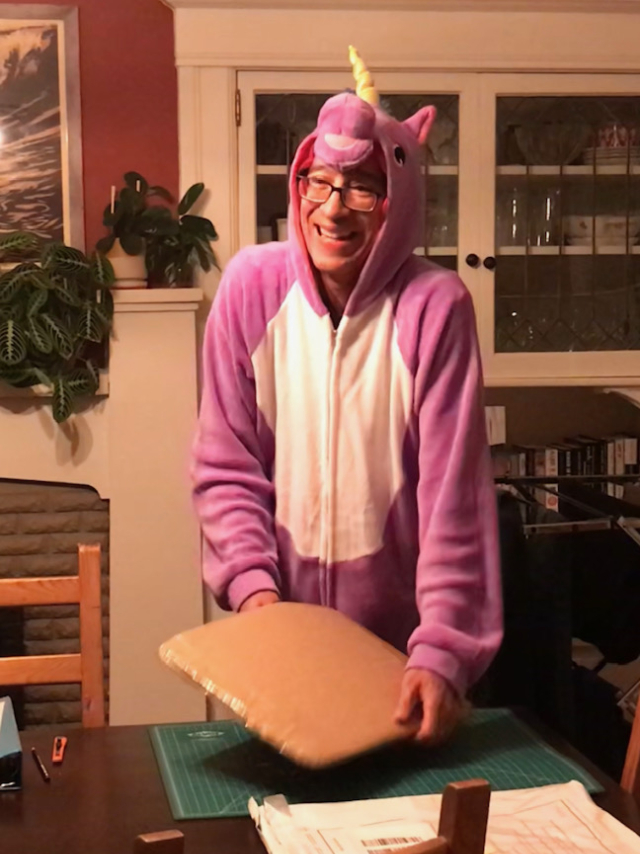
Unexpected Unicorn Unboxing Read More »
WELL.
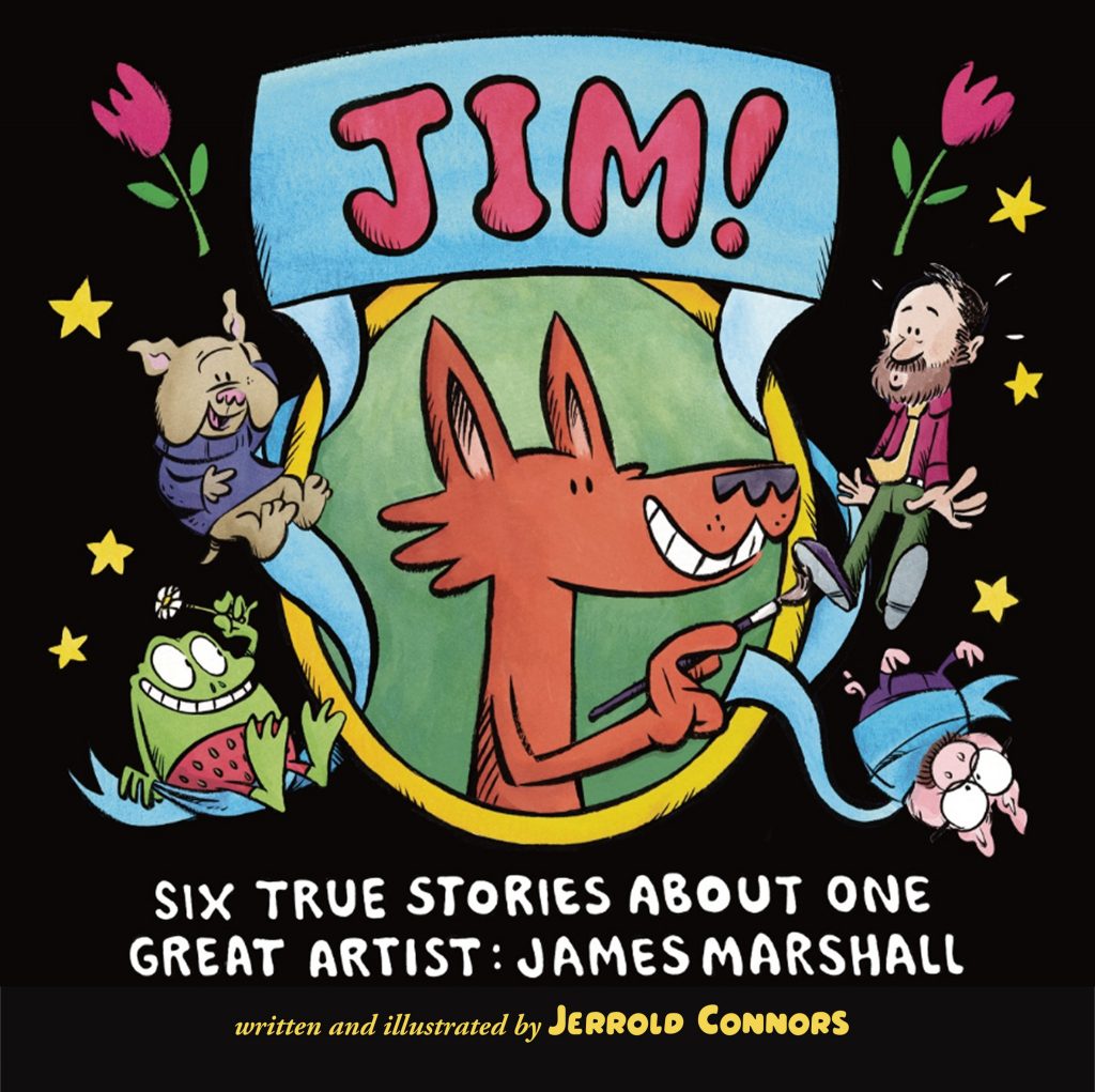
Late last year I asked Betsy Bird and Travis Jonker if they would like to do a joint cover reveal on their respective blogs over on the School Library Journal website. Heroes of children’s literature that they are, they agreed. Thanksgiving came and went, as did Christmas, then New Years, and then this morning…
The cover was revealed on Fuse Eight! This is, technically, a “spotlight” as the cover was already available to be viewed online at various retail sites. The Fuse Eight spotlight comes with an interview, nine questions that I had a lot of fun answering. I hope you take time to read it, Betsy’s sharply focused question anchor this project and sets the stage for JIM! perfectly.
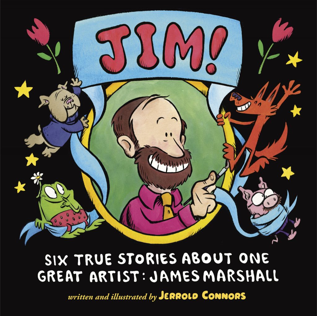
Travis Jonker did me the honor of featuring the case (what you find under a dust jacket) on his blog, 100 Scope Notes. In this case, the case reveal was indeed a true reveal as this illustration isn’t shown in any online retail gallery. Case covers tend to be a surprise and not everyone thinks to look for them. Travis gives attention to this sometimes hidden, often underappreciated art form in his end-of-year award celebration “The Undies“. I’ll look forward to seeing where JIM! lands in 2025’s contest.
But I need to come clean about something. I lied to you, my dear friend. Neither of these reveals, nor those at retails sites, were the true debut of the cover. That happened on Halloween of last year. You see, our house gets about 1,200 trick or treaters and I had the idea that this could be an excellent grassroots marketing opportunity. I mean, how often do you have a guaranteed 2,400 young reader aged eyeballs passing by your front door? At the last minute (almost exactly an hour before our first trick or treaters would usually arrive) I covered a sheet of plywood in paper and began painting.
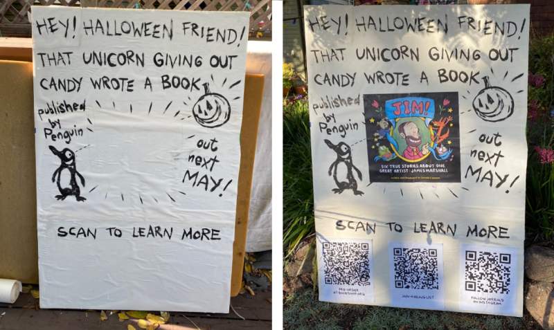
You’ll see a small blank spot above the “scan to learn more” sign. I wasn’t sure what to write. I didn’t want to do the hard sell, that didn’t feel right. Then it hit me:
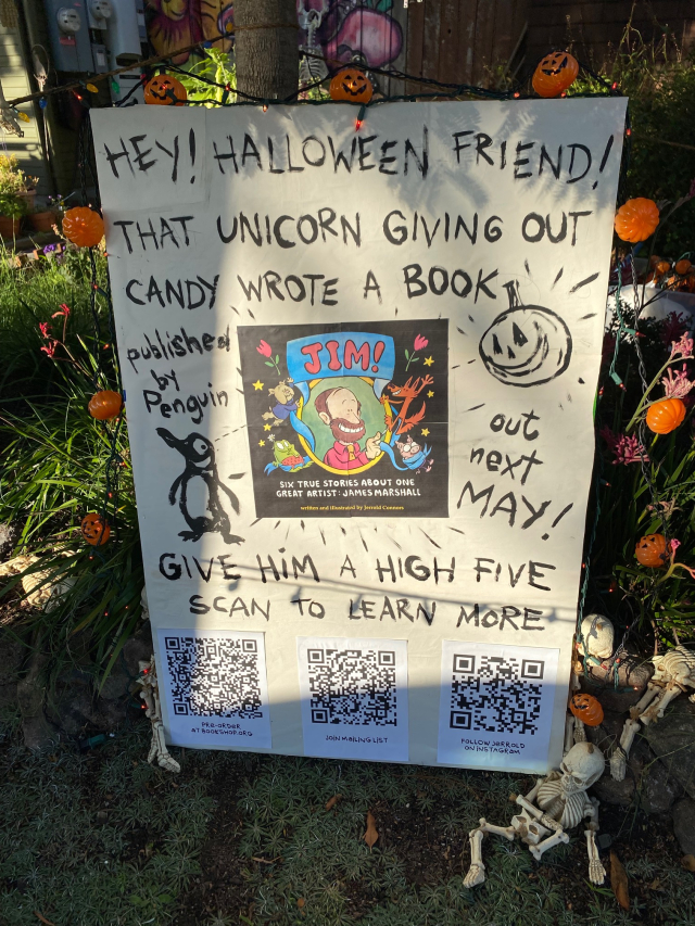
It was a celebration more than a sales pitch and it was centered for kids, exactly where I’m most comfortable. Speaking of comfortable… the “unicorn” in question is me, I bought a fuzzy unicorn onesie at a garage sale in the summer and decided to wear it as my Halloween costume.
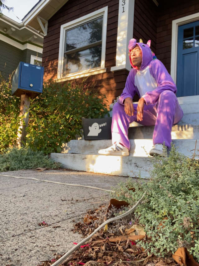
So there you go. I hope you can forgive me for the trickery.
Once more, a big thank you to Betsy and Travis for featuring me on their blogs and making the cover reveal available to the broader public. I am very grateful to them and to everyone sharing their enthusiasm for the book. Exciting times ahead!
Listening to:
Cover Confessional Read More »
I was supposed to be writing a treatise on sasquatch urine but I started painting some color studies this afternoon and got carried away well into the evening. No regrets. Between coloring these and another half dozen pages, I think I’ve unlocked something in my usually trepidatious approach to watercolor.
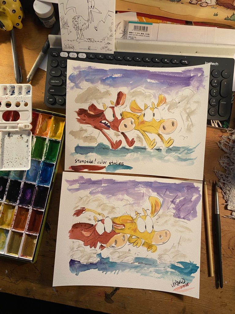
A good feeling. Let’s see where these cows lead us.
STAMPEDE! Color Studies Read More »
One of my favorite working cartoonists is Lucie Ebrey, who I first learned of via her daily comic diary Muggy Ebes. Her linework in that comic is fantastic, bold and full of a wild appeal. I think it can be easy to make things look good online but I got to see Lucie’s work in print for the first time at the 2019 Toronto Comics Art Festival where I scored a copy of Werewolf Social Club and holy mackerel…

Lucie is a tremendously talented inker. Check out the inscription:
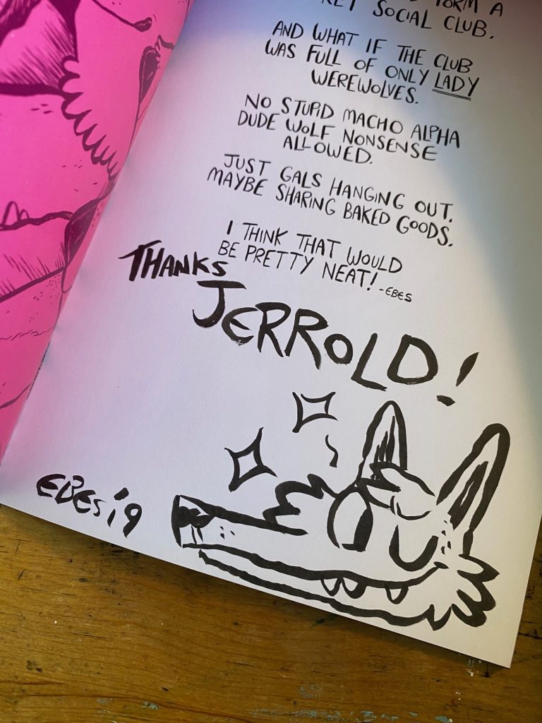
That’s no mere doodle. It’s a perfect drawing, packed with texture and life. I love it. Clearly I’m a fan so it should be no surprise one of the books I looked forward to most last year was Lucie’s Cowgirls & Dinosaurs: Big Trouble in Little Spittle.
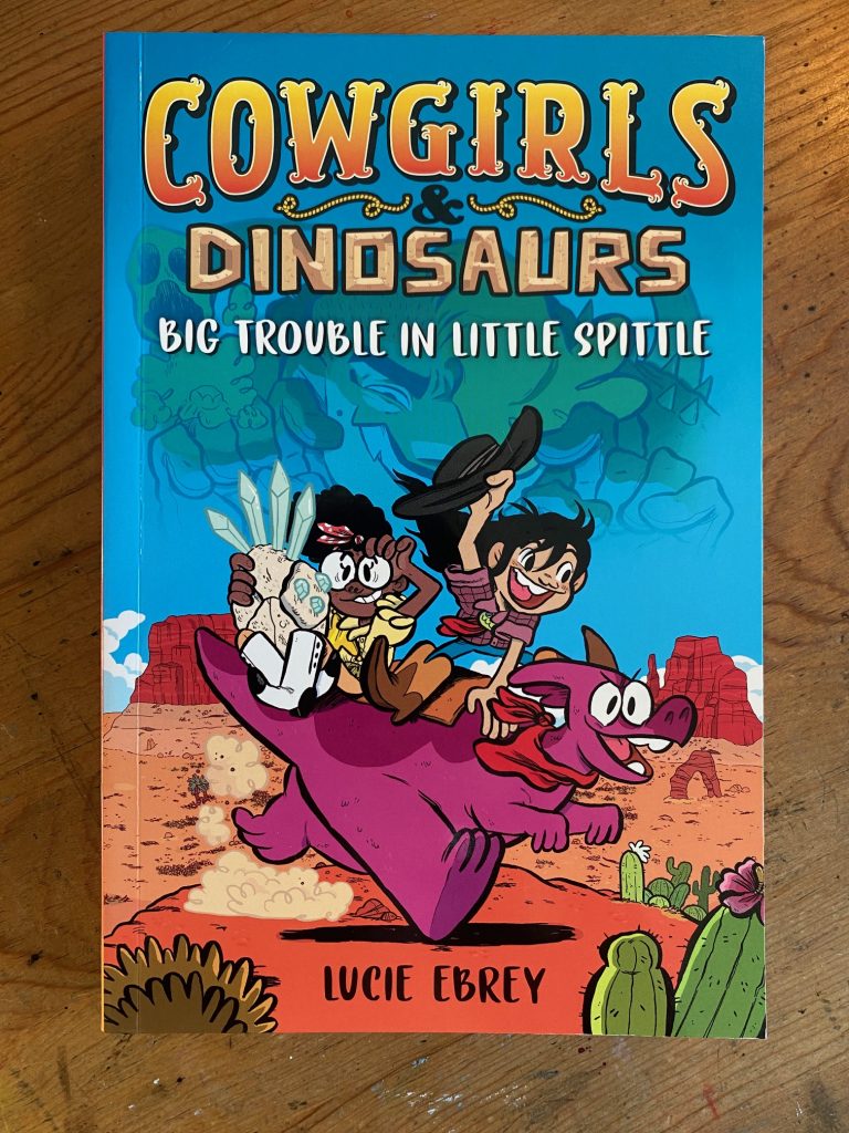
I love so much about this book, the character design:
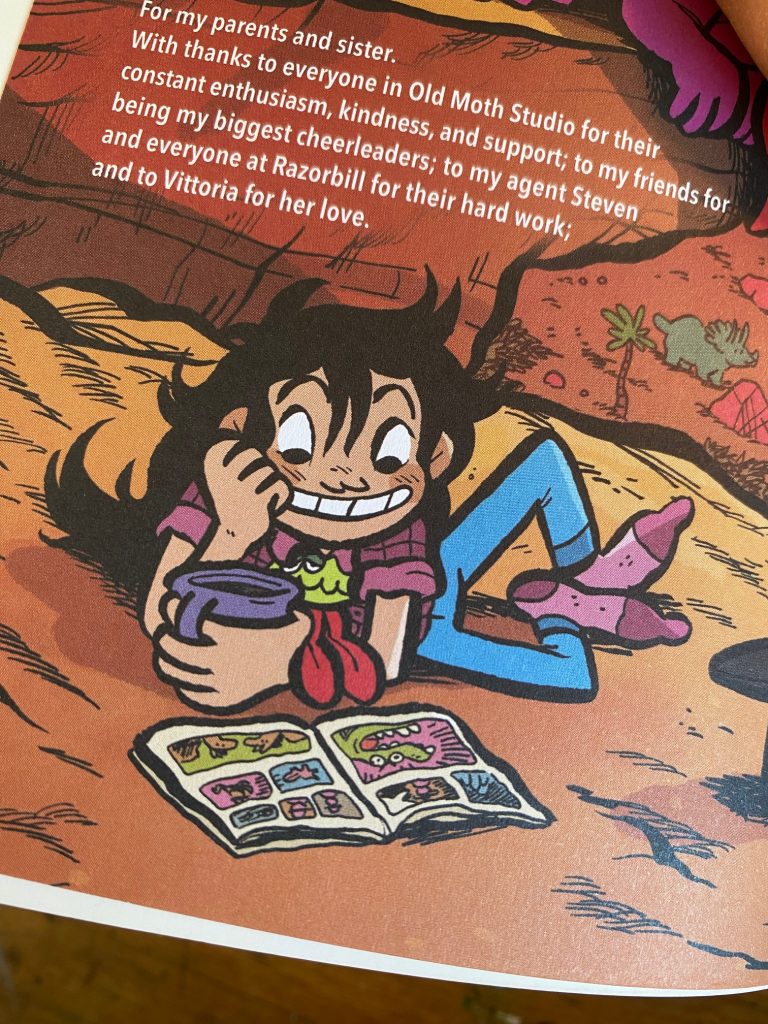
Rootbeer, the faithful dinosaur companion (and the character names in general):
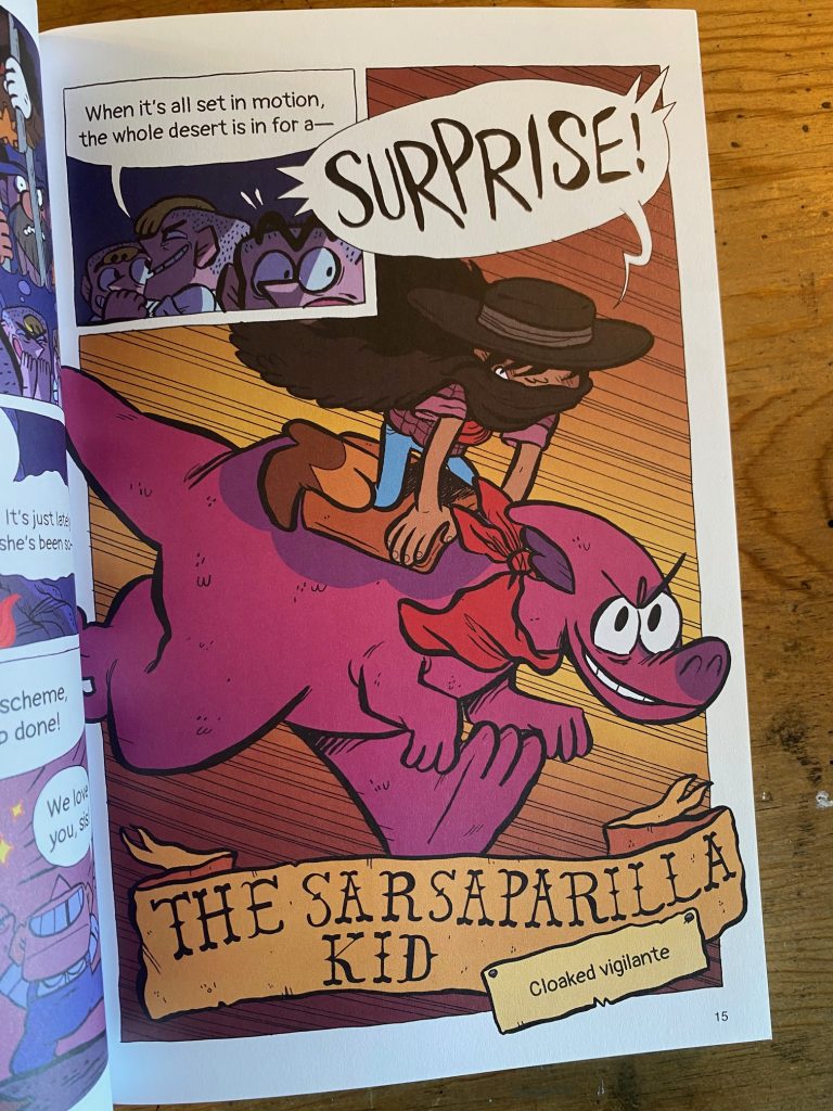
The (smeck) romance!
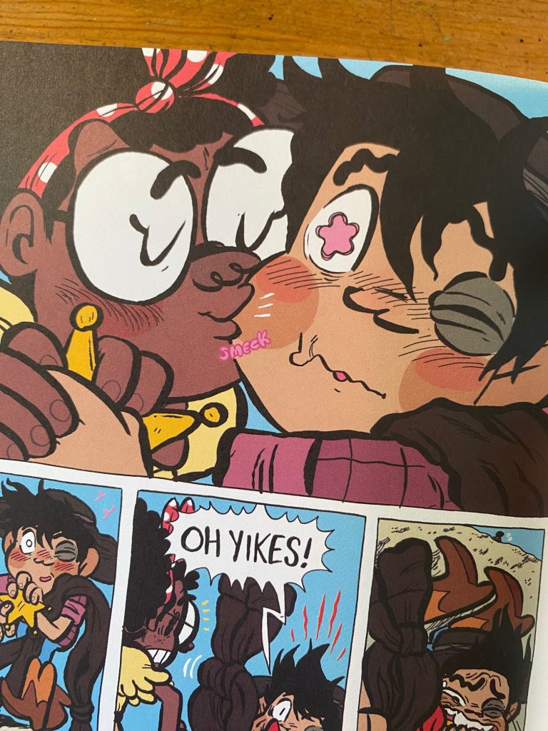
The villain’s rollercoaster of a redemption/non-redemption arc:
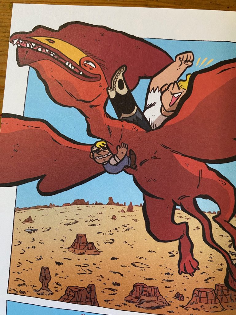
There’s so much good stuff in here. If I had any wish, it might be that the book was printed in the larger European BD format but at 284 pages, the story would probably have had to have been broken up into multiple volumes. Still, the “bio “about the cartoonist” page from inside the Werewolf zine gives us a hint at how good Lucie’s art looks full scale.
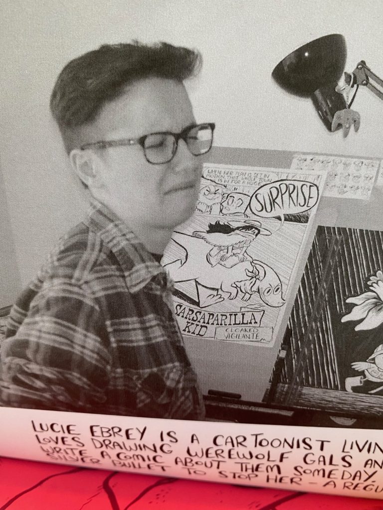
Maybe worth noting: the bio on that page says “Lucie Ebrey is a cartoonist living in Bristol”. Cowgirls & Dinosaurs has a lot of old West lingo and coming from a British cartoonist, the dialogue might be expected to sound like that scene at the end of A Fish Called Wanda where John Cleese mocks Kevin Kline, but it doesn’t. The writing is joyfully raucous but not gratuitously “Y’all better git if’n you know what’s good fer ya.”
Okay, one final appreciation. If Jeff Smith’s Bone is Walt Kelly’s Pogo meets Lord of the Rings, then Lucie Ebrey’s Cowgirls & Dinosaurs is Jack Kent’s King Aroo meets Thelma and Louise.
Oh yeah, the book is colored by Boya Sun and his work is excellent.
Appreciation: Cowgirls & Dinosaurs: Big Trouble in Little Spittle Read More »
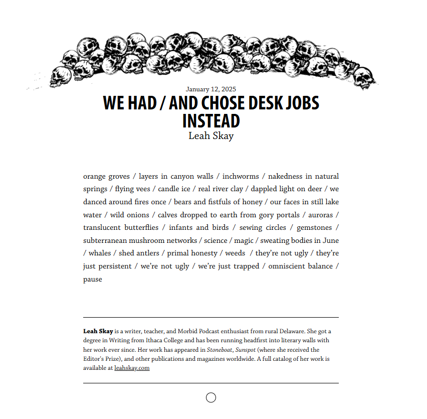
I’m starting to wonder if the old internet really is dead or if I’ve just been too distracted by my phone to realize that there’s still people out there making sites “just ‘cuz”. Sites like HAD. Stumbled across it today and saw this poem I liked.
Found a New Site Today Read More »
My friend, writer Jess Yoon, posted this to Instagram yesterday.
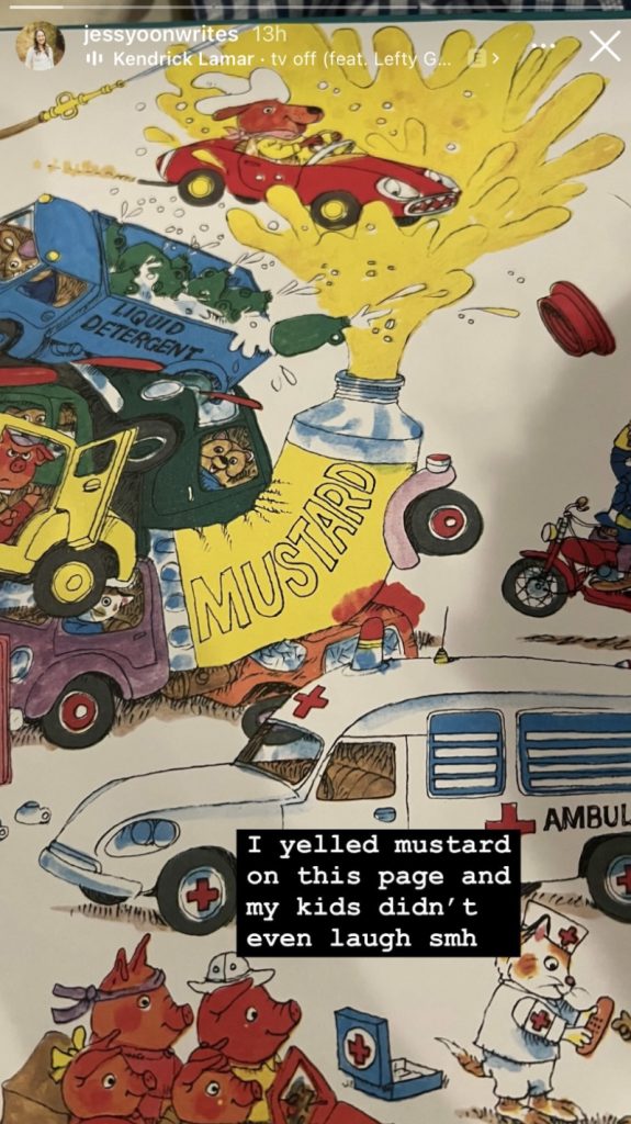
Jess’ son is a whip-smart critic and despite the fact that I’ve been on the receiving end of one of his stinging appraisals, and that Jess herself is an excellent writer and good friend, I didn’t commiserate with her over this brutal take down of her Richard Scarry reading. Instead I replied to Jess’ post with a sassy “That’s not what’s funny about this page!”
My comment was, like most my comments, off the cuff but I know myself well enough to know that even my most random comments are based somewhere in truth. Thus, there must be a part of this scene (the climax of Richard Scarry’s automobile epic Cars and Trucks and Things That Go) that is funnier than all the others. Take a moment to appreciate this illustration, it is a Busytown tour de force. It’s simultaneously chaotic and perfectly balanced. It’s frenetic, but not frantic. And it’s funny.
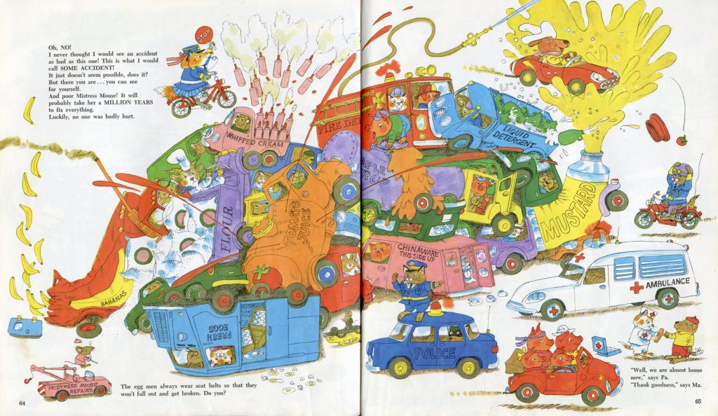
I’ll tell you now that I’m not going to do one of those “the whole is greater than the sum of its parts” cop-outs. We’re digging in and finding what single element is funniest part of this picture. I’ve narrowed it down to a few key pieces. Let’s start with:
PIG VERSUS SYRUP
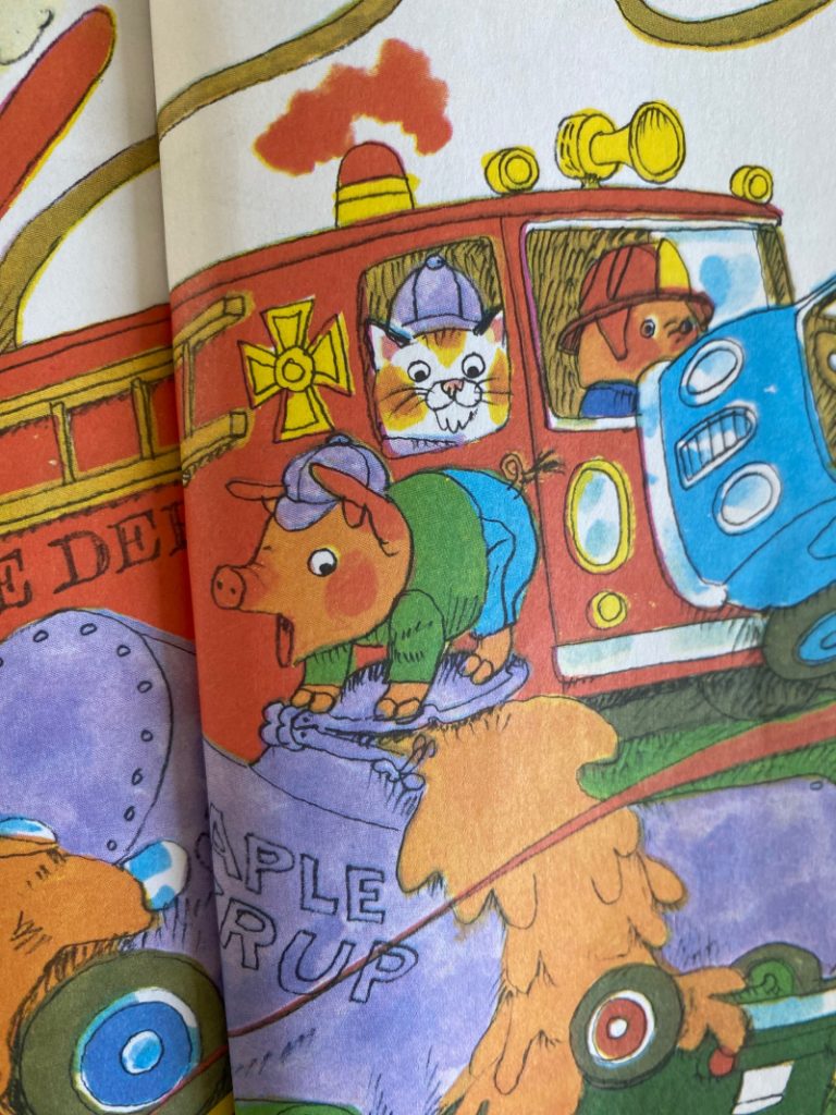
Near the center top of the pile-up we have a pig valiantly trying to re-cork his maple syrup tanker. The expression on the pig’s face is perfect and I like that he’s pushing with his hands and feet. Still, I think it would be funnier if he was jumping up and down. And the maple syrup itself looks to have the viscosity of molasses so that’s making me think the pig should be covered in the stuff. Also, what if the characters in the car beneath were holding out a stack of pancakes? Too many missed opportunities. 4/10
WE ARE THE EGGMEN, GOO GOO GA JOOB
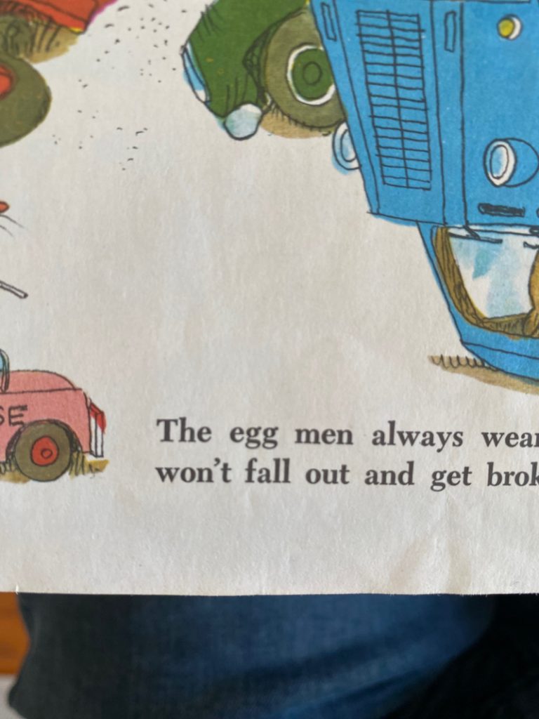
It’s easy to take Scarry’s words for granted but the phrase “egg men” is wonderfully delightful. It’s fun to think about delivery people dropping off eggs by the dozen at doors around town, but we’re snapped out of that reverie by the text which veers swiftly into seatbelt safety. 5/10
CAUTION: FALLING TOMATO
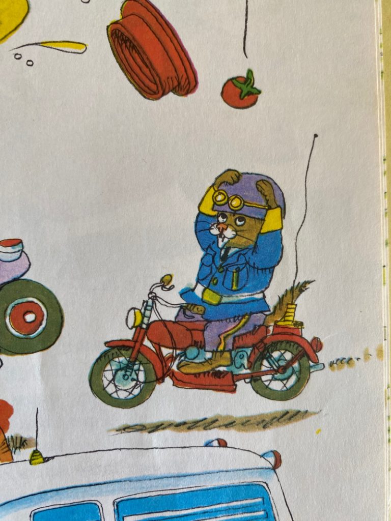
This gag of the motorcycle cop being worried about a single tomato falling on his head when there is a multi-vehicle pile-up just a few feet ahead of him is very funny. It’s subtle, though, and I have to admit the only traffic enforcement personality I’m invested is Officer Flossie. 6/10
YES, WE HAVE NO BANANAS
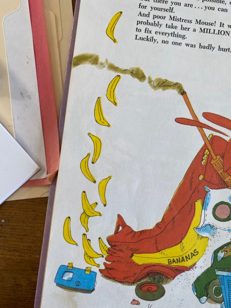
Jess was right to center on a fountain of food being the foremost farce, but she might have focused on this banana geyser. Bananas are always funny and you can say the word in any number of funny ways. This element could have ranked higher, but its placement on the far left lets it get overshadowed by the rest of the scene. And I’m realizing now that if the falling tomato on the far right was a BANANA… hoo boy, this could’ve been the funniest gag on the page. As it is… 7/10
WE’RE GOING TO NEED A BIGGER TRUCK
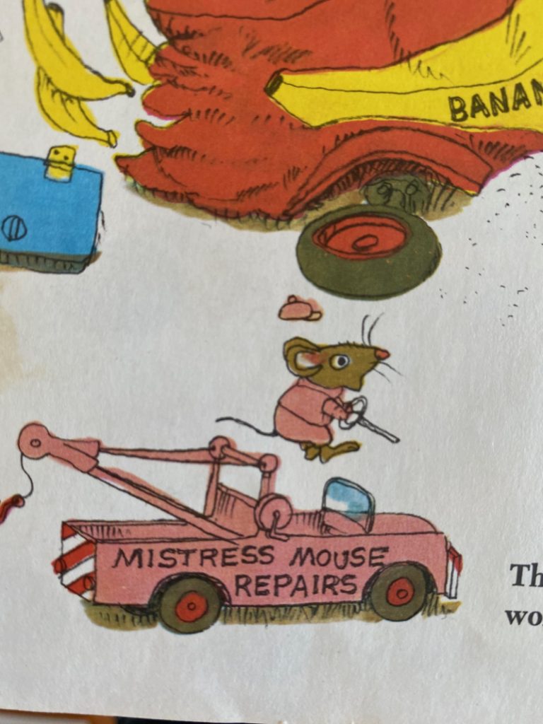
Mistress Mouse has the perfect reaction to the scale of this accident. You pair this with the “It will probably take her a MILLION YEARS to fix everything” line at the top of the page and you have a solid 8/10.
WE’RE GOING TO NEED A BIGGER BAND-AID
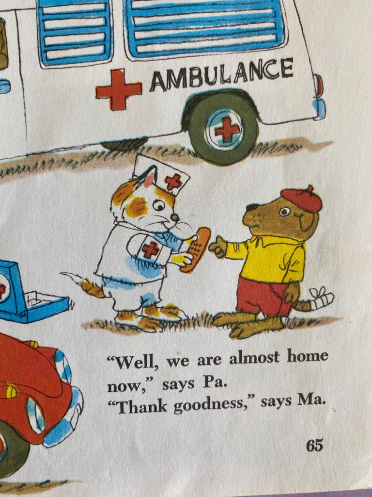
Look at the size of that band-aid! 8.5/10
FLOSSIE TAKES FLIGHT
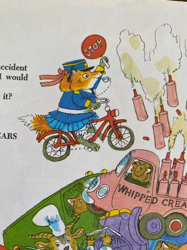
Flossie’s pursuit of Dingo Dog throughout this book has been consistently funny and her doing an Evel Knievel leap over this mountain of smashed trucks is exactly the climax this story deserves. Flossie’s expression (not to mention her hat) remains surprisingly impassive which is the joke, but I feel like wouldn’t have minded seeing a bit more fire in her eyes. That moment’s saved, rightfully, for the last page when Flossie finally catches up with Dingo but that sacrifice leaves this at 9/10.
Which brings us to…
…
The fact that I was just made aware I missed the joke entirely. You see, I was scrolling with the sound off and completely missed the audio Jess had added to her story.

Jess yelling “MUSTARRRRRRRD!” is a good 10/10 but her kids’ lukewarm reaction to it is an 11. My cluelessness and the fact that I wrote a whole dang post about this when I’m actually on deadline? Tragic. It’s not the slightest bit funny.
SMDH.
What’s So Funny About Mustard? Read More »
I posted over on Instagram two pictures with a small story.
My kids found an injured monarch butterfly on the sidewalk. We picked it up carefully and moved it about a block down the street to where we knew a neighbor kept a patch of milkweed. Whether the butterfly would have preferred to be laid to rest at a honeysuckle bush, we’ll never know, but we noticed a few caterpillars in the same garden and that felt right.
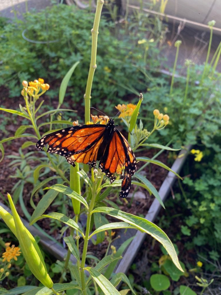
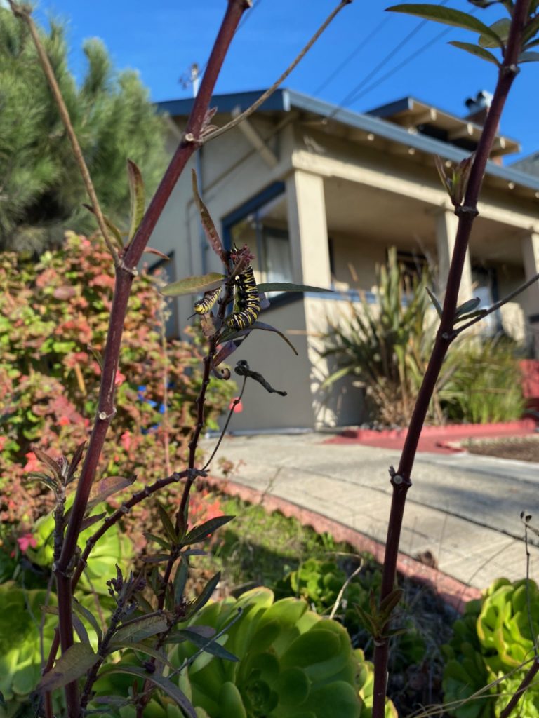
The post was offered in response to the Los Angeles fires which are heartbreaking and familiar.

The fires we had in Northern California back in 2020 were a bit north of us. Far enough that we weren’t scared, but close enough that we could smell it. Our skies were orange and there was enough ash in the air that outdoor recess was cancelled at our local schools and parents, as they always do in these moments, turned to the Mister Rogers quote “Look for the helpers”.
You’ll find few people who admire Mister Rogers as much as I do (I’ve watched the YouTube crayon video about a million times and I remember exactly where I was when I learned he had died) but I’m starting to feel like that quote is being overused. It does work, when you’re feeling overwhelmed, to have a point of focus. And knowing that there are people looking out for each other is always a good feeling. Still, I’m thinking the quote needs to change to “Be the helper.”
Three years before that picture above was taken, California had another wildfire rip through a city. One family’s experience was chronicled by cartoonist Brian Fies here.
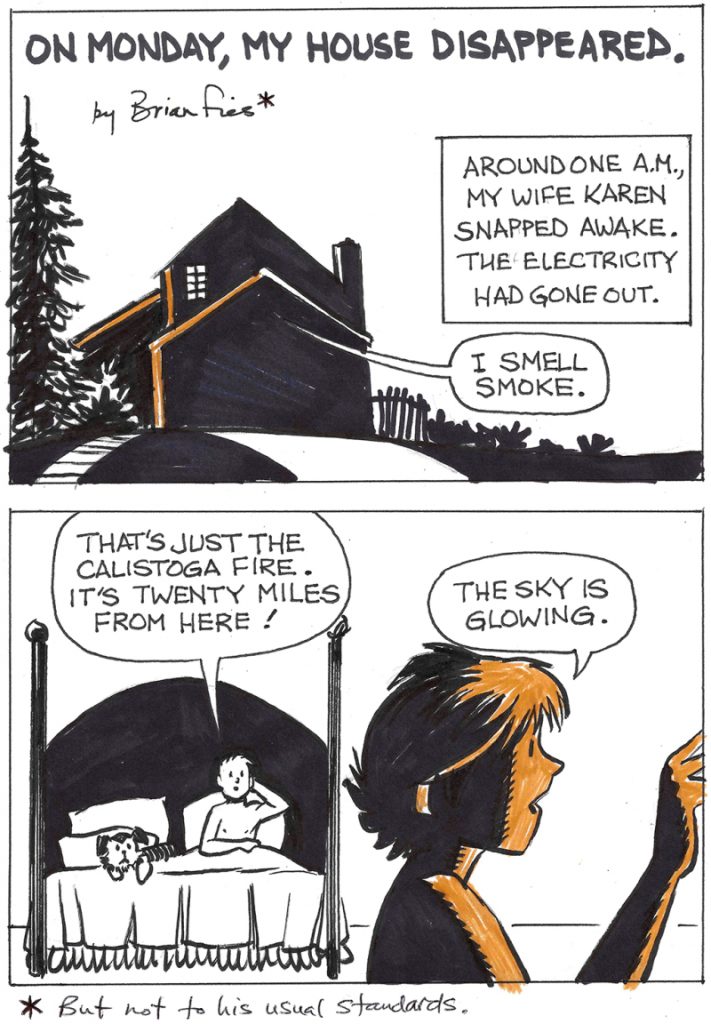
Looking for “the helpers” time after time after time is a bit numbing. And when I say it’s time to be the helper I don’t mean (necessarily) donating to affected families or voting (of course you should vote) to increase funding to your local fire departments. I mean it’s time to begin the work of dismantling the organizations that make these wildfires inevitable, common, and frequent. Everything is, after all, all connected.
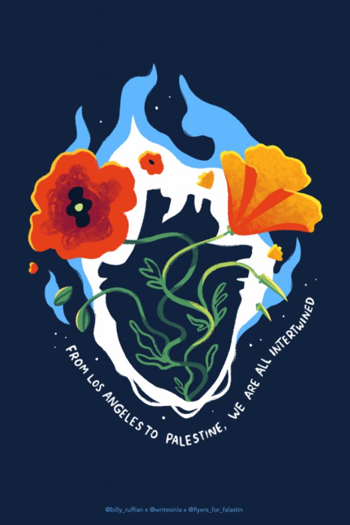
I had two feelings behind my butterfly post. The first was to offer a reminder that there are opportunities for small acts of kindness all around us. The second was just sort of a vague hope that we are in a moment of metamorphosis and that we’ll come out of our cocoons with stronger, more beautiful wings.
Listening to:
The Butterfly Effect Read More »
At the risk of stealing a bit from Fuse Eight, here’s two oddly similar books*, THE CAT WAY (October 8, 2024) and I KNOW HOW TO DRAW AN OWL (October 29, 2024). 2025 may be the year of the rhinoceros, but 2024 was apparently the year of the red flannel and black jeans clad nocturnal naturalist.
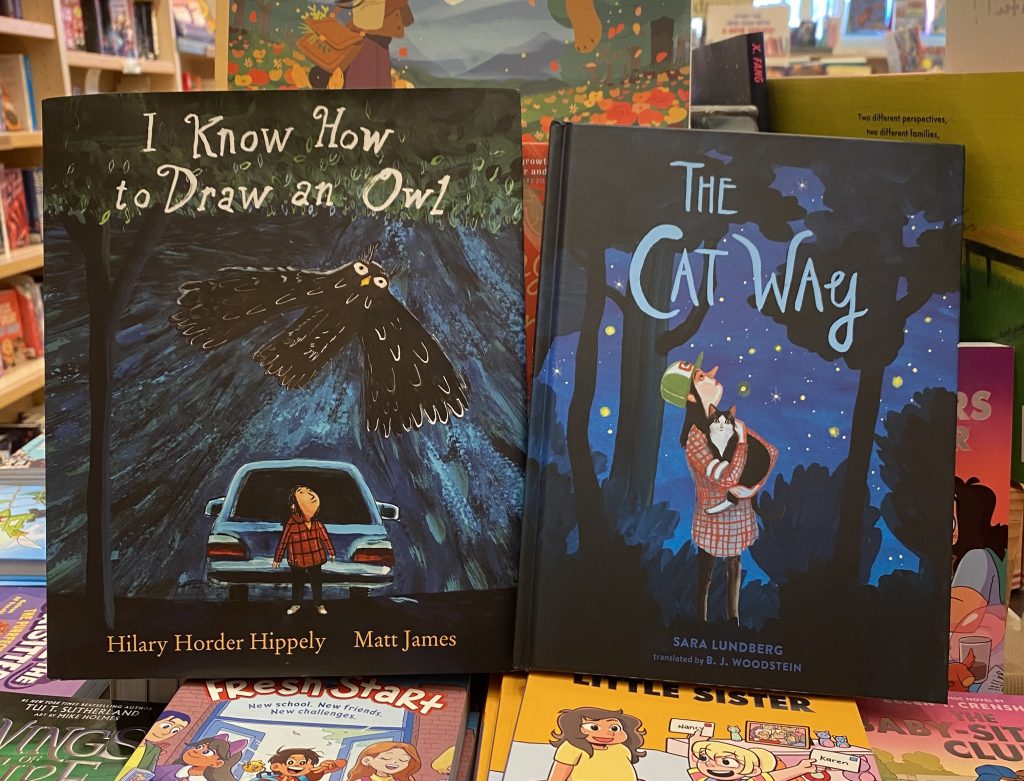
*superficially, anyway. Each story is beautiful and beautifully unique.
The Owl and the Pussycat Read More »