When Julie Danielson and I were researching the for-grown-ups version of the James Marshall, she coordinated a call for us with Sheldon Fogelman, Jim’s agent. We hopped on a conference line and had a casual chat about his memories of working with Jim. If we had any secret hopes for good dirt (I did have those hopes), they were quickly dashed because “Shelly” (as he asked us to call him) spoke with nothing but the highest respect for his old client. At one point Shelly said “Jim was one of the two nicest people I ever worked with in publishing.” I asked him who the other was and he said “Jerry Pinkney”.
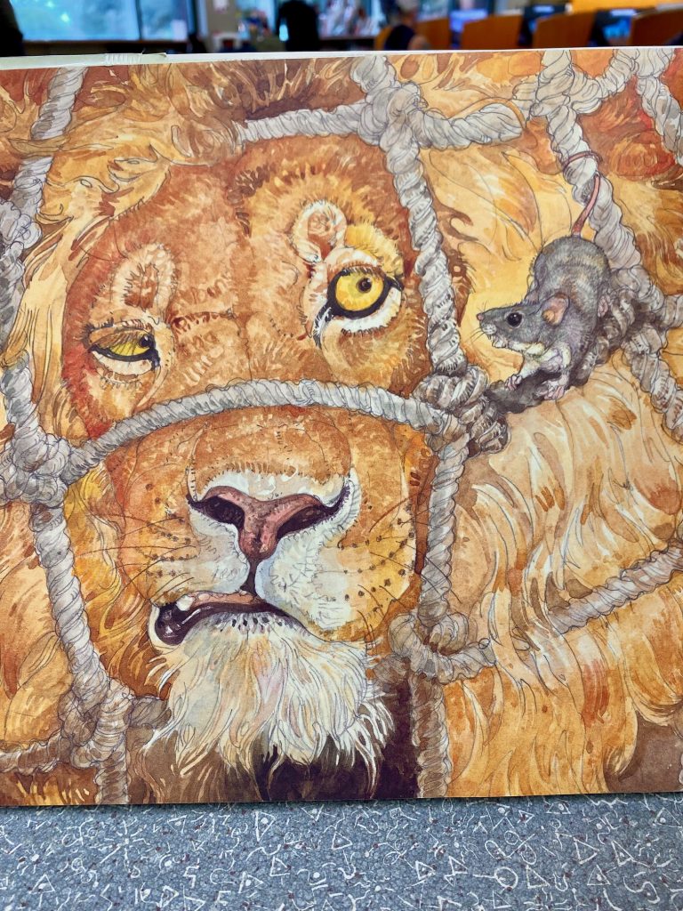
I’m on the road right now and passing some time at a public library. I was hoping to read Pinkney’ autobiography JUST JERRY but it’s checked out. In place of that, I’m reacquainting myself with his various takes on Aesop’s fables and am (as always) amazed at how much the warmth and humor in these just jump off the page. My feeling is that Shelly must have been playing it cool, there’s no way the person who drew and painted this wasn’t one of the kindest humans on the planet.
The Lion and the Mouse (2009)
I was thinking of doing a post about the fable collections of done by Arnold Lobel and James Marshall in sort of a head-to-head “who did it better” type thing. (For some reason I always think of Aesop in the spring). Not to spoil things, but I see now I’m going to have to widen the bracket. ‘Til March, my friends.
For some reason, whenever I think of picture books from my early school days it’s always this one that pops into my mind.
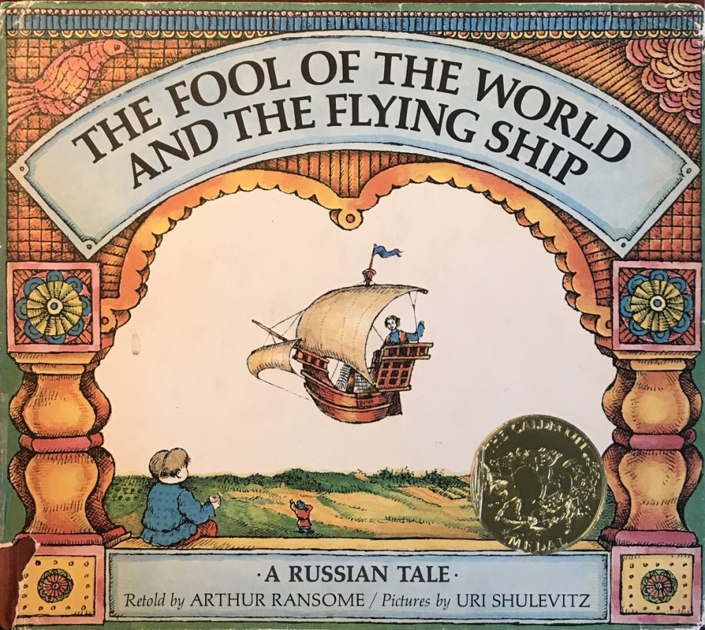
This is despite the fact that to this day I haven’t read it (grimace face). That’s not intended as any kind of insult, it would have been nearly impossible for anyone to compete with Sylvester and the Magic Pebble or Herman the Helper, but the fact is FOOL OF THE WORLD is just one of “those” books. Landmark.
A Shulevitz book I have read, for years off and on, is his Writing with Pictures: How to Write and Illustrate Children’s Books. I used to get it from the Vancouver Public Library and flip through it, mostly enjoying it for all the illustrations (from popular artists of the time, including Steig and Aruego, as well as Shulevitz himself). These days, I like it for two main reasons: first, it’s full of really good advice on how to be a mindful creator.
Draw Boldly: Think, meditate, or debate in your mind as long as you wish on what and how you are going to draw,but once you take the plunge, draw resolutely.
I really like that line. He also has a good one about picture books being like theater. A common enough point of view, but Shulevitz says it in his simultaneously eloquent and matter-of-fact way.
Second, WRITING WITH PICTURES is a product of the era of when illustrators were ‘tradespeople’. There’s a big section on color separations and how to prepare your art for maximum fidelity. So much of this process is antiquated, but the book reminds us how much science and math used to go into art making. It’s a great historical record.
In follow-up to my process post, here’s a list (downloaded from Twitter a few years back) of Adobe software alternatives separated by category (photo, vector, prepress, layout, animation etc). I can vouch for Clip Studio Paint (in place of Photoshop), Affinity Publisher (in place of InDesign), and Olive (in place of Premiere). Making the switch to Clip Studio Paint and Affinity Publisher was pretty smooth. Olive had a much steeper learning curve but how often do you get to learn new things?
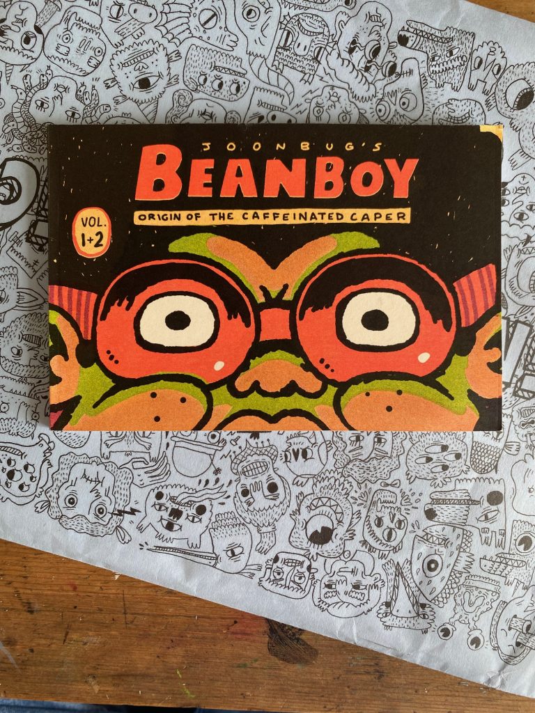
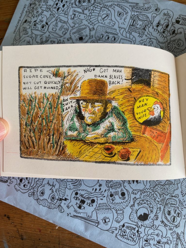
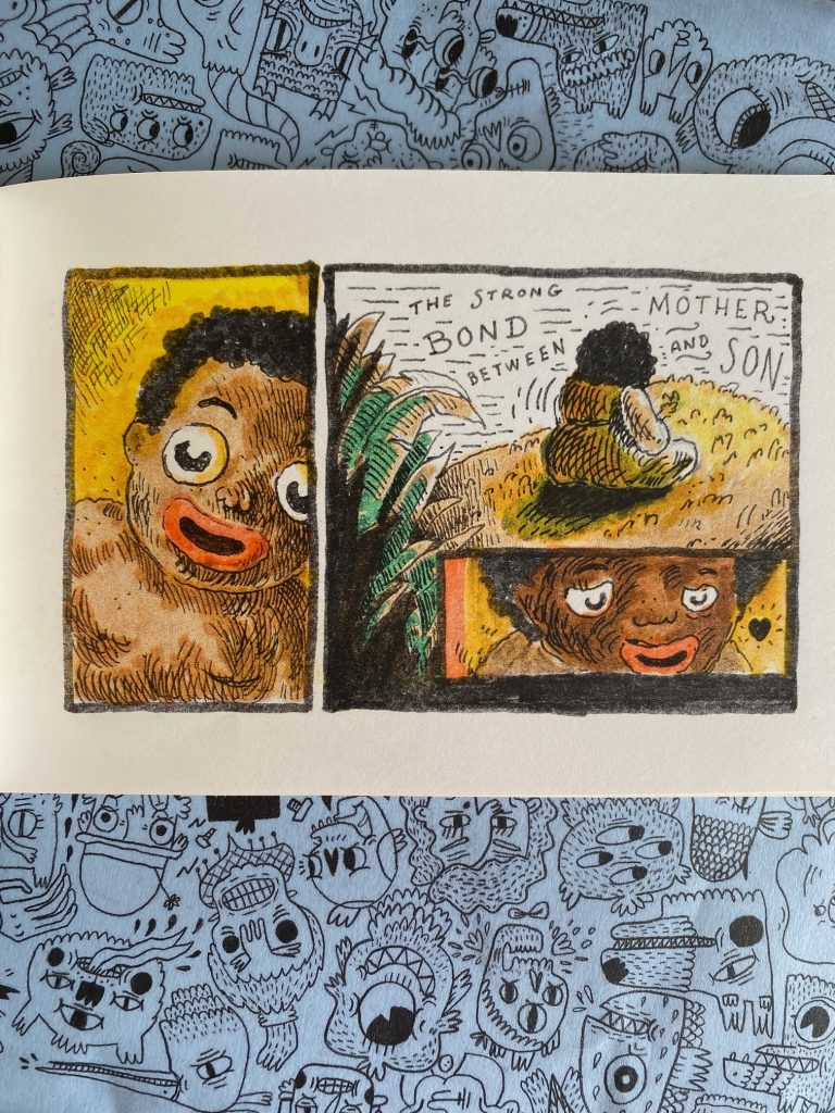
As you probably noticed from the hashtag on this post (#ZineMonday), I’ve been taking a day a week to share some of my favorite and most recently acquired zines. This blog is mostly about picture books but really it’s about my inspirations. I find a lot of inspiration in zines but I have to say, they’re not always the most kid-friendly. This week’s zine* in particular is intended for mature audiences.
What I’m finding inspiring here is the technique. It’s risograph but it looks like something between a watercolor and marker.
The line drawings underneath this color remind me very strongly of Joann Sfar’s work. There’s a raw energy in this comic that I really admire.
Beanboy’s original’s story feels like a Creole folktale viewed through a sort of 1920s comic strip lens. I don’t know enough about the main character or the artist’s background to know how much of the story is drawn from life but the fact the book is dedicated to the artist’s mother makes it feels like the subject and themes are all very personal.
The book is small, measuring something like 2.5 by 4 inches, which seems to suit it perfectly.
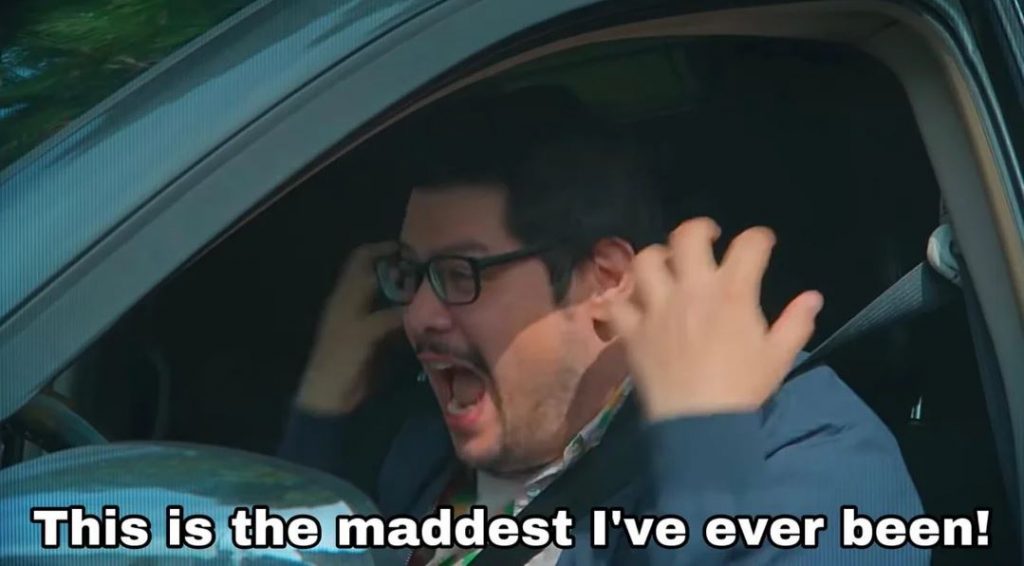
Alright. You’ve met Emotional Jerrold. Get ready to meet Angry Jerrold.
You ready?
JIM! received a review in which my illustrations were described as “digitally enhanced ink and watercolor artwork” and when I tell you I bristled at that wording…
Yeah. I was livid. To me, the implication is that I passed an AI filter over my drawings and (deep breath, Jerrold) even typing that now brings a heavy, throbbing pressure to my neck. I can actually feel my blood pressure rising and in general I have been in a terribly distracted state since I read this review two weeks ago. I want to deal with my anger, so with your indulgence, I’m going to try and figure out just why it is I am as upset as I am. Let’s dig in!
To begin, I will own the fact that to some degree I brought this on myself. Included on the copyright page of JIM! is an art note. It reads:
The illustrations for this book were drawn with a Winsor and Newton Series 7 Kolinsky sable brush and colored with Kuretake Gansai Tambi watercolors. Digital enhancements were added in Procreate with the Adilson Farias watercolor brush set.
First of all, why include this? Well, it’s a convention I enjoy seeing in picture books. As a note, it’s small and unobtrusive enough that I don’t think it spoils any storytelling magic, but to an art nerd this little extra information adds a level of appreciation otherwise missing. In writing mine, I wanted to let the reader in on what I felt are the most important parts of my process. It’s simplified, of course, but a full description of these steps would be:
INK
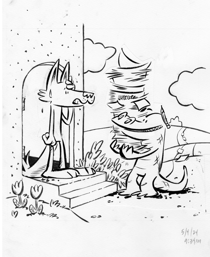
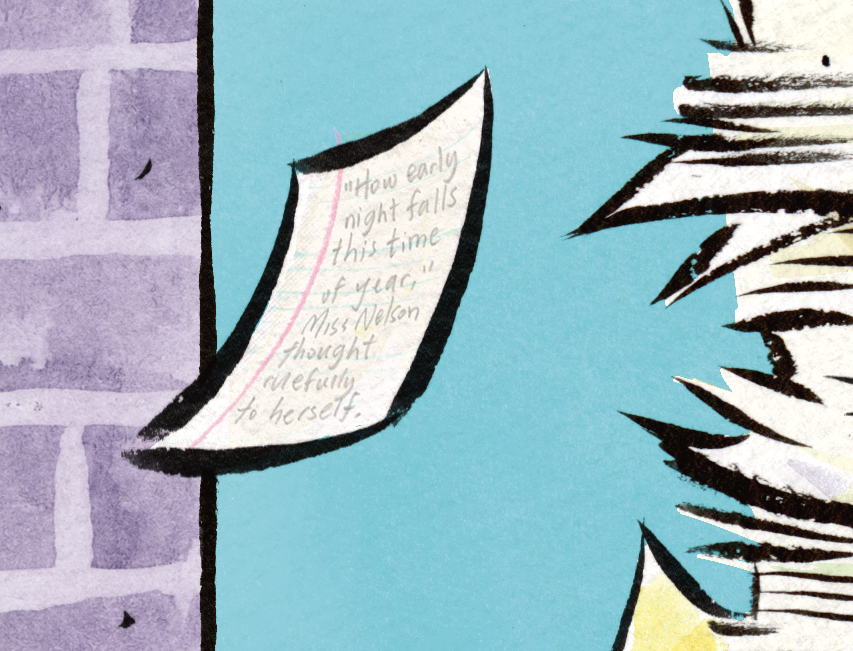
I think my greatest strength in illustration is my inking. I’m confident in my linework and have worked hard at becoming so. Here’s a piece from the first chapter of JIM! where Harry Allard is visiting Jim’s home to drop off his manuscript for Miss Nelson Is Missing!
One of the greatest challenges in inking is finding that place where you are using your rough sketch as a guide without deliberately tracing each and every pencil line—at its best, the ink drawing should have a life of its own. Sometimes, there will be a part of the drawing that didn’t quite, to my eye, meet that criteria. In those cases, I’d ink that piece on its own, cut it out and paste it to the illustration (you can see this with Jim’s head and with Harry’s entire body). It’s important to me to get the ink as final as possible, which is to say, I don’t like cutting and pasting on the computer. It really bothers me, for some reason, to have two “final” versions of an ink drawing. It’s silly and it’s immaterial, but I’ve always felt that way.
COLOR
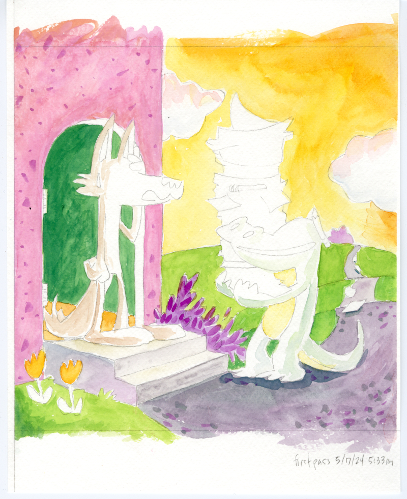
I wish I had the confidence in watercolors that I do in inking, but I don’t. I am too hesitant (and, paradoxically, too impatient) to be a good watercolorist. I admire people who watercolor directly over their ink drawings. I don’t trust I won’t ruin the ink drawing so I trace the lines onto watercolor paper and then color it there.
A saving grace for this project was my late-in-the-game discovery of Kuretake Gansai Tambi watercolors. Watercolors, used properly, require a painting, drying, overpainting, drying, overpainting again technique that brings out the luminosity of the media. BUT, as I mentioned above, I’m way too impatient for all that. Gansai Tambi watercolors are somewhat like gouache (in that they are much thicker and don’t require so much layering), but they retain that watercolor “look”. They felt, to me, to be the perfect media to have a painterly quality but be reminiscent of Marshall’s own watercolor work.
As a side note, Marshall himself usually colored directly onto his ink drawings, though not always. For Nosey Mrs. Rat, he colored the back sides of his ink drawings. A very peculiar technique, unique, I think, to this one book. I’ll talk more about this on a future post.
from NOSEY MRS. RAT, photo from UCONN archives
MERGING THE TWO (not mentioned)
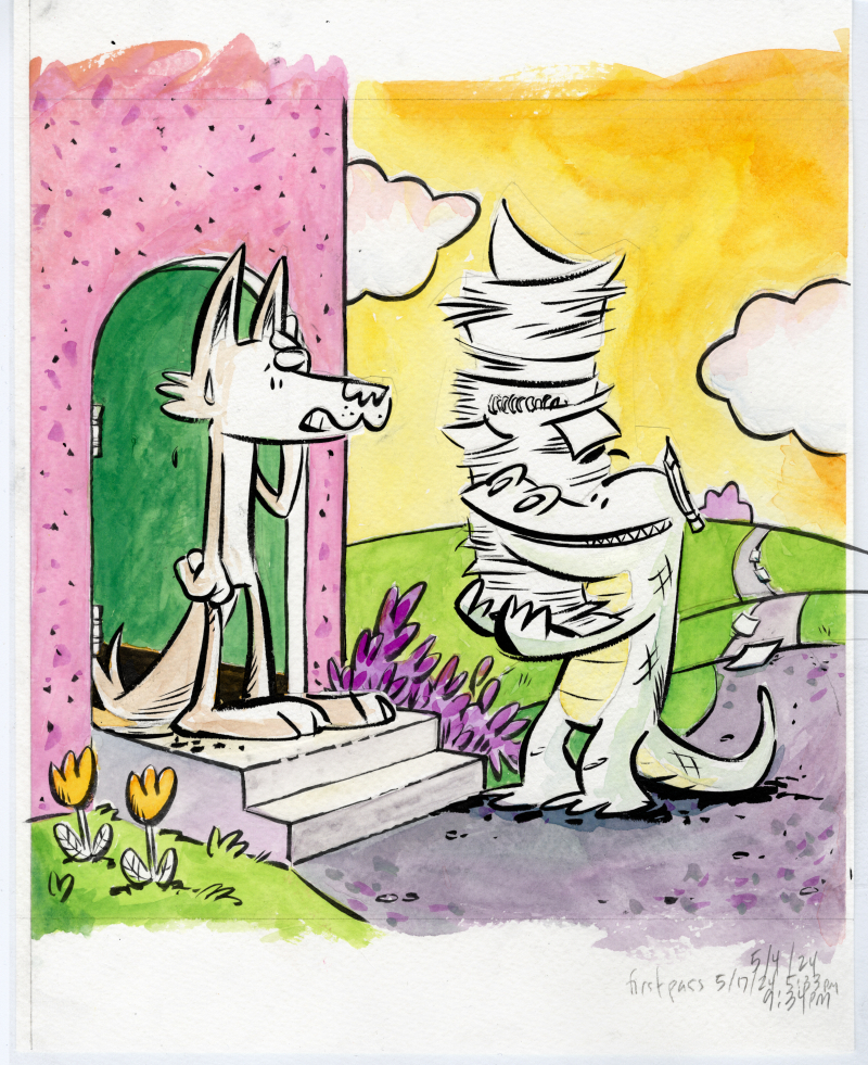
A step I left out of my pub-page art process blurb was “The ink and color drawings were scanned and composited in Clip Studio Paint”. I actually wanted to include this to throw a shout out to Clip Studio Paint, an app I adopted after abandoning PhotoShop and all Adobe products after Adobe’s acceptance of AI scraping. I didn’t list it, though, because it felt a bit too obvious (also, would I start listing every single step? drawing scanned with an Epson Expression 13000XL scanner, files uploaded to Drive etc etc etc). Anyway, here’s how they look merged:
I will say that Clip Studio Paint did come in clutch, though, because I was working with a lot of layers. If you notice that Jim and Harry aren’t colored (besides having a slight indications of shadows), that’s because I colored them separately. Elements that required special attention (eg. color consistency in the main characters) were usually colored on their own pieces of paper, scanned and imported individually into their own layers.
STARTING OVER (also not mentioned)
There’s a trick employed in animation where scenes are animated out of sequence so that if the art style morphs over time, that distortion becomes less apparent. It’s sort of insurance against having the main character slowly grow a foot taller between the start and the end of the movie. The scene of Harry at Jim’s door was the second illustration I did for JIM! and towards the end of the project, it became apparent I needed to redraw it. I hesitate to share it here because I want to keep it a surprise for the book’s release. However, I’m mentioning the step because it’s relevant to the next point.
DIGITAL (shudder) ENHANCEMENTS
So, another—and the real—reason I didn’t include Clip Studio Paint in my art process is that as a step, it doesn’t really add anything new to the piece. It’s a merging of two existing drawings and if there was any change (say a clean up of misaligned edges), it would be subtractive. The reason Idid include Procreate as a step was because new elements were added to the drawing at this stage. For example:
That single sheet of falling loose leaf paper… I drew the lines on it in Procreate. There are small elements like this on many (probably all) the illustrations in the book. It might be a spot of blush on a character’s cheek, a shadow under a vase holding a single tulip, or a shine on a medallion. I think I could have called these embellishments instead of enhancements but I do think they add to the art and to the story. In the case of this note, it adds a detail that hints to Harry’s eccentric energy and gives a nod to Harry’s self-published fourth Miss Nelson book (I’m paraphrasing a line from that story, not that anyone would know).
As a step, this provides a set of unifying details across all the illustrations (see the above point about consistency). Could I have drawn these lines on paper and scanned them in? Sure. The writing on that page is. But, fact is, doing it directly in Procreate allowed for some of that spontaneity I described in the first step (eg. not tracing).
PROCESSING ALL OF THIS
Well, the throbbing in my neck has gone down (a little) and it’s apparent to me now why that “digital enhancements” hit me as hard as it did. It’s the erasure of the human element. When you’re in the process of making a book, or at least when I was in the process of making JIM!, you might not be fully aware of just how much work you’re putting into each and every drawing. At the same time, I’m not trying to paint myself (on several separate sheets of cold-press paper with Japanese watercolors) as a tortured artist. Each of these steps, even the most tedious, was a joy and there’s no point subjecting even the most steadfast art lover to a process note that reads:
The illustrations for this book were drawn with a Winsor and Newton Series 7 Kolinsky sable brush and traced with pencil onto three to four separate sheets of Strathmore cold press watercolor paper where they were colored with with Kuretake Gansai Tambi watercolors. The ink and color pieces were composited together in Clip Studio Paint, where any misaligned edges were cleaned up.Finer details and various highlights were drawn in Procreate with the Adilson Farias watercolor brush set.The creator took a lot of naps but nonetheless suffered two crises of confidence where he became bed bound for a total of four hours which may not sound like a lot but is actually a big deal to him. Oh yeah, he also had Covid at one point.
Although, I will admit, that might have been funny.
It’s also clear to me that much of my anger is fueled by the world right now and how the world’s richest, most obnoxious tech bros are constantly in my face insisting I employ AI assistance in every aspect of my life even as they dismantle everything I love, from National Parks to libraries. I’ve spoken out about rejecting AI art and I’ve lamented the disappearance of analog ephemera so to have “digital enhancements” attached to any part of my work, however it was intended, just felt like a particular kick in the teeth.
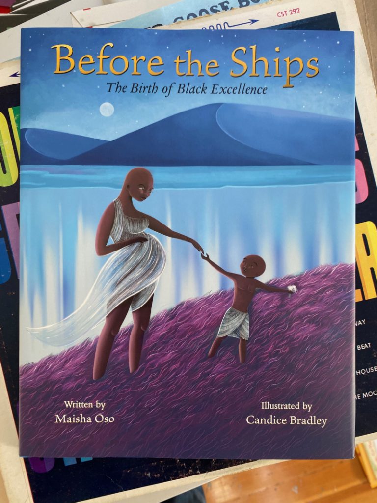
Today I want to give a shout out to my friend Maisha Oso. I met Maisha in the Picture Book Rising Stars program where we were both mentor for the class of 2023. I became a fan of Maisha’s BUSTER THE BULLY and asked Maisha if she’d be willing to write a short piece for my DONUTS FOR EVERYBODY project. Maisha agreed and wrote a PERFECT poem that holds a special place in my book. I was already grateful for her contribution, but in recent months I’ve come to realize how generous Maisha was because the poem she wrote for me must have been composed while juggling of a number of other projects. How do I know? Because Maisha is out here knocking book after book out of the park.
I’m not talking about the art in this post but Candice Bradley captured something really beautiful here.
BEFORE THE SHIPS came out last year and immediately found its place on several “Best of” lists. A quick side note: there are a lot of people out there who are really good at writing book reviews, I’m not sure I’m one of them. I can get lost in the weeds when I’m digging into a book and I tend to overthink my response. In this case, though, I knew what I wanted to say:
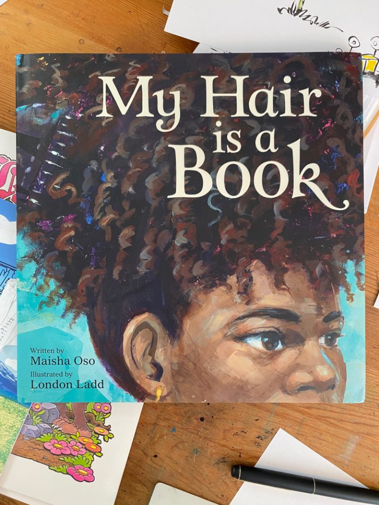
Maisha’s other 2024 release was MY HAIR IS A BOOK. It, too, found its place on Best of lists (the one I’m most jealous of is the New York Public Library’s) and on my desk.
NYPL is way more prestigious and also, probably, a lot tidier.
I’m thinking my way through the review I want to write for MY HAIR IS A BOOK and the one word that keeps coming to mind is BOLD. The writing has a lot of wordplay, and I don’t mean yok-yok punny wordplay, I mean things like double meanings. The title itself tells the analogy at play, MY HAIR IS A BOOK, but within that is the idea that each strand is a story, each twist an event, and each braid a memory. (That last bit brought to mind an animated short, LADY WITH LONG HAIR by Barbara Bakos which is a whole different kind of story and storytelling, but it was nice to be reminded of it.)
There is, too, some amount of joyous wordplay (pick it/picket) and in-jokes (undefeated!) that reads so naturally. None of it is corny (see, I was almost tempted to write “corn-row-y” which is terrible and which proves Maisha is way better at this than I’d ever be) and the rhythm of the entire book is such that even a half-bald goofball who almost said “corn-row-y” can sound good reading it.
But most of all, MOST of all, what I love about MY HAIR IS A BOOK is that the writing was so clearly in Maisha’s voice that it reminded me of the poem she gave me for DONUTS and how lucky I am to count Maisha as a friend and that made me happy.
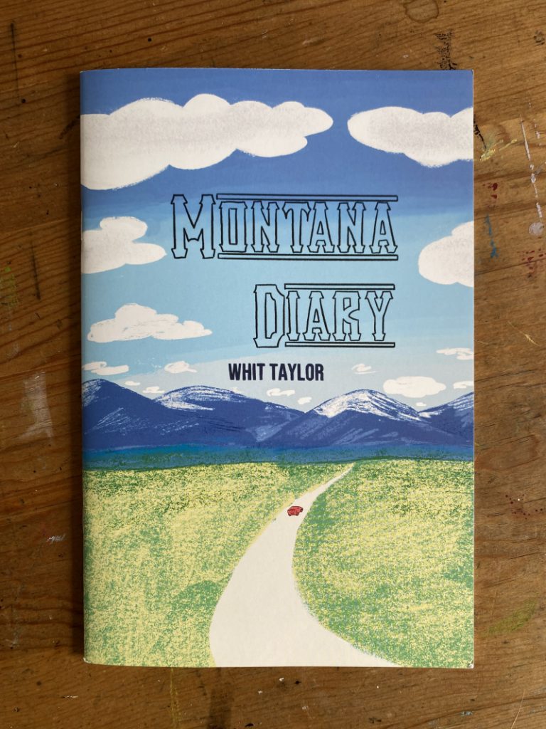
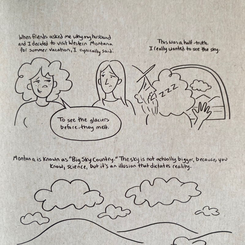
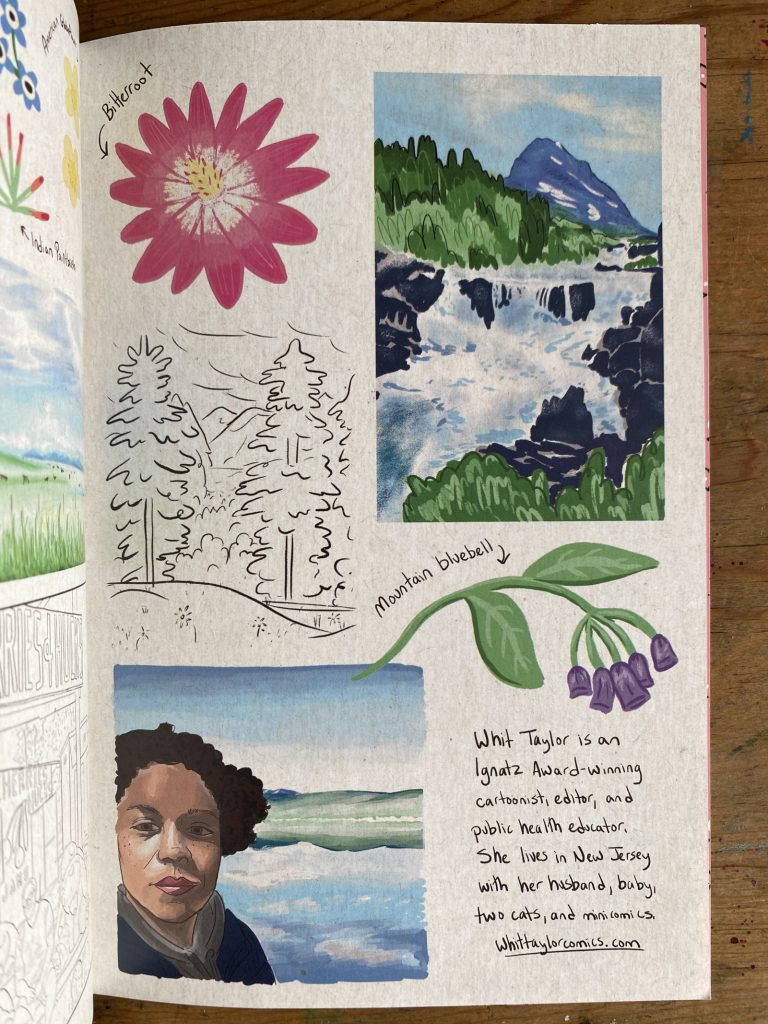
MONTANA DIARY is a comic journal by Whit Taylor, detailing a summer’s road trip across “Big Sky Country”.
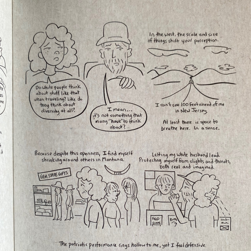
Whit’s journey across Montana is beset with anxiety. First from being a Black traveler in a very white, very red state (where Whit sees Confederate memorabilia on display at a gift shop).
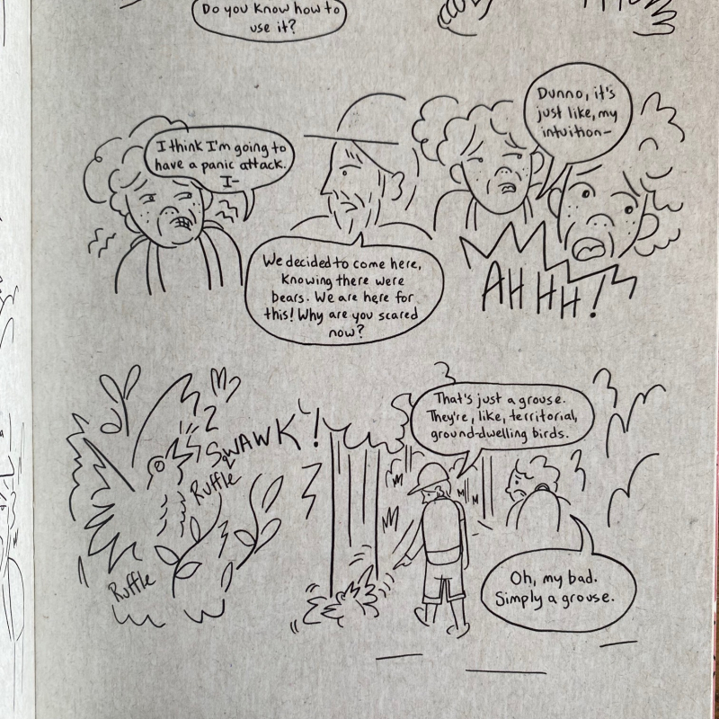
Then from nature itself. An imagined stalking bear turns out to be a territorial grouse (their fears weren’t unfounded, they would later encounter a bear on the same hike).
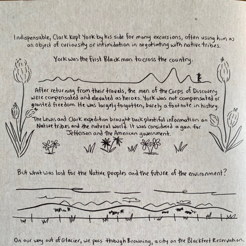
Whit’s anxiety comes across as does the irony of not being able to breathe in Big Sky Country. Eventually, Whit manages to be more present with her surroundings and this is where the zine digs into the history of Montana and its indigenous people as preserved by museums in various National Parks.
This reference to National Parks is why the zine is on my mind. National Park employees have been laid off en masse under the guise of “government efficiency” but is really nothing more, as far as I’m concerned, than a longer term play to privatize public lands and turn the Grand Canyon into a casino and Big Sky Country into a tar pit. I wish more people would call these layoffs out for being just that. I can’t be the only one who sees this, can I?
Whit’s zine ends with some tender watercolor observations that feel bittersweet. They remind me beautiful places exist and make me glad National Parks exist.