On the topic of updating classic works (see James Marshall post) I wanted to talk about this one:
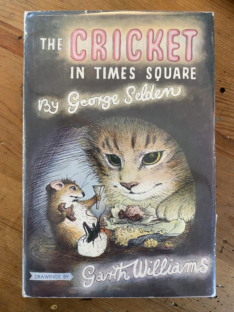
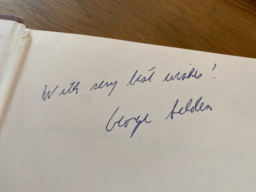
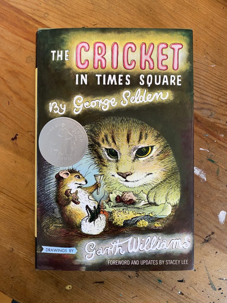
When I tell you I’m a big fan of THE CRICKET IN TIMES SQUARE, please believe me. I’m a big fan of THE CRICKET IN TIMES SQUARE. One of my prized kidlit possessions is a copy of the book (tenth printing, 1966) signed by George Selden.
I read it first as a student in Mrs. Boehlke’s third grade classroom at Jakarta International School and it made a big impression on me. The book painted New York as magical, of course, but it also cemented Connecticut as a place I desperately wanted to visit (never mind that I had access to coral reefs and rainforests in Indonesia, I wanted to see a bubbling brook in a Connecticut field). The descriptions of music left me tracking down the various overtures and arias that made up Chester’s repertoire and the animal’s feasts inspired a life-long love of liverwurst (it’s still one of my favorite sandwiches). Looking back, though, I wonder if what made me fall in love with the story was that it’s the first one I ever read where I saw myself in the protagonist. Like Mario, I was a lonely kid who loved animals.
I don’t remember feeling any particular way about the representation of Sai Fong, the older Chinese gentleman who plays a part in several chapters, but I do recall finding having to swap the Ls and Rs in his dialogue a bit tedious (Selden swaps the letters in that familiar way, “Velly good” and “most honalable” etc). It’s tedious and annoying and, or course, insensitive. If the book has a saving grace, it’s that the Chinese characters are sympathetic. Sai Fong (and his friend, another Chinese gentleman) help Mario and Chester early in the story and then return towards the book’s end and get to share in Chester’s triumphant final concert.
The portrayal of Asian characters in THE CRICKET IN TIMES SQUARE isn’t BREAKFAST AT TIFFANY’S level obnoxious, far from it, but I would agree that the book (given its status as a perennial classic) could use an update. I was excited to learn last year that there was a revised and updated version in the works and, naturally, picked it up as quickly as I could.
I might have expected the only revision to be the removal of Sai Fong’s broken English but there are a few other changes. Sai Fong’s Emporium (a bric-a-brac and novelty store) is now a music shop, which makes sense given the themes of the book, but Chester, who is a natural musician is now referred to as first a fighting cricket and then a poet. The legend of Hsi Shuai is gone, I’m assuming this is because Selden’s version is probably not accurate or maybe it’s not his story tell. But if the book is updated and the revisions are credited to an Asian author, couldn’t you say that part of the story belongs to them? I’m not sure why the legend was removed, but I kind of miss it. I feel a bit of the magic is gone. It’s a tough assignment, keeping Chinatown an particularly unique destination (Mario, a born and bred New Yorker had never traveled there) without relegating it and Sai Fong to a “magical minority” role.
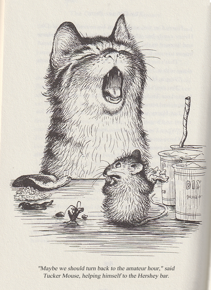
But I’m not writing about any of that. My concern with the reissue is that the book’s producers have completely messed up the art. I’m going to share some scans from the 1973 Dell Yearling edition (pictured on the left) and the 2022 revised and updated edition (pictured on the right). I’ve scanned then at the same resolution, how you see them is how they would look side by side.
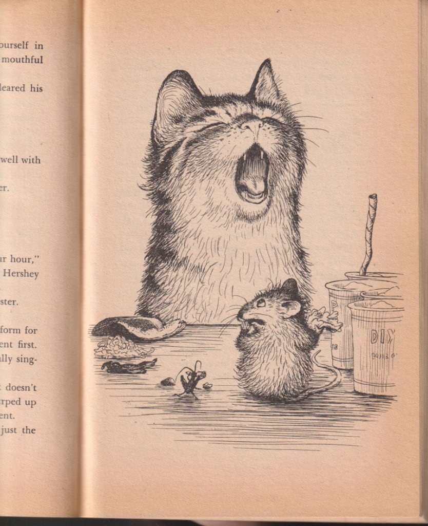
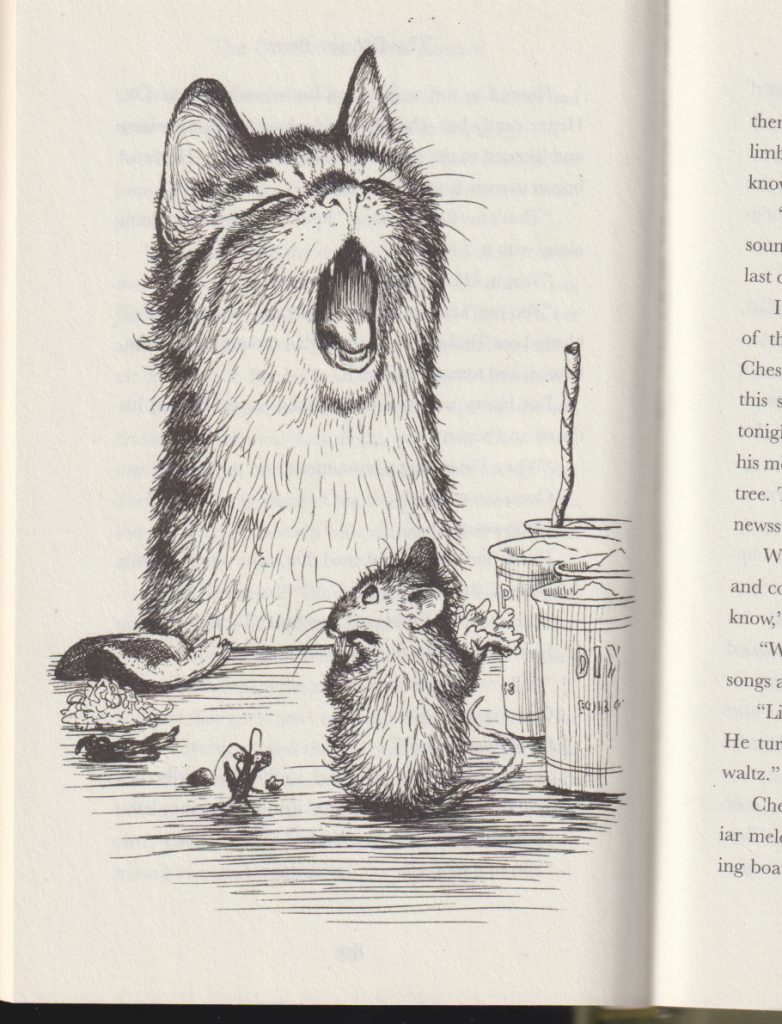
You’ll notice the original has a lot of blank space at the top and bottom of the page. The art in the new edition has been set to “stretch to fill” (a command that will have an image asset stretch vertically and horizontally to eliminate empty areas on the page) and as a result, the image is distorted. It’s not such a big deal if the object is stretching proportionally along both axes. But if you’re stretching a lot only in one direction, then you get something like this:
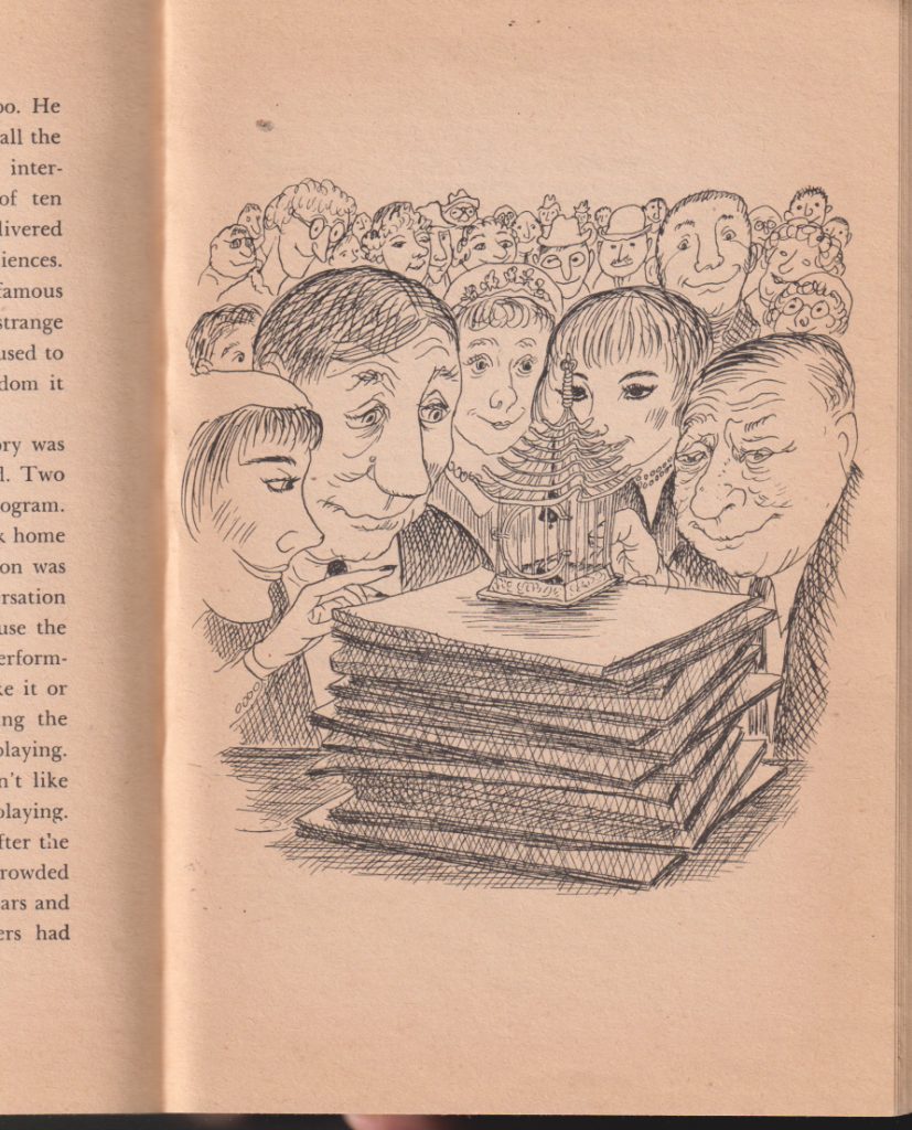
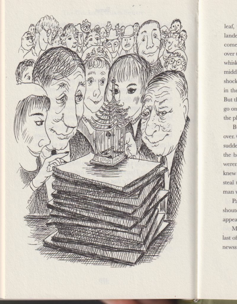
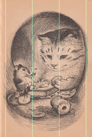
Most of the images in the new edition have suffered some distortion but the majority are only scaled a little. The illustration of Chester, Harry and Tucker celebrating a farewell dinner (which also serves as the book’s cover) is scaled around 7% taller. I doubt most readers without a side-by-side would notice any difference.
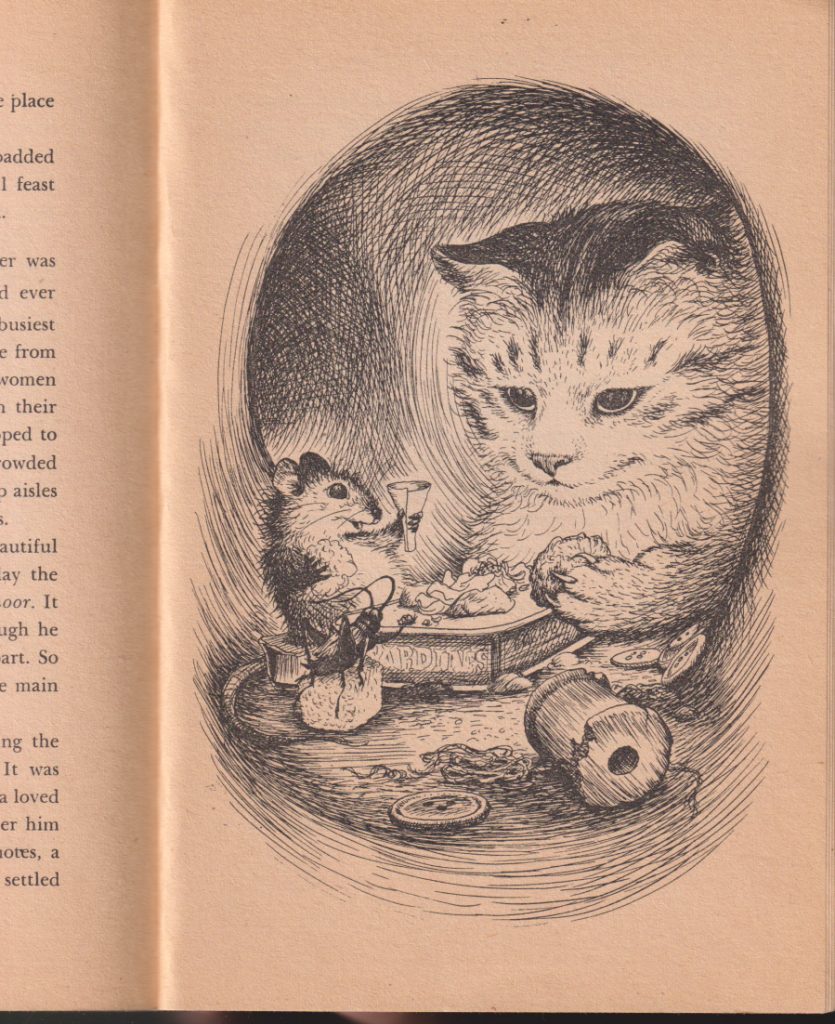
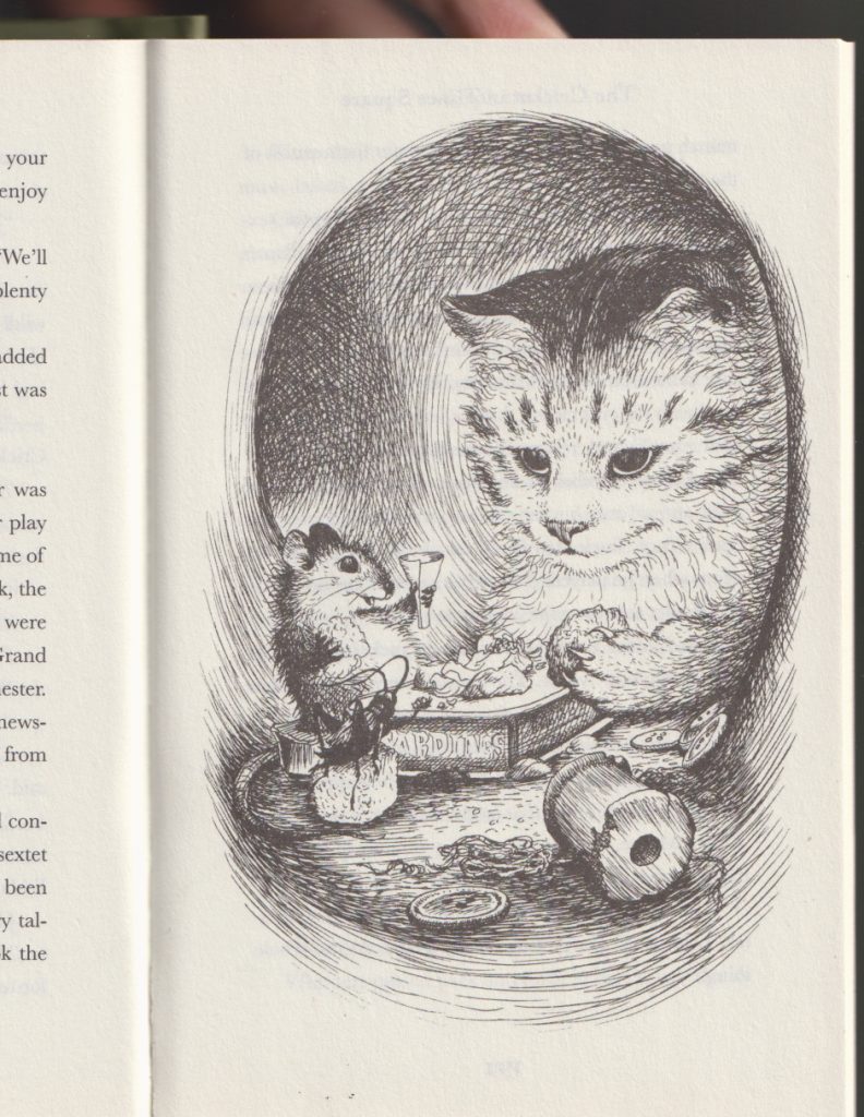
But the difference is there. I’ve overlaid them at the same scale so you can see how much it’s stretched (cyan lines added to show there’s no horizontal scaling).
Twelve years ago Phil Nel wrote about an updated version of James Marshall’s THE THREE LITTLE PIGS in a blog post titled Vandalizing James Marshall. Would I call this Vandalizing Garth Williams? I don’t know. Marshall’s book had its trim size changed to fit a mass market model. That was unfortunate (as was the use of Edmunds as the book’s new typeface). With the updated edition of THE CRICKET IN TIMES SQUARE, I feel like the art issue is carelessness more than anything. If the white space surrounding the art was a concern, the easiest fix would have been to fill it with those text descriptors you see in older chapter books. Something like this:
Then again, I can’t help but think the illustrations were enlarged to target a younger audience. Maybe there’s a feeling third graders these days aren’t interested in reading about talking animals (ugh). If that’s the root of these art and layout changes, that would seem to be an editorial decision not in keeping with the book’s original intent and I’d be inclined to call it vandalism. If the revised edition goes into reprint, maybe they could return the art to its original aspect ratio. How do we make that happen?
It’s always so interesting to read different versions of books at the same time — like, I reread the “standard” version of the first Babysitters Club story at the same time as I read the graphic novel version, side by side, just to see how things translated and what choices were made (to learn the craft of graphic novels better, basically). And I’ve compared rhyming texts before — my favorite two to compare are The Gruffalo in American English and Orkney Scot version. But I’ve never compared a reprint with the original, and it’s super interesting to see these choices. It feels like rescaled art should always, at a bare minimum, stay proportional, though…
Oh my goodness, I loved this book as a kid. I read anything animal-related I could get my hands on. I’m glad that they have tried to correct the racist spellings, but it’s a shame about the art (especially because it’s such good art)!
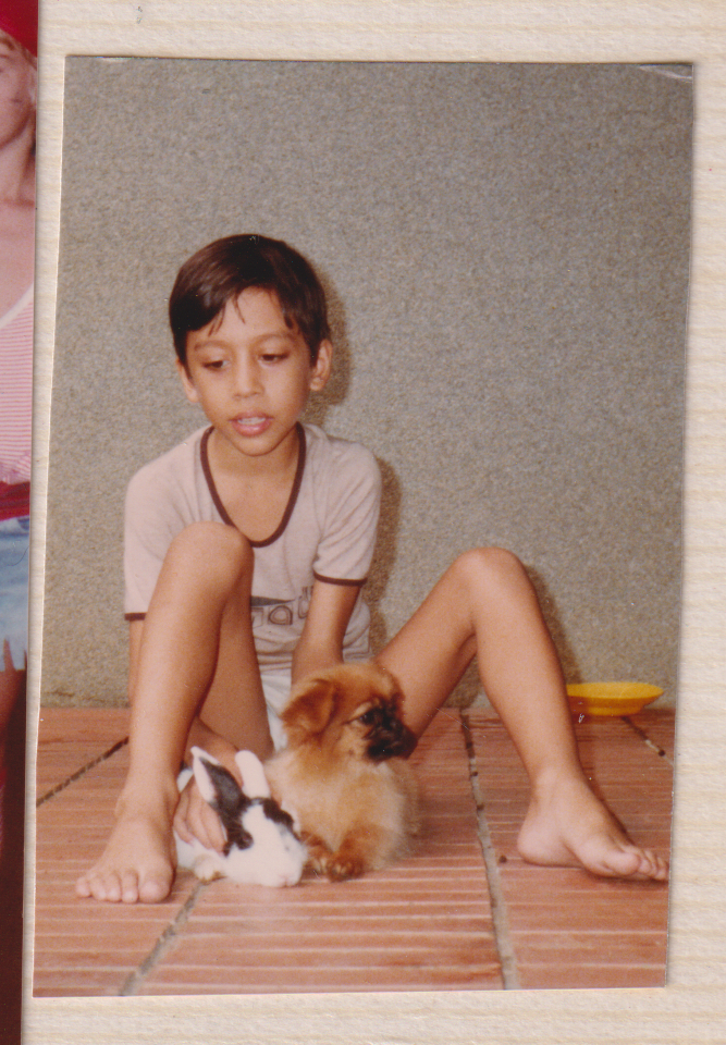
P.S. Love the young Jerrold pic!
Thank you for this close examination of THE CRICKET IN TIMES SQUARES artwork! I appreciate your side-by-side comparison. It helps to make apparent the changes, and in my opinion, the loss of intimacy in some illustrations and the downright freaky distortion of others. I hope that it will encourage publishers to take these details into consideration when revising classics in the future.
Thanks for this thoughtful look at the updated version. They definitely should have left the art alone!