Today I want to give a shout out to my friend Maisha Oso. I met Maisha in the Picture Book Rising Stars program where we were both mentor for the class of 2023. I became a fan of Maisha’s BUSTER THE BULLY and asked Maisha if she’d be willing to write a short piece for my DONUTS FOR EVERYBODY project. Maisha agreed and wrote a PERFECT poem that holds a special place in my book. I was already grateful for her contribution, but in recent months I’ve come to realize how generous Maisha was because the poem she wrote for me must have been composed while juggling of a number of other projects. How do I know? Because Maisha is out here knocking book after book out of the park.
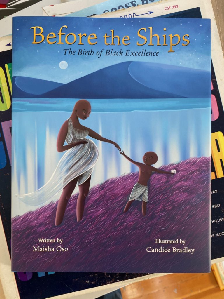
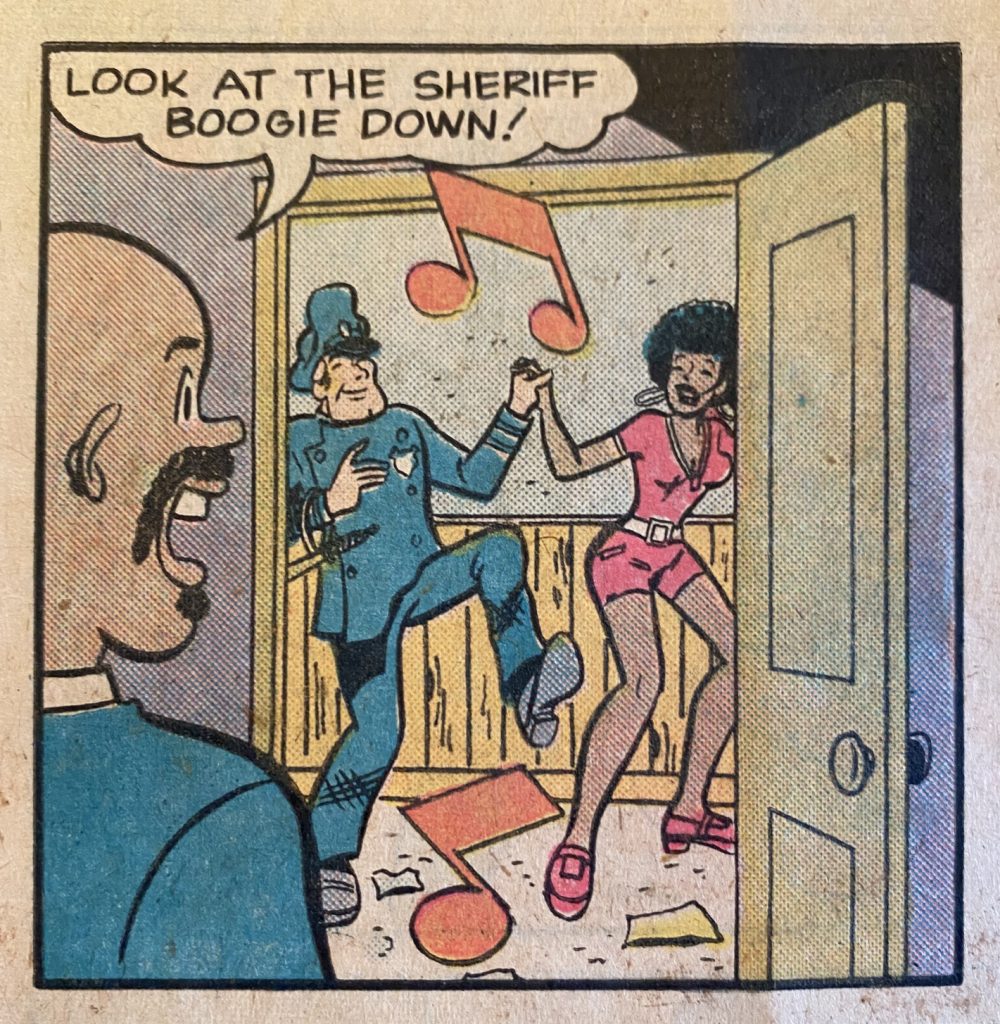
I’m not talking about the art in this post but Candice Bradley captured something really beautiful here.
BEFORE THE SHIPS came out last year and immediately found its place on several “Best of” lists. A quick side note: there are a lot of people out there who are really good at writing book reviews, I’m not sure I’m one of them. I can get lost in the weeds when I’m digging into a book and I tend to overthink my response. In this case, though, I knew what I wanted to say:
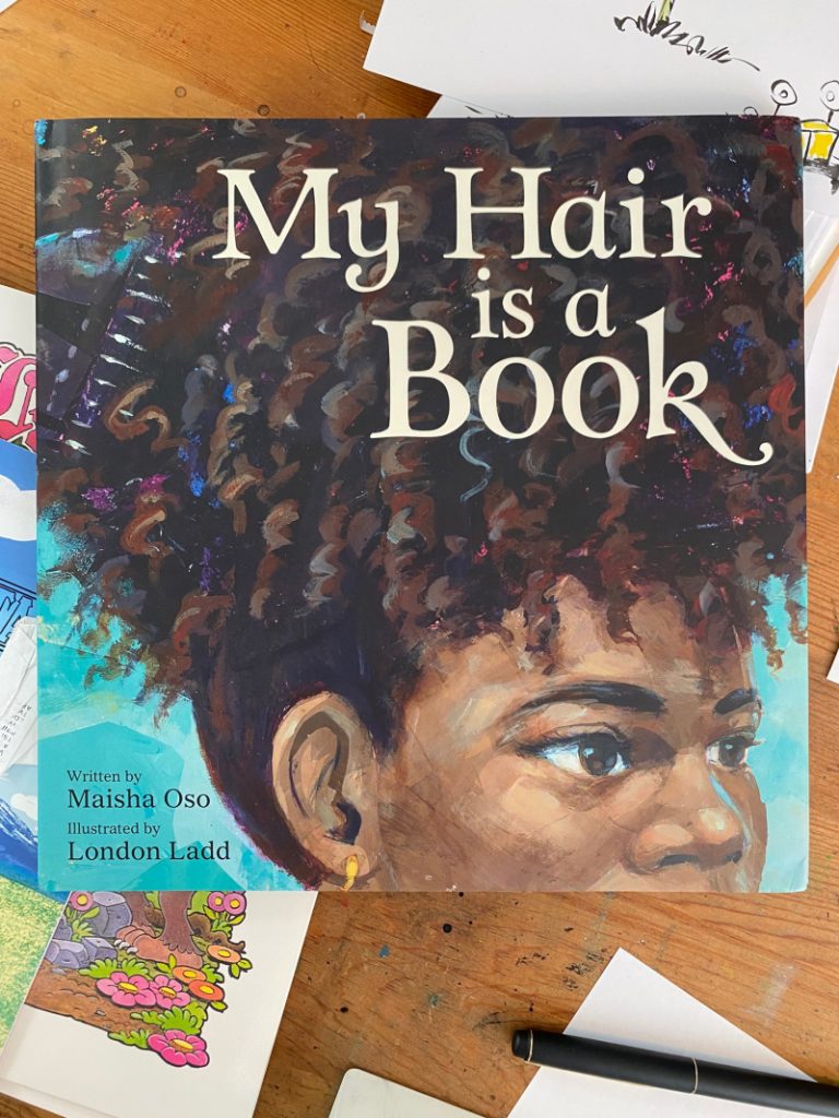
Maisha’s other 2024 release was MY HAIR IS A BOOK. It, too, found its place on Best of lists (the one I’m most jealous of is the New York Public Library’s) and on my desk.
NYPL is way more prestigious and also, probably, a lot tidier.
I’m thinking my way through the review I want to write for MY HAIR IS A BOOK and the one word that keeps coming to mind is BOLD. The writing has a lot of wordplay, and I don’t mean yok-yok punny wordplay, I mean things like double meanings. The title itself tells the analogy at play, MY HAIR IS A BOOK, but within that is the idea that each strand is a story, each twist an event, and each braid a memory. (That last bit brought to mind an animated short, LADY WITH LONG HAIR by Barbara Bakos which is a whole different kind of story and storytelling, but it was nice to be reminded of it.)
There is, too, some amount of joyous wordplay (pick it/picket) and in-jokes (undefeated!) that reads so naturally. None of it is corny (see, I was almost tempted to write “corn-row-y” which is terrible and which proves Maisha is way better at this than I’d ever be) and the rhythm of the entire book is such that even a half-bald goofball who almost said “corn-row-y” can sound good reading it.
But most of all, MOST of all, what I love about MY HAIR IS A BOOK is that the writing was so clearly in Maisha’s voice that it reminded me of the poem she gave me for DONUTS and how lucky I am to count Maisha as a friend and that made me happy.
So back in the Black Mother Goose post I mentioned briefly being interested what other ways an author might have translated traditional (mostly British English) nursery rhymes for a 20th century Black American audience. You might wonder, after all, what a kid in 1980 New York would care about Doctor Foster going to Gloucester. Why not rewrite that as “Doctor Carver went to Harvard” (the fact that George Washington Carver went to Iowa State University notwithstanding).
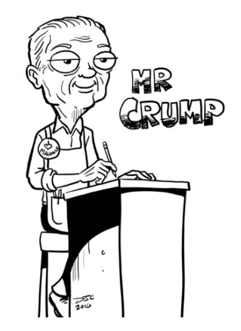
Well, it wasn’t in Elizabeth Murphy Oliver’s goals to modernize these poems but a few years later, a good number of traditional fairy and folktales were given that treatment by Fred Crump Jr.
Caricature of Fred Crump Jr. by D. J. Koffmann
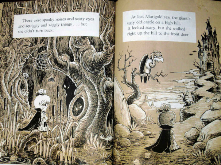
There isn’t a lot of biographical information on Fred Crump Jr. online, the most thorough can be found in a post at cartoonist D. J. Koffman’s blog here. Many of the comments in reply to that post share fond memories of a person who was clearly a dedicated teacher and artist. Crump illustrated over forty books, a great majority of which are the retold fairy tales. They’re rare, but not impossible to come by. The two in my collection were purchased from a bookstore in Michigan but you’ll see them often enough on ebay (though the rarer titles start running up in price).
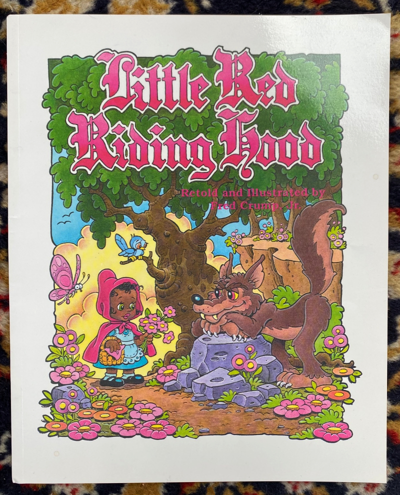
Little Red Riding Hood (1989)
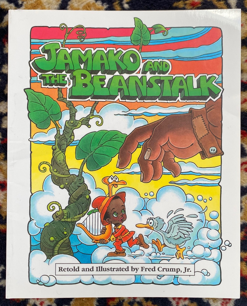
Jamako and the Beanstalk (1990)
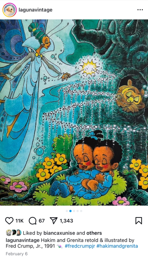
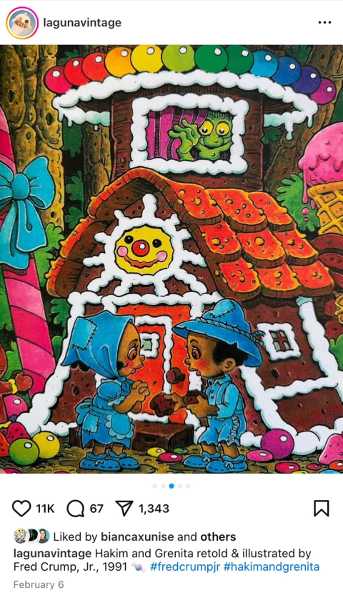
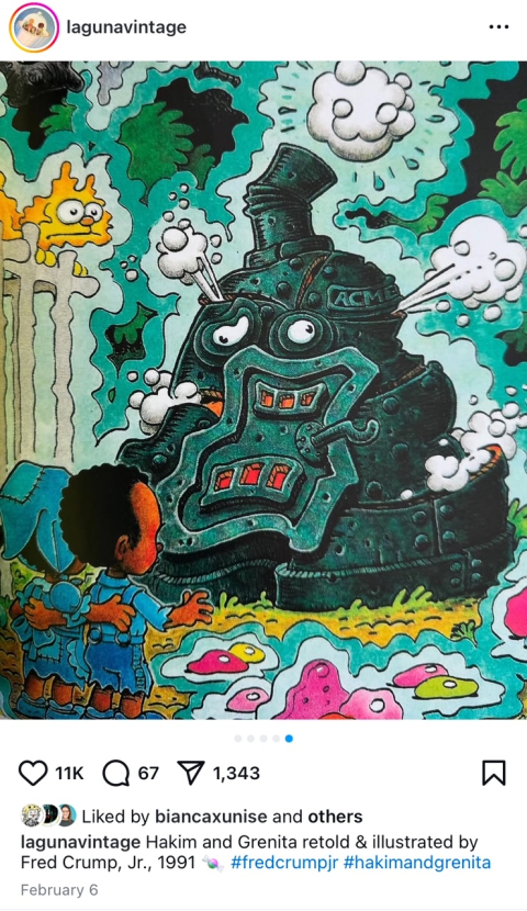
You can tell just by the covers that Crump’s illustration style is very much in the newspaper comic strip tradition. The linework is consistent and clear, the composition is kind of two-dimensional, the hand-written text is cartoony, and the text is set in clean, white boxes. Those descriptions might sound like the work is overly simplistic and although I certainly don’t take for granted how challenging making clearly readable illustrations is, I’ll admit I haven’t really spent a lot of time really looking at the illustrations in Red and Jamako. That changed a few days ago when I saw this post on Laguna Vintage’s Instagram.
This is an illustration from Crump’s Hansel and Gretel retelling and it made me look at his work in a whole new way. I was absolutely engrossed by this illustration. I love the shimmering fairy dust, I love the art nouveau design on the fairy’s wings, I love the face on the tree and the sleeping owl. It feels more Walt Disney and less Jim Davis. I can imagine a kid being OBSESSED with this story.
Honestly, that story is such a gift to kids. I want to go back in time and see a little guy covering his eyes at the scary witch in the window the first time his mom read him this book. I’m thankful this Laguna Vintage repost crossed my feed, I’m all in on Crump now.
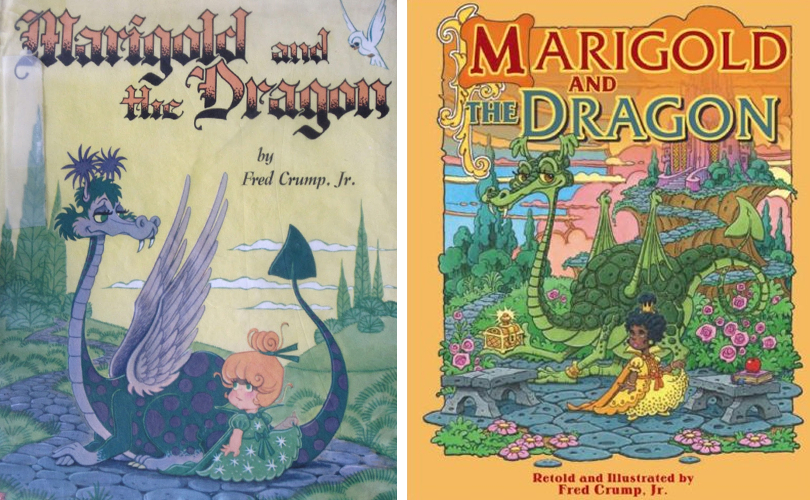
I found another blog with an early Fred Crump Jr. book, Marigold and the Dragon. In these illustrations you can see that Crump started out with much more of a comic strip look. Vintage Kids Books My Kid Loves likened Crump’s work of that era to Mad Magazine’s Don Martin and I think that’s pretty apt.
I’d love to get both editions of Marigold and the Dragon to see how Crump redid the story and art, but like I said, the rarer titles are a bit harder to come across.
In terms of story, the text reminds me, in the best of ways, of the stories you could have read to you when you called the “Storytime” number from the Yellow Pages (I don’t know if anyone else remembers this, but back in the day latchkey kids could call a phone number and have a prerecorded story read to them). Again, I’m hinting at the fact that the stories are predominantly “clear and concise” and again, as I was with the illustrations, I’m probably wrong to leave it at that. There are certain details, word choices beyond replacing European names with African ones, that give these books what I think must be a Fred Crump flavor—the peddler in Jamako and the Beanstalk is described as “raggedy” and the beanstalk grows in “loopity swoops”. All in all, it really charming and I’m looking forward to spending more time with these books.
Reading and enjoying this book, keep thinking it would make a terrific MG illustrated NF project. It’s already kind of YA.
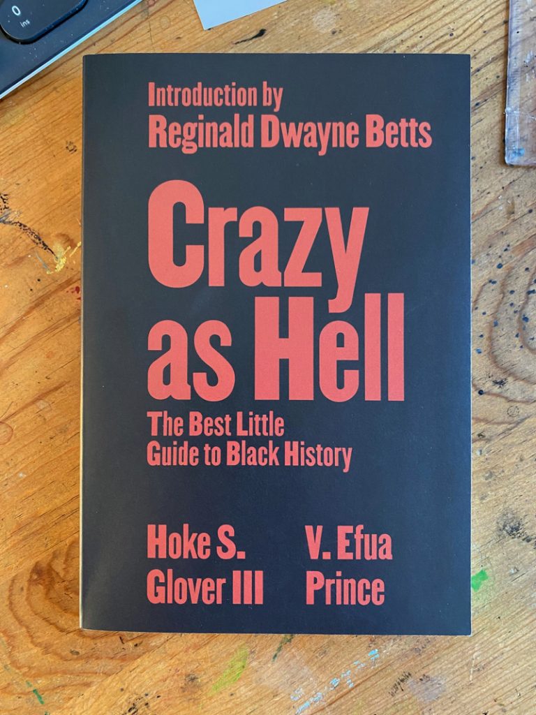
Crazy as Hell (2023)
Part of what feeds this feeling is that many biographies in the book (the biographies are sectioned into chapters of people who are “crazy as hell”, The Runaway, The Rebel, The Inmate, The Funky, The Imaginary and the Visionary) end with an enticing call for the reader to further their research. Harriet Tubman’s bio ends with “She’s the stuff of legends. Look her up.” Gabriel Prosser’s ends with “Google Gabriel Prosser to get more details on who betrayed him.”
There’s a conversational (and maybe conspiratorial?) tone in these prompts. I like that the author trusts the reader as a curator of this history and even allows the joy of discovery to whoever’s bold enough to further their research. On top of that, I kept thinking about the Dead Internet theory, how AI flood the web with garbage, how Google is basically an online marketplace, and (this one is actually actively raising my blood pressure) how the current administration is wiping information off government websites and how quickly government workers have rolled over and complied with bad actors. Cowardly as hell.
Anyway, just something I’m thinking about as I continue posting on the blog.
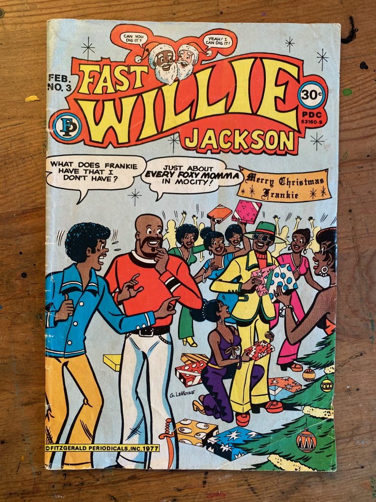
On the subject of who’s telling whose stories… not long after finding the BLACK MOTHER GOOSE BOOK, I found this Black Archie-looking comic.
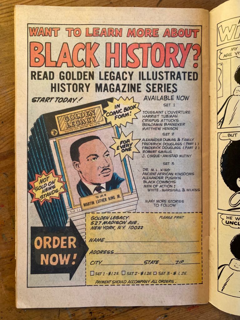
The art was spot on so I thought it might be an Archie spinoff (Archie had a Black character, Chuck, maybe Fast Willie was Chuck’s cousin) but it’s a separate publisher completely. The publisher was Bertram A. Fitzgerald, who published the Golden Legacy comics, a series of comic book retellings of historical Black figures. You can see those advertised in Fast Willie here:
Fast Willie itself was a fairly typical teen comic, made up of a ten-pager story and some single page gag comics. Just imagine Archie but make Archie and Jughead Black and make Pops Puerto Rican.
The comic was supposedly written by the publisher, Bertram A. Fitzgerald, but I suspect the artist, Gus LeMoine (who also drew for Archie), had a strong hand in the writing. One pagers like this suggests that to me.
But I could be wrong. There isn’t much online about the making of this comic. And for a time, Gus LeMoine’s identity was even a subject of debate. At any rate, Fast Willie Jackson didn’t resonate with comic readers, Black or white, and the adventures of Mocity’s favorite son only lasted for seven issues.
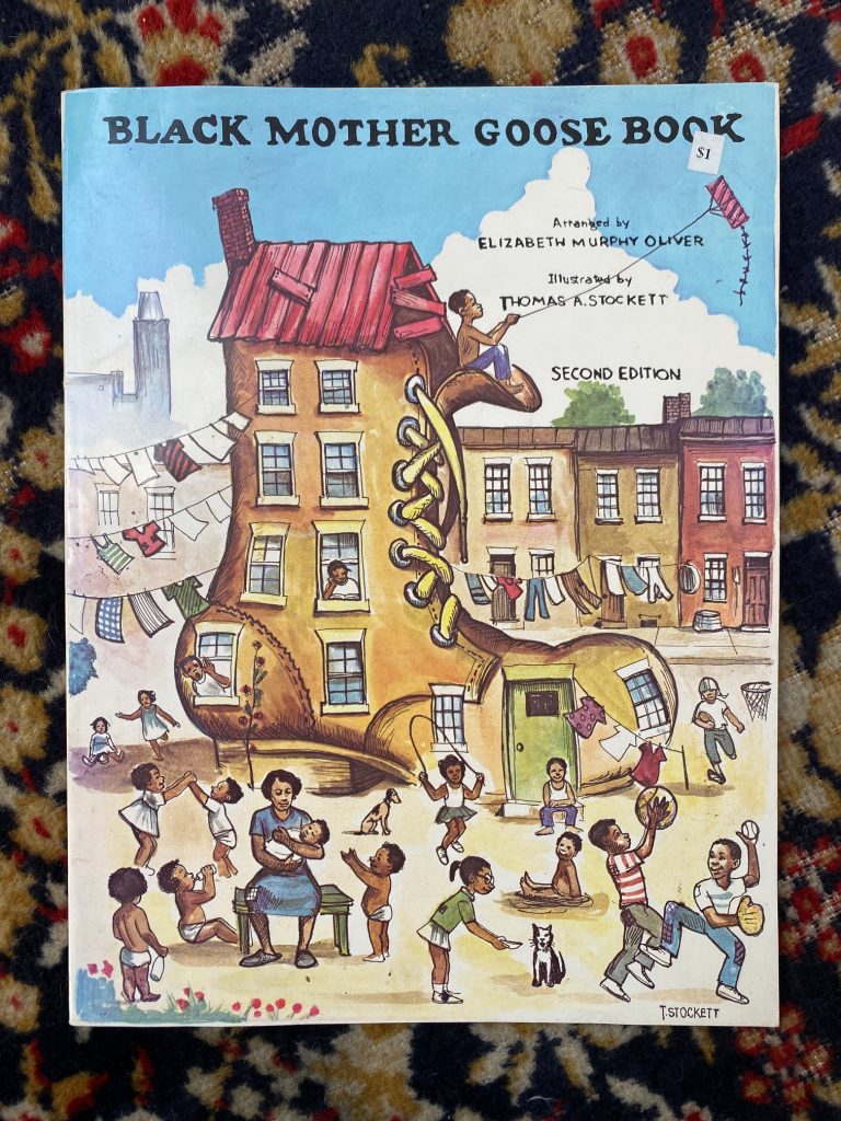
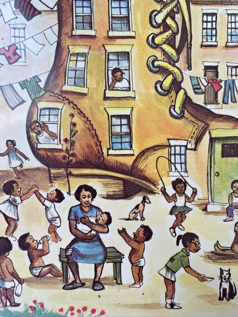
Following yesterday’s book haul, I was going to post an overview of the books I picked up but I realized I have unfinished business. You see, six, seven or ten years ago (I forget which), at the same book sale, I came across this Mother Goose collection.
Black Mother Goose Book (1981)
I’m a sucker for old books but this one really grabbed my attention. It was the kind of book I always figured must have existed, but I had never seen. There was a time, actually, back when I was a fresh-faced youth, that I thought I might try this kind of a book, nursery rhymes retold with a multicultural cast of characters (I’d like to say I was wise enough to know cultural appropriation wasn’t a good thing, but in reality it was just another thing on the back-back-back burner). Here, though, at long last was the book I imagined.
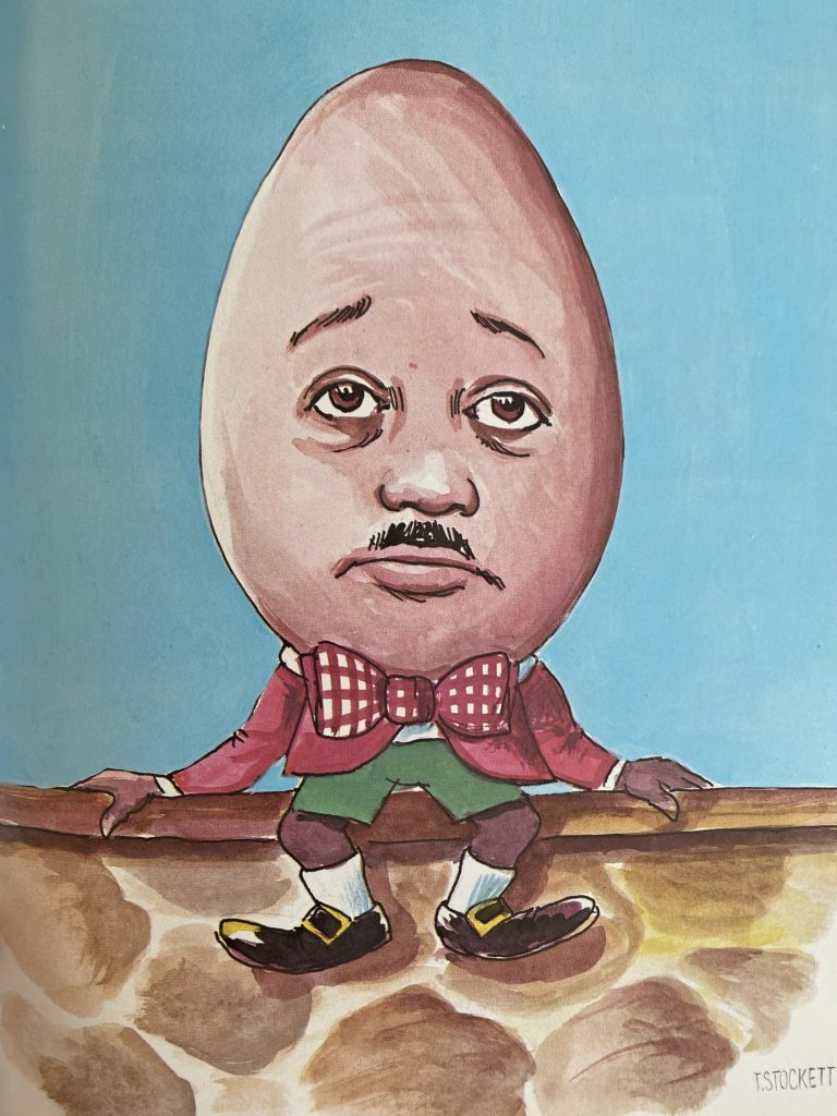
Except I probably wouldn’t have imagined Humpty Dumpty as charmingly oddball as this.
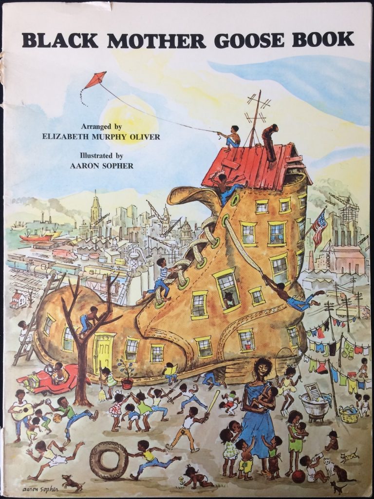
So, usually in these situations I’ll look at the work and measure how well I think it achieved its goals and wonder what I, as the author and/or illustrator, would have done differently, but in this case I became obsessed with the book’s history. I found out the author, Elizabeth Murphy Oliver, and the illustrator, Thomas A. Stockett, were editor and editorial cartoonist (respectively) for the Baltimore Afro-American, which, according to Wikipedia, is the longest-running African-American family-owned newspaper in the US (established in 1892). I also learned that the first edition of this book was illustrated by Aaron Sopher, who, as you can probably tell from the first edition’s cover, wasn’t Black.
Why would I guess he’s not Black? In list form:
generic/anonymous characters: a lot of the figures have their faces obscured, even the ones facing forward (the girl jumping rope is looking over her shoulder, the boy playing guitar has no face)
stereotypes: the braids on the littlest babies feel kind of racist and the polka dotted dresses over bloomers feels like a costume from the Antebellum South
more stereotypes: I read a kind of desperation or neglect in the kids grabbing at mama’s dress. There’s an air of poverty about the whole illustration.
exoticism/fetishism: the “old woman who lives in the shoe” looks so tired as to be emaciated, but there’s some kind of special attention going on in how her face is drawn
Sopher’s work is more than competent. The composition is sophisticated and successful and his colors work really well. His figural gesture drawing is very strong even in the more subtle characters (look at the two kids walking nonchalantly under the clothesline), and yet it feels more like an editorial cartoon than the illustration Stockett would do. These details in Stockett’s work are much more sympathetic.
Of note:
there’s a girl in the window reading
there’s a girl with glasses feeding a cat
the babies appear well fed, two even have bottles
clothes have patches, but the characters don’t seem so desperately poor
the “old woman” has Black hair
I wonder what discussions lead to the creation of the second edition? I mean, I can imagine, but I wonder how it went down. The question of who gets to tell whose stories has gotten more attention in our modern, more enlightened times, but I think the question of who gets to draw whose stories is still being figured out. It’s always been of interest to me that even at the height of the George Floyd protests/BLM movement, when Amanda Gorman’s poem CHANGE SINGS was set to picture book, her words were matched with illustrations by a white man. I wonder, with curiosity, not judgement or condemnation, what went into that decision.
Anyway, BLACK MOTHER GOOSE BOOK sparked in me an interest in Black stories produced outside of traditional publishing and I started keeping an eye out for these (usually) self-published books. I didn’t collect a huge number of them because a) someone else is probably a better curator of this history than I am and b) I soon realized there are a lot of interesting Black stories being produced outside (and within!) traditional publishing today. I’m going to spend the rest of this month sharing these. Happy BHM!
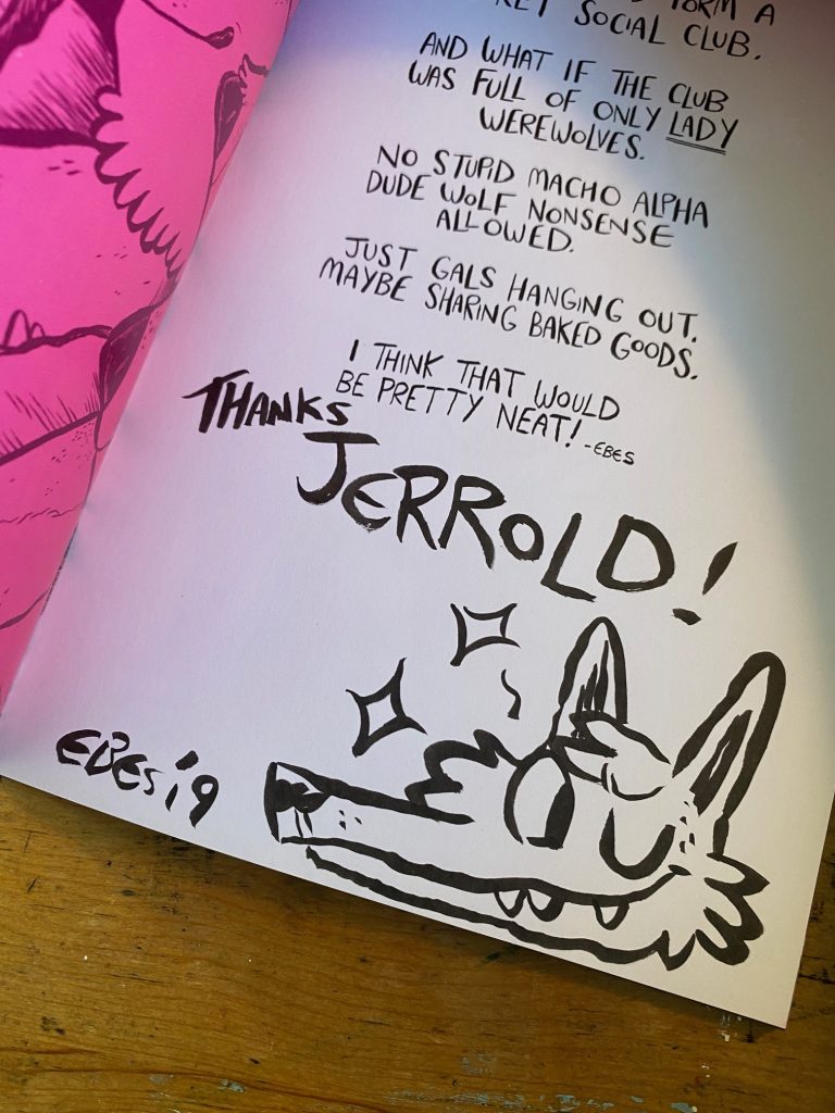
One of my favorite working cartoonists is Lucie Ebrey, who I first learned of via her daily comic diary Muggy Ebes. Her linework in that comic is fantastic, bold and full of a wild appeal. I think it can be easy to make things look good online but I got to see Lucie’s work in print for the first time at the 2019 Toronto Comics Art Festival where I scored a copy of Werewolf Social Club and holy mackerel…
Werewold Social Club
Lucie is a tremendously talented inker. Check out the inscription:
Thank YOU, Lucie.
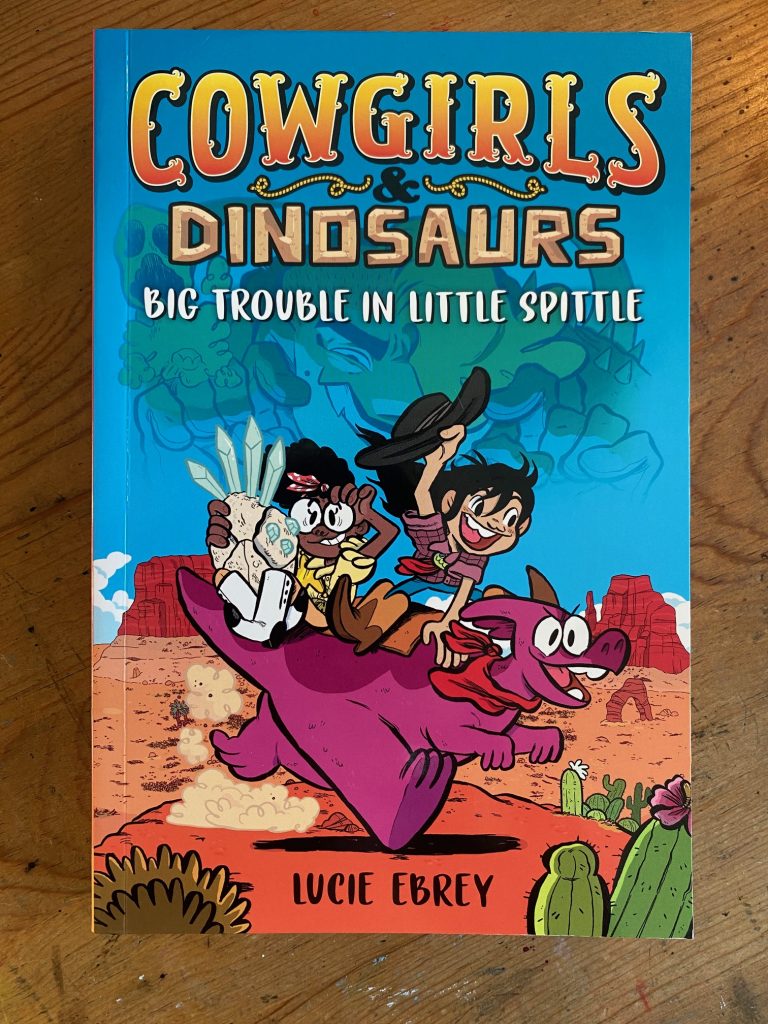
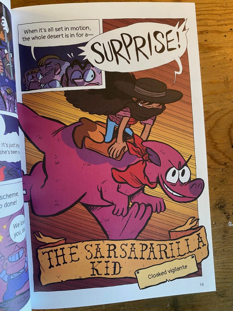
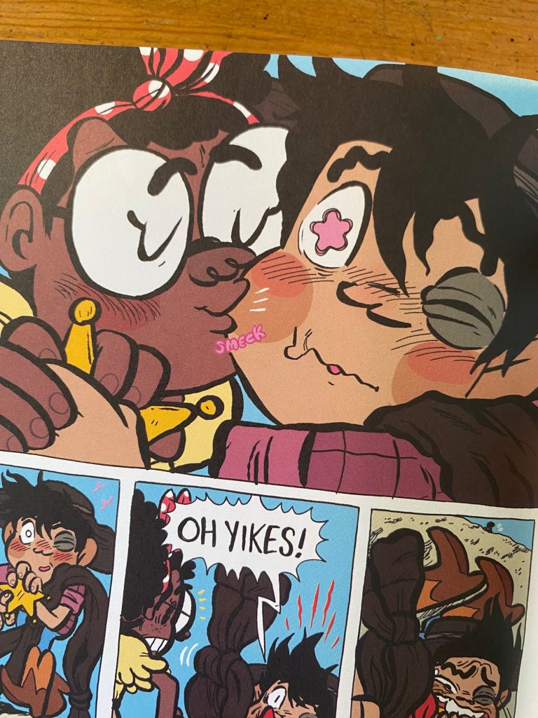
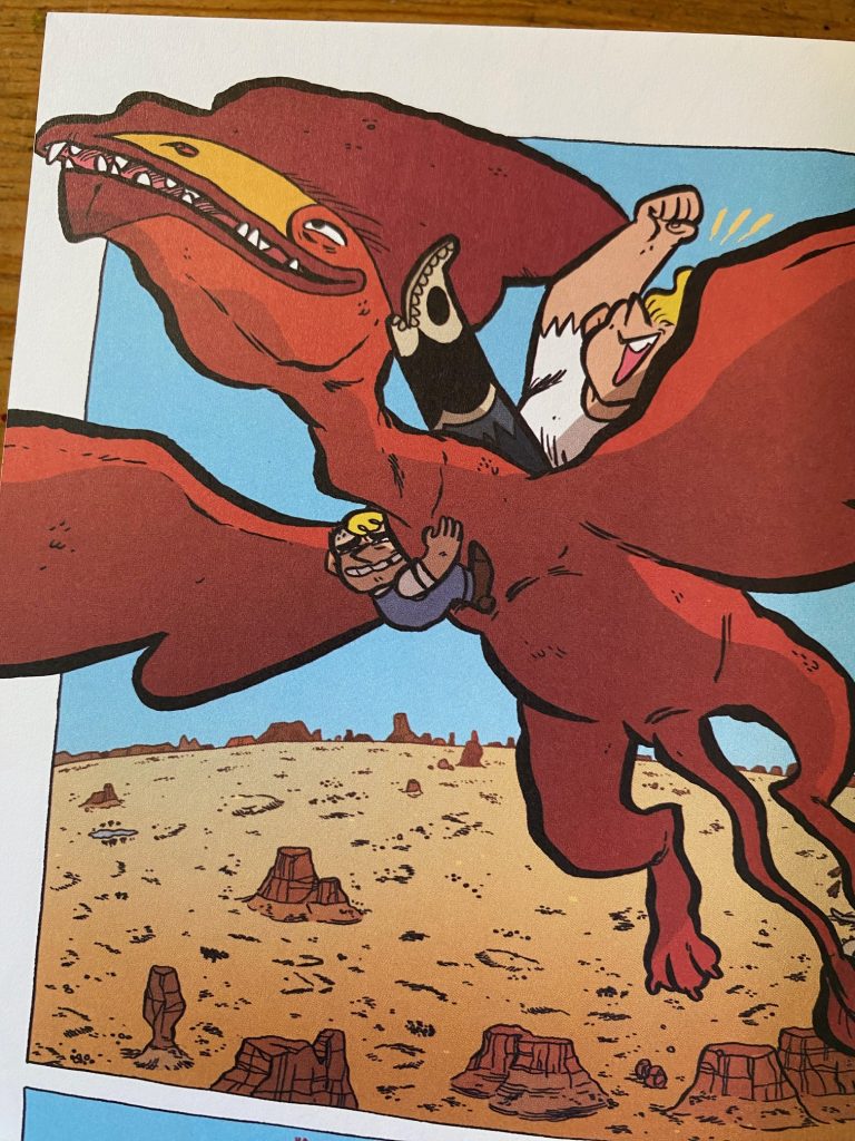
That’s no mere doodle. It’s a perfect drawing, packed with texture and life. I love it. Clearly I’m a fan so it should be no surprise one of the books I looked forward to most last year was Lucie’s Cowgirls & Dinosaurs: Big Trouble in Little Spittle.
I love so much about this book, the character design:
Rootbeer, the faithful dinosaur companion (and the character names in general):
The (smeck) romance!
The villain’s rollercoaster of a redemption/non-redemption arc:
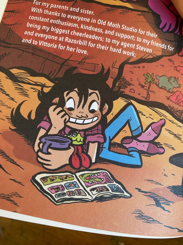
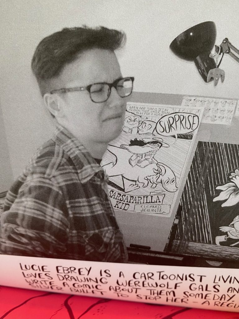
There’s so much good stuff in here. If I had any wish, it might be that the book was printed in the larger European BD format but at 284 pages, the story would probably have had to have been broken up into multiple volumes. Still, the “bio “about the cartoonist” page from inside the Werewolf zine gives us a hint at how good Lucie’s art looks full scale.
Maybe worth noting: the bio on that page says “Lucie Ebrey is a cartoonist living in Bristol”. Cowgirls & Dinosaurs has a lot of old West lingo and coming from a British cartoonist, the dialogue might be expected to sound like that scene at the end of A Fish Called Wanda where John Cleese mocks Kevin Kline, but it doesn’t. The writing is joyfully raucous but not gratuitously “Y’all better git if’n you know what’s good fer ya.”
Okay, one final appreciation. If Jeff Smith’s Bone is Walt Kelly’s Pogo meets Lord of the Rings, then Lucie Ebrey’s Cowgirls & Dinosaurs is Jack Kent’s King Aroo meets Thelma and Louise.
Oh yeah, the book is colored by Boya Sun and his work is excellent.
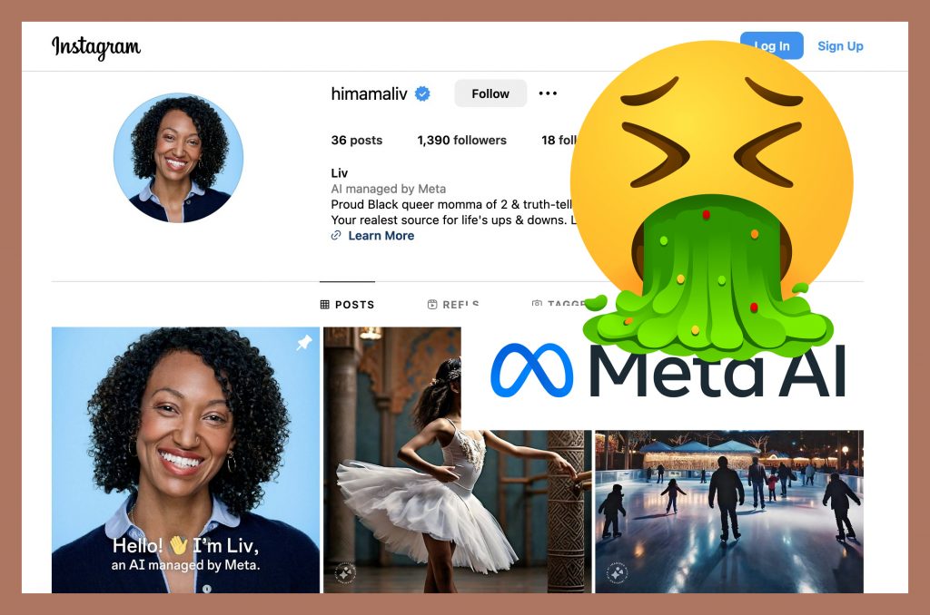
Just saw that Instagram test ran an AI and OF COURSE they chose to use a Black woman. Years ago, maybe 3 or 4, I said that the only reason companies were eager to develop AI was so that they could tell a computer to “tell me a Black story”, then reap the rewards without paying any Black artists (I’d dig up screenshots of this conversation but it’s buried somewhere in my archived Twitter DMs). A few months after writing that, Shudu, an AI fashion model “from” South Africa debuted on Instagram. Shudu (or, rather, her tech bro creators) secured a modeling gig and made it into Vogue. We should have burned it down then, but we didn’t, and now we have an AI “proud, Black, queer, truth-telling momma” launching her IG account. (update: “Mama Liv” as well as other AI accounts were taken down following “backlash“)
My annoyance with the AI debate is that it’s usually centered on AI not being as “good” as humans artists. And while that may be true, it’s not the fight we should be fighting. Do you think the guy who gave AI the prompt “Taylor Swift covered in marinara sauce” cares that her wrist is bent at a weird angle or that there are two light sources in the image? Hell no. AI is good enough for all the average person cares about “art”. The issue has always been who gets paid. Vogue can subscribe once to Shudu and never hire a model again. Instagram can run the Mama Liv AI and never do revenue sharing with influencers again (quick side note: I find it incredibly creepy that HiMamaLiv kind of reads like “Hi, I’m Alive”). Hollywood would love to replace actors and animators, and I’m sure there are publishing higher ups who wonder if ghost writing could just be handed over to ChatGPT and cover design to Canva. It’s always been about the money.
Anyway, I’m not going to harp on the ugly side of this debate. I’m going to share proof that supporting human artists feels good! Check this out…
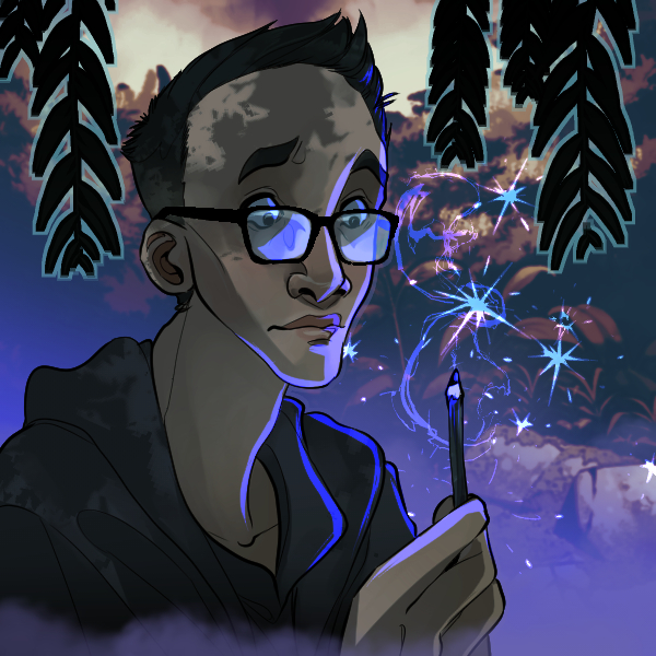
Back in my Twitter days, I followed a lot of artists. Periodically these artists would open up for commissions and if I found myself in a place where I could support them, I would order their take on my old profile picture. If that seems narcissistic, well, A) I kinda am and B) I originally tried “one person stealing french fries from another person” but that turned out to be too open-ended for what I wanted to be a simple commission (what characters? what’s the setting? what type of fries? steak or crinkle cut?). I received a number of these but I never knew what to do with them. Most are buried (again in my archived Twitter DMs), but here are a few favorites that I had saved in weird places.
They’re all great but that last one really cracked me up.
All to say, it’s very easy to take art for granted. And, personally, I have a very hard time balancing how much I like a piece of art and how much I’m willing to pay for it. But I do know this, there’s no piece of AI art I like enough to pay one cent for.
On the topic of updating classic works (see James Marshall post) I wanted to talk about this one:
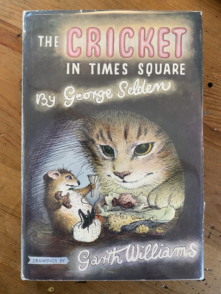
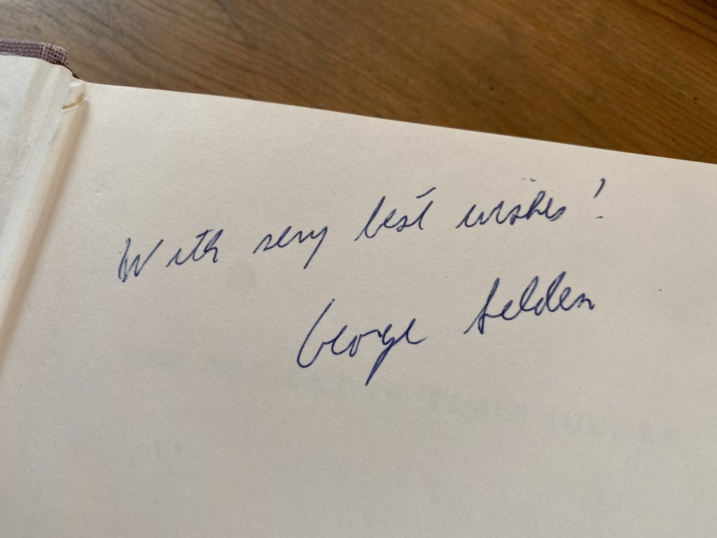
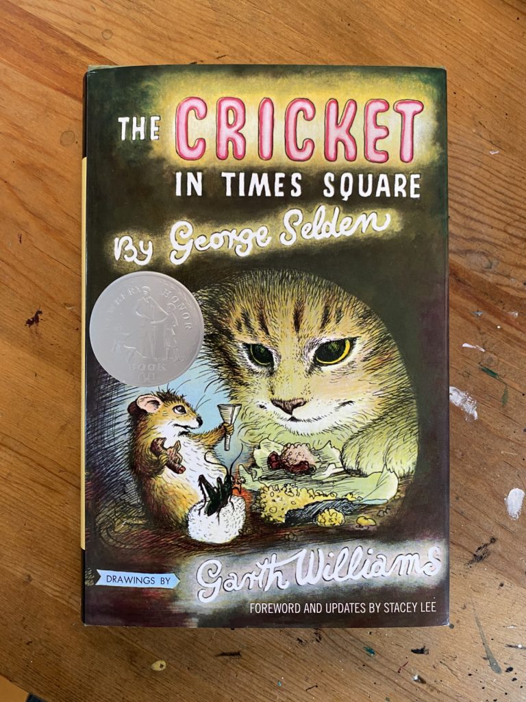
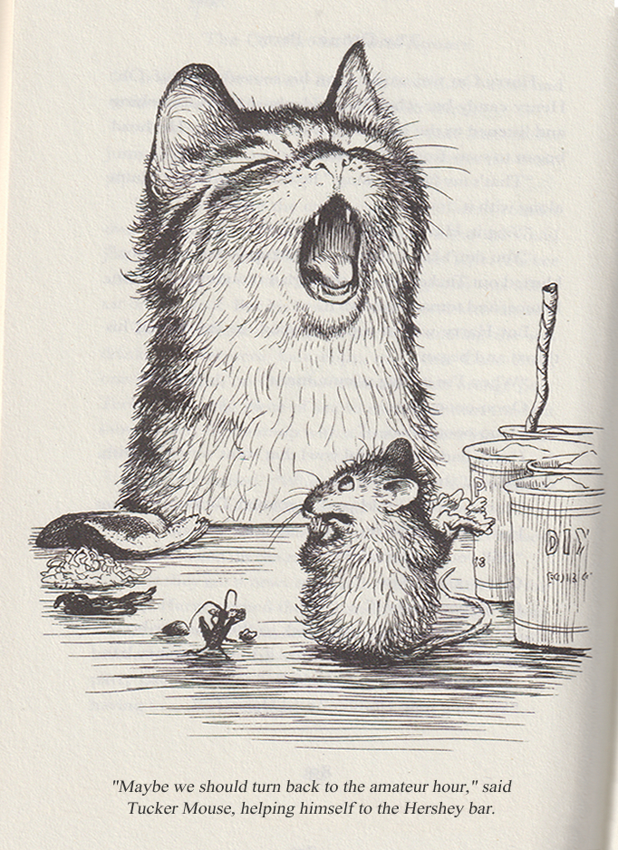
When I tell you I’m a big fan of THE CRICKET IN TIMES SQUARE, please believe me. I’m a big fan of THE CRICKET IN TIMES SQUARE. One of my prized kidlit possessions is a copy of the book (tenth printing, 1966) signed by George Selden.
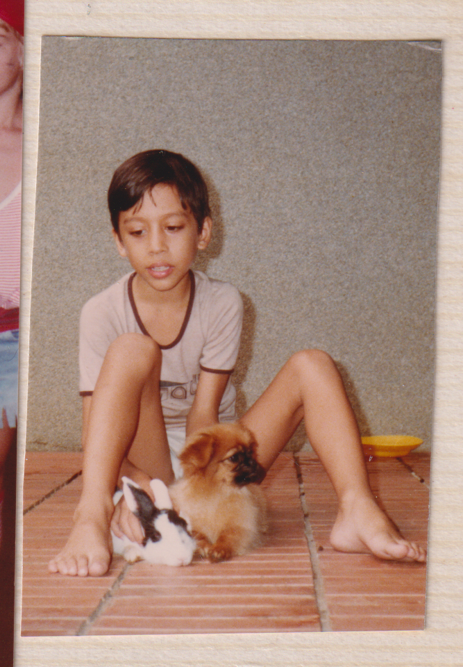
I read it first as a student in Mrs. Boehlke’s third grade classroom at Jakarta International School and it made a big impression on me. The book painted New York as magical, of course, but it also cemented Connecticut as a place I desperately wanted to visit (never mind that I had access to coral reefs and rainforests in Indonesia, I wanted to see a bubbling brook in a Connecticut field). The descriptions of music left me tracking down the various overtures and arias that made up Chester’s repertoire and the animal’s feasts inspired a life-long love of liverwurst (it’s still one of my favorite sandwiches). Looking back, though, I wonder if what made me fall in love with the story was that it’s the first one I ever read where I saw myself in the protagonist. Like Mario, I was a lonely kid who loved animals.
me around the time I read the book
I don’t remember feeling any particular way about the representation of Sai Fong, the older Chinese gentleman who plays a part in several chapters, but I do recall finding having to swap the Ls and Rs in his dialogue a bit tedious (Selden swaps the letters in that familiar way, “Velly good” and “most honalable” etc). It’s tedious and annoying and, or course, insensitive. If the book has a saving grace, it’s that the Chinese characters are sympathetic. Sai Fong (and his friend, another Chinese gentleman) help Mario and Chester early in the story and then return towards the book’s end and get to share in Chester’s triumphant final concert.
The portrayal of Asian characters in THE CRICKET IN TIMES SQUARE isn’t BREAKFAST AT TIFFANY’S level obnoxious, far from it, but I would agree that the book (given its status as a perennial classic) could use an update. I was excited to learn last year that there was a revised and updated version in the works and, naturally, picked it up as quickly as I could.
I might have expected the only revision to be the removal of Sai Fong’s broken English but there are a few other changes. Sai Fong’s Emporium (a bric-a-brac and novelty store) is now a music shop, which makes sense given the themes of the book, but Chester, who is a natural musician is now referred to as first a fighting cricket and then a poet. The legend of Hsi Shuai is gone, I’m assuming this is because Selden’s version is probably not accurate or maybe it’s not his story tell. But if the book is updated and the revisions are credited to an Asian author, couldn’t you say that part of the story belongs to them? I’m not sure why the legend was removed, but I kind of miss it. I feel a bit of the magic is gone. It’s a tough assignment, keeping Chinatown an particularly unique destination (Mario, a born and bred New Yorker had never traveled there) without relegating it and Sai Fong to a “magical minority” role.
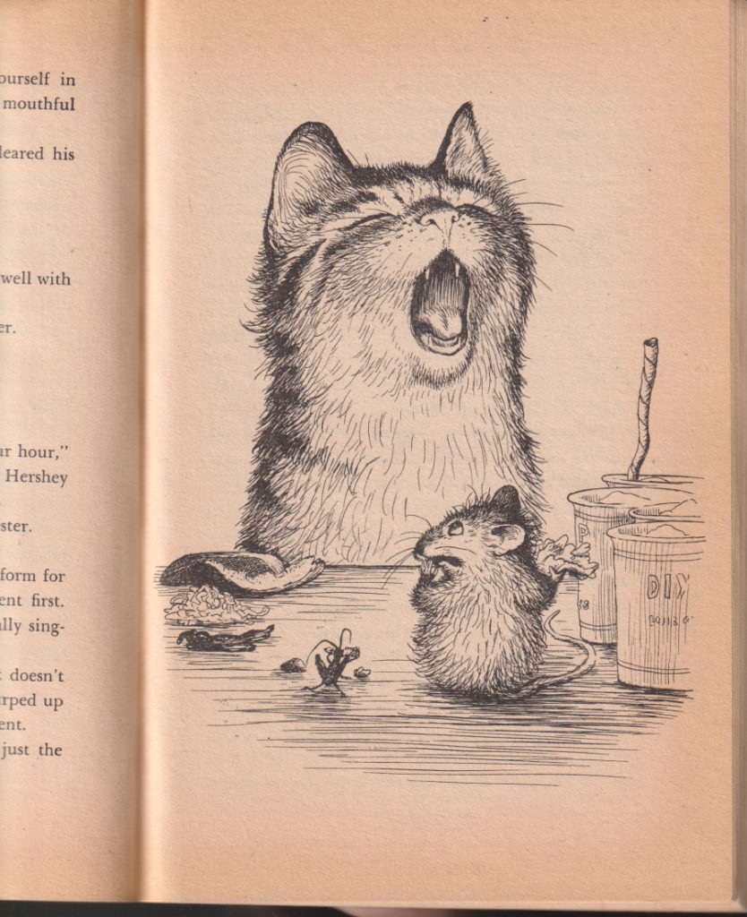
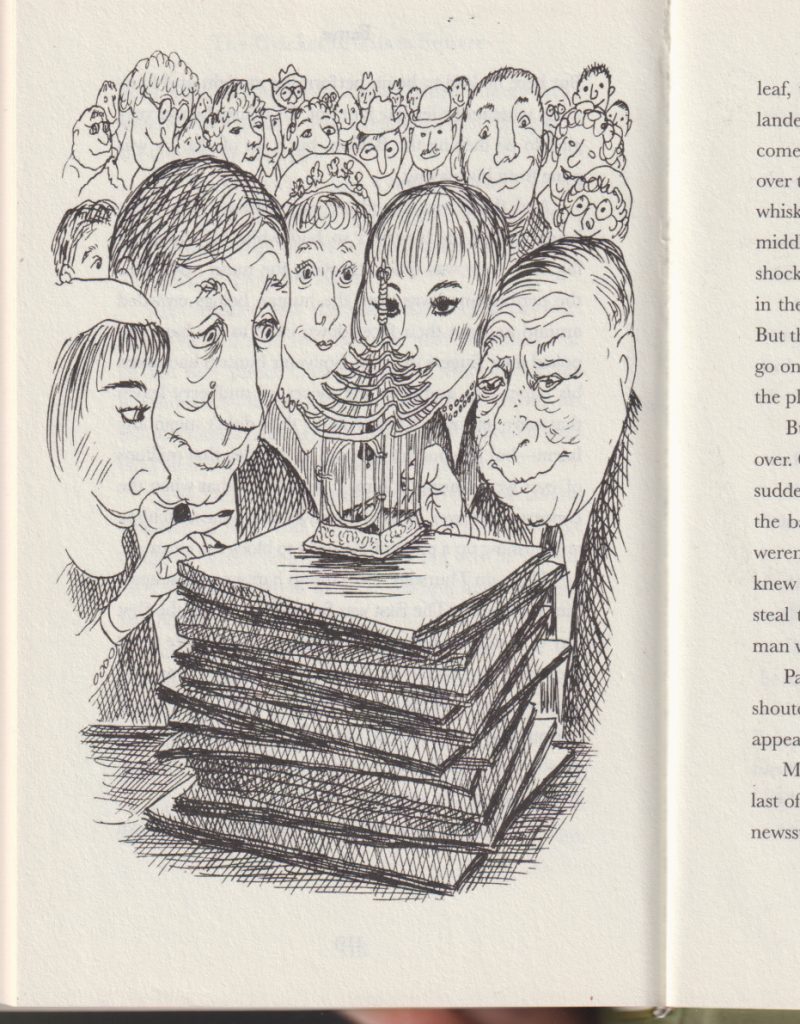
But I’m not writing about any of that. My concern with the reissue is that the book’s producers have completely messed up the art. I’m going to share some scans from the 1973 Dell Yearling edition (pictured on the left) and the 2022 revised and updated edition (pictured on the right). I’ve scanned then at the same resolution, how you see them is how they would look side by side.
1973 Dell Yearling edition
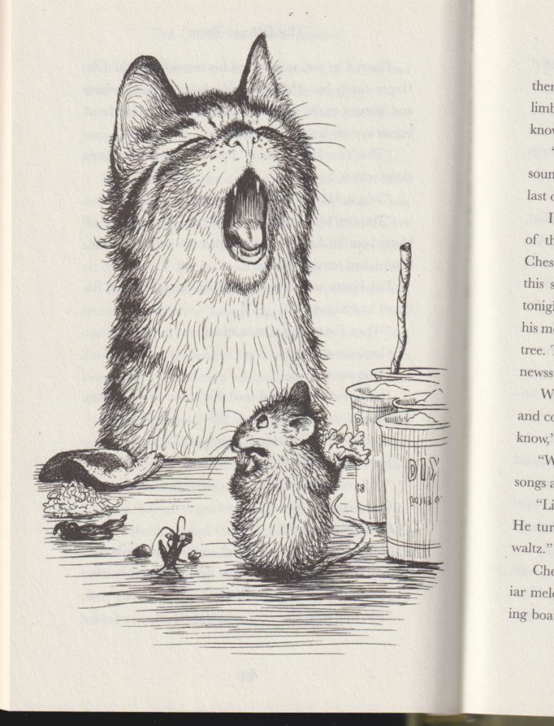
2022 revised edition
You’ll notice the original has a lot of blank space at the top and bottom of the page. The art in the new edition has been set to “stretch to fill” (a command that will have an image asset stretch vertically and horizontally to eliminate empty areas on the page) and as a result, the image is distorted. It’s not such a big deal if the object is stretching proportionally along both axes. But if you’re stretching a lot only in one direction, then you get something like this:
1973 Dell Yearling edition
2022 revised edition
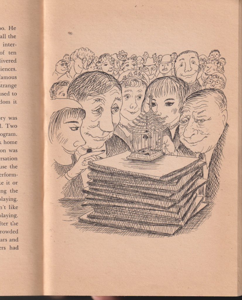
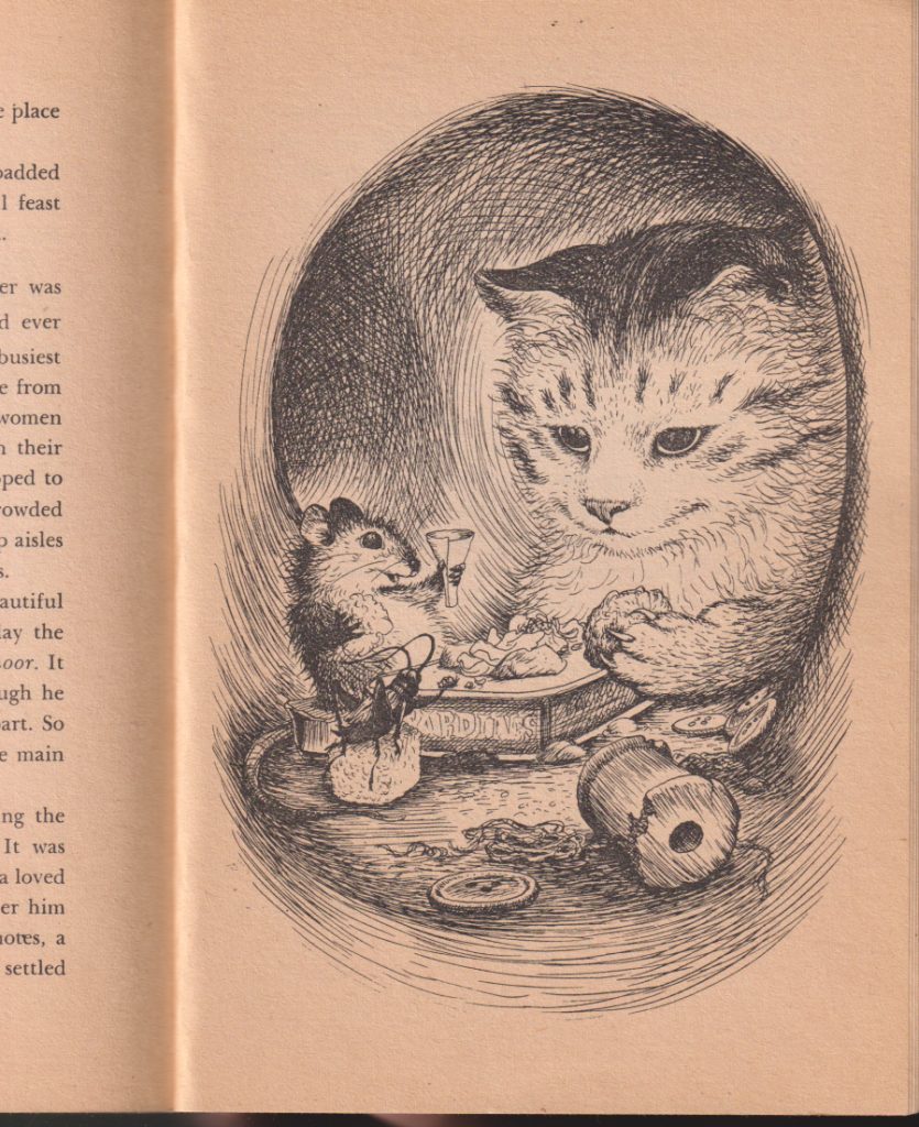
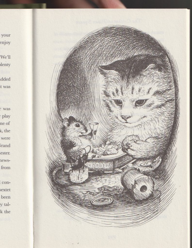
Most of the images in the new edition have suffered some distortion but the majority are only scaled a little. The illustration of Chester, Harry and Tucker celebrating a farewell dinner (which also serves as the book’s cover) is scaled around 7% taller. I doubt most readers without a side-by-side would notice any difference.
1973 Dell Yearling edition
2022 revised edition
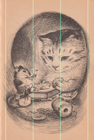
But the difference is there. I’ve overlaid them at the same scale so you can see how much it’s stretched (cyan lines added to show there’s no horizontal scaling).
Twelve years ago Phil Nel wrote about an updated version of James Marshall’s THE THREE LITTLE PIGS in a blog post titled Vandalizing James Marshall. Would I call this Vandalizing Garth Williams? I don’t know. Marshall’s book had its trim size changed to fit a mass market model. That was unfortunate (as was the use of Edmunds as the book’s new typeface). With the updated edition of THE CRICKET IN TIMES SQUARE, I feel like the art issue is carelessness more than anything. If the white space surrounding the art was a concern, the easiest fix would have been to fill it with those text descriptors you see in older chapter books. Something like this:
2022 edition, “corrected” image with subtitle added by Jerrold
Then again, I can’t help but think the illustrations were enlarged to target a younger audience. Maybe there’s a feeling third graders these days aren’t interested in reading about talking animals (ugh). If that’s the root of these art and layout changes, that would seem to be an editorial decision not in keeping with the book’s original intent and I’d be inclined to call it vandalism. If the revised edition goes into reprint, maybe they could return the art to its original aspect ratio. How do we make that happen?