#PBwithJ: THE EMPEROR’S NEW CLOTHES (1998)
I heard you like picture books by celebrities!

Yeah, yeah. I know people love to hate on celebrity-authored books, but I, quite honestly and just for the record, I have no opinion on them. This book, though, stands out in my mind because it had ALL the celebrities. I hadn’t seen it since I thumbed through it at a bookstore in Napa twenty-five years ago and I suddenly wanted to see it again. Thanks to ThriftBooks over on ebay, I was able to pick up a copy.
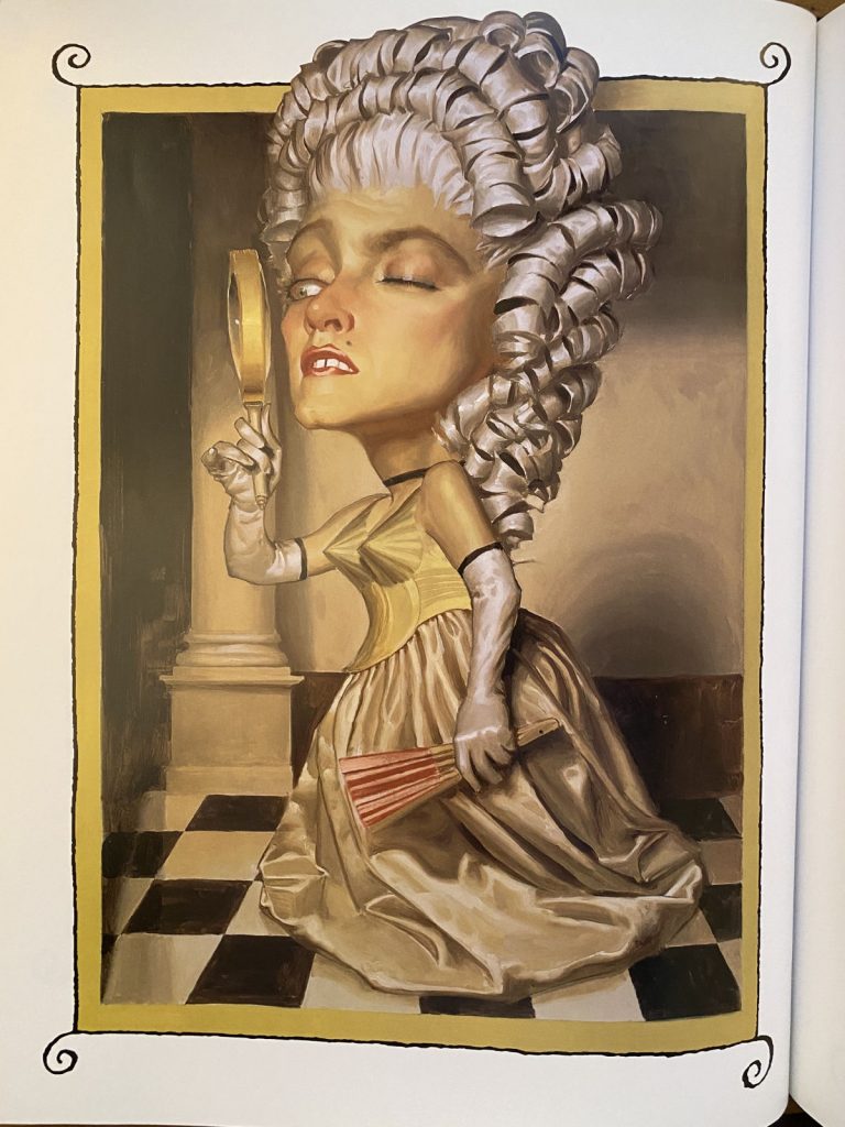
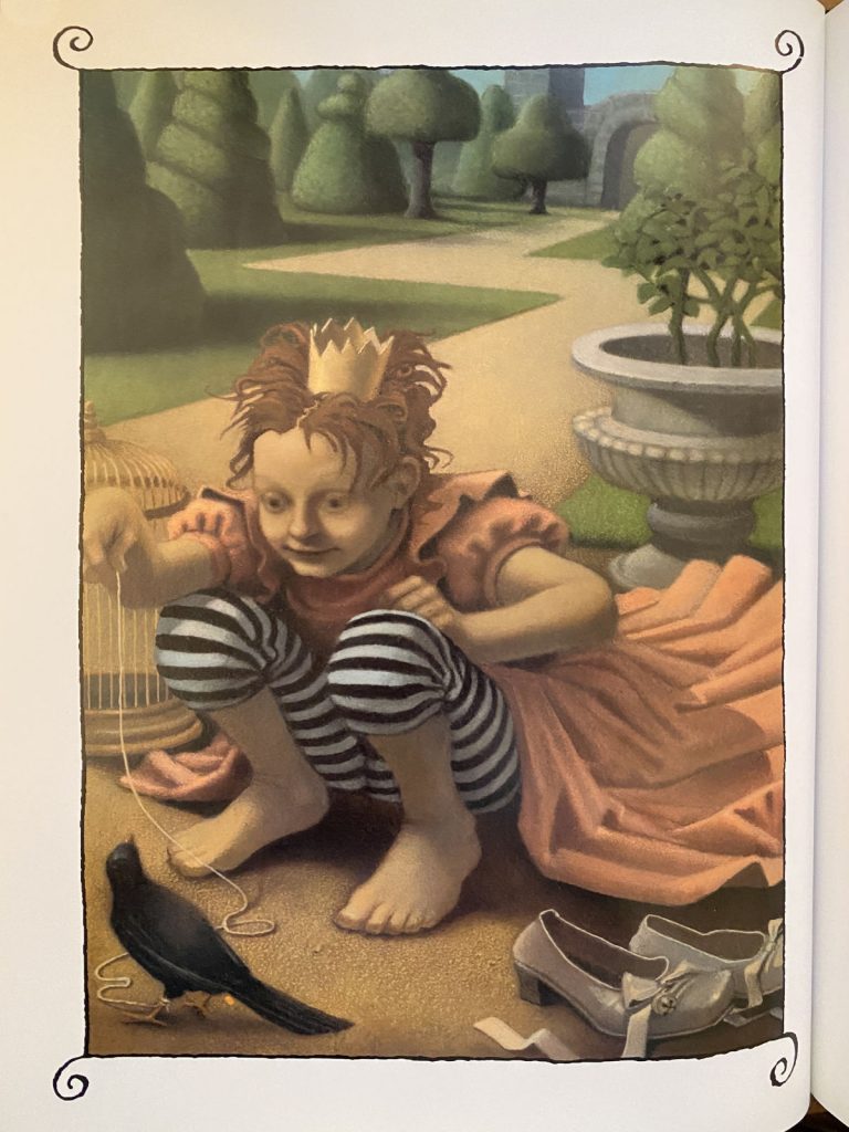
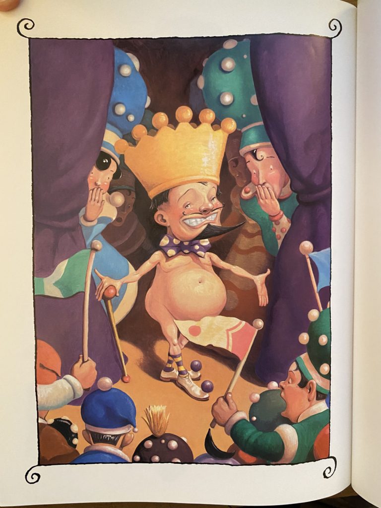
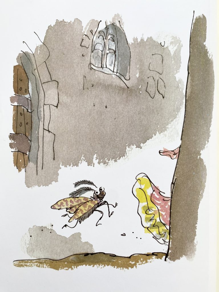
The story is Hans Christian Andersen’s THE EMPEROR’S NEW CLOTHES as told from the perspective of various court members and townspeople. The threads of the story are held together by a moth (illustrated by Quentin Blake) who flutters around the kingdom acting, if you’ll pardon the expression, as a fly on the wall letting the reader in on the various schemes and machinations behind the Emperor’s eventual humiliation.
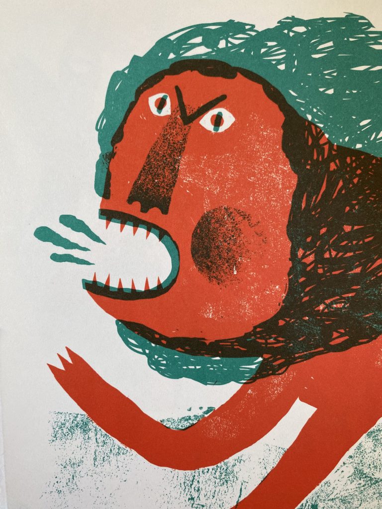
So, each character (celebrity) gets a spread and each spread is given to an illustrator, themselves a celebrity of the children’s book illustration world. I mean look at that line-up! It’s a who’s-who of the then heaviest hitters—headliners at your local Bookstop, Borders, Coles, or Waldenbooks.

So I’m flipping through the book and I’m instantly struck by two things: man, did illustration have a “look” back then and, boy, do I ever miss it!


Thinking about how so many books from the 90s had that painterly look made me wonder which media dominated illustration at various times. It’s hardly a scientific survey, but I’d break it down like this:
| DECADE | MEDIA |
| 70s | ink/ink and watercolor |
| 80s | colored pencil |
| 90s | oil pastel/oils |
| 00s | gouache |
| 10s | digital gouache/Procreate |
| 20s | ??? |
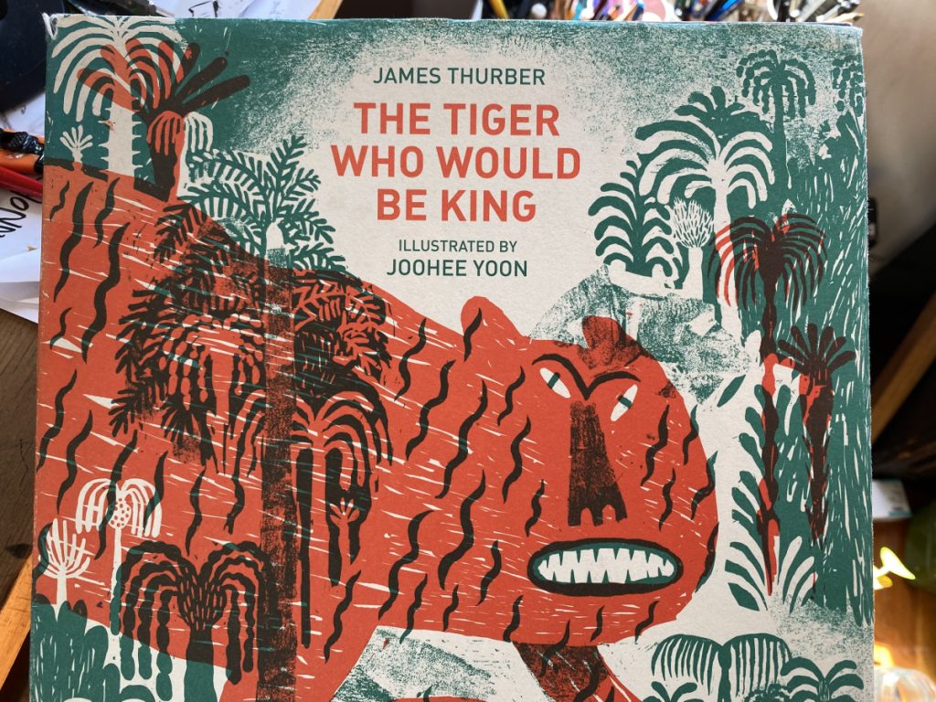
We’re only three years into this decade so maybe it’s too early to call it, but I expected to see a turn towards silkscreen and risography. Sure, I’m a zine fan and it was probably more than a little bit of wishful thinking but I remember rubbing my hands together when Joohee Yoon’s THE TIGER WHO WOULD BE KING (2015) came out and thinking, “Oh man! Here we go!!!”
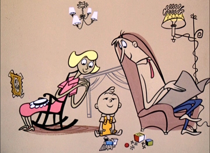
Maybe it’s too gritty, indie, or artsy but I don’t think silkscreen/risograph is making headway as a dominant style for the 20s. That’s okay, I’m used to being wrong (I thought pencil was going to take over the 10s solely on the incredible appeal of Benjamin Chaud and Isabelle Arsenault’s works and it didn’t). Digital gouache, which some might call the “Procreate” style, stole the show. You see a lot of it and I think it’s poised to stick around for a while. To be clear, I’m not throwing any shade at those works! I have a fondness the style, it pairs really well with humor and a mid-century modern design sensibility. I will say, though, that I think few people do it as well as the OG (Original Gerald).
I’m interested to know what you think. Do you agree with my breakdown above? Have I overlooked an entire style or maybe missed the boat entirely? Hit me up in the comments. For now, I’m off like the the Moth, to go grab a late lunch. See ya!
UPDATE: To clear up a question from the comments: The Gerald Mc Boing Boing comparison was in reference to the style, rather than the medium. A better way to put it might be to say gouache/digital gouache looks really good with cartoonier characters. A lot of animators working in the early part of the 2000s were drawing inspiration from artists like Mary Blair. Gouache was getting a lot of play in Pixar concept art, for example. And given that there’s always some cross-pollination between animators and illustrators, it’s probably inevitable it would make its way into picture books.