I heard you like picture books by celebrities!

Yeah, yeah. I know people love to hate on celebrity-authored books, but I, quite honestly and just for the record, I have no opinion on them. This book, though, stands out in my mind because it had ALL the celebrities. I hadn’t seen it since I thumbed through it at a bookstore in Napa twenty-five years ago and I suddenly wanted to see it again. Thanks to ThriftBooks over on ebay, I was able to pick up a copy.
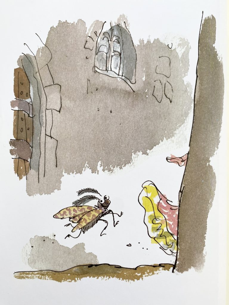
The story is Hans Christian Andersen’s THE EMPEROR’S NEW CLOTHES as told from the perspective of various court members and townspeople. The threads of the story are held together by a moth (illustrated by Quentin Blake) who flutters around the kingdom acting, if you’ll pardon the expression, as a fly on the wall letting the reader in on the various schemes and machinations behind the Emperor’s eventual humiliation.
So, each character (celebrity) gets a spread and each spread is given to an illustrator, themselves a celebrity of the children’s book illustration world. I mean look at that line-up! It’s a who’s-who of the then heaviest hitters—headliners at your local Bookstop, Borders, Coles, or Waldenbooks.

So I’m flipping through the book and I’m instantly struck by two things: man, did illustration have a “look” back then and, boy, do I ever miss it!


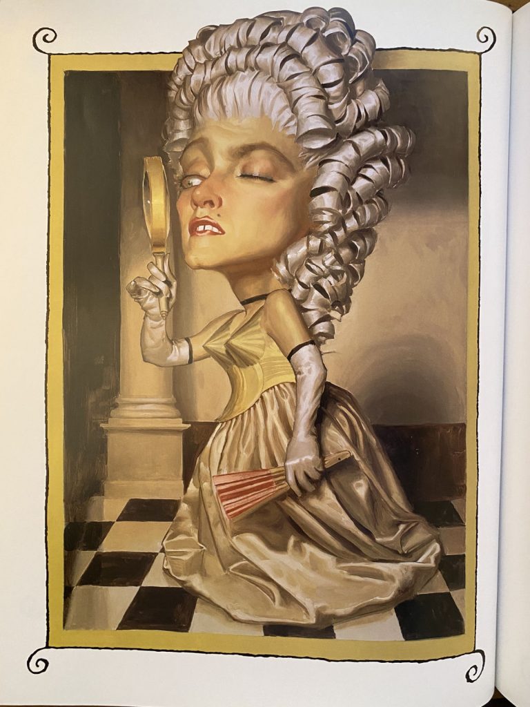
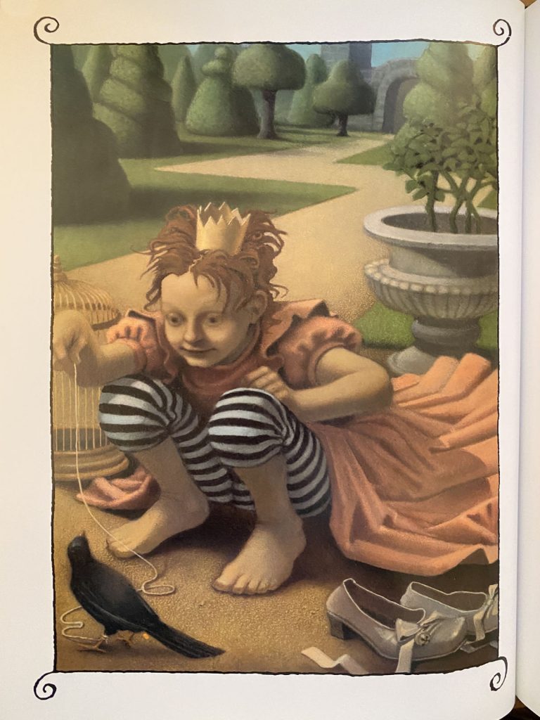
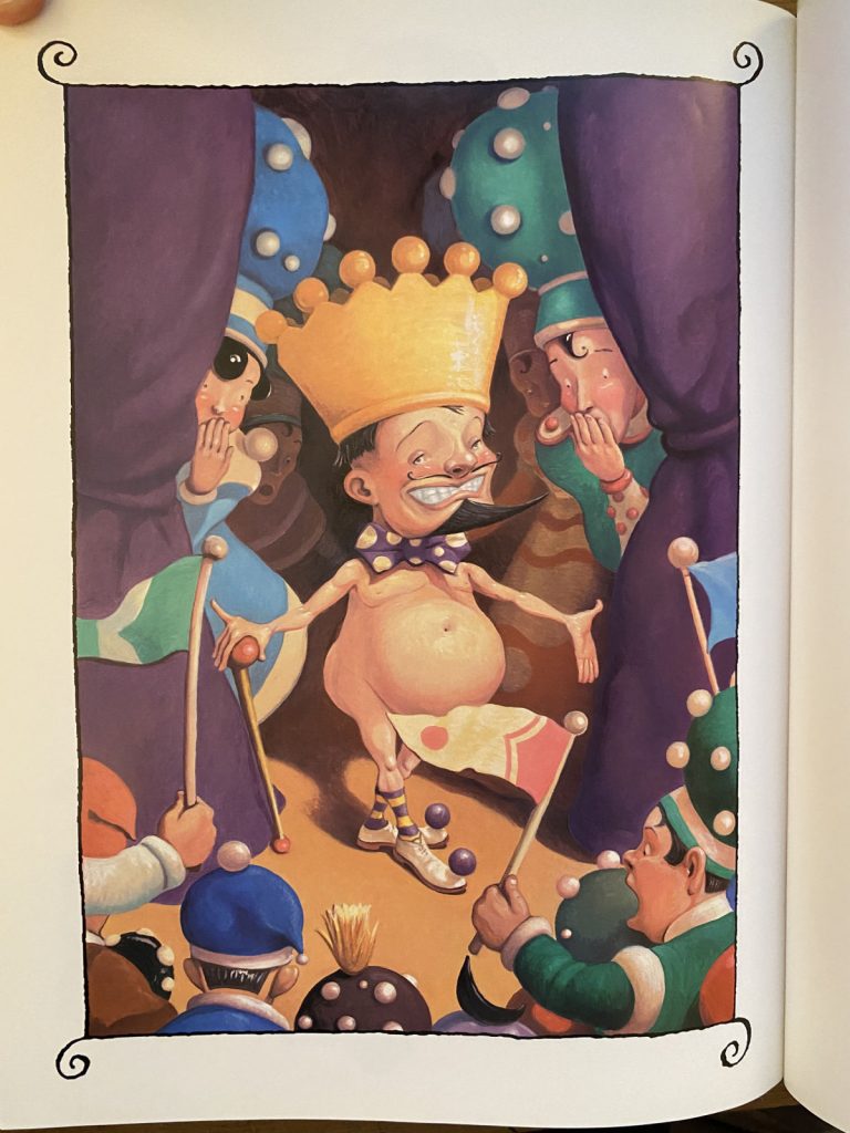
Thinking about how so many books from the 90s had that painterly look made me wonder which media dominated illustration at various times. It’s hardly a scientific survey, but I’d break it down like this:
| DECADE | MEDIA |
| 70s | ink/ink and watercolor |
| 80s | colored pencil |
| 90s | oil pastel/oils |
| 00s | gouache |
| 10s | digital gouache/Procreate |
| 20s | ??? |
We’re only three years into this decade so maybe it’s too early to call it, but I expected to see a turn towards silkscreen and risography. Sure, I’m a zine fan and it was probably more than a little bit of wishful thinking but I remember rubbing my hands together when Joohee Yoon’s THE TIGER WHO WOULD BE KING (2015) came out and thinking, “Oh man! Here we go!!!”
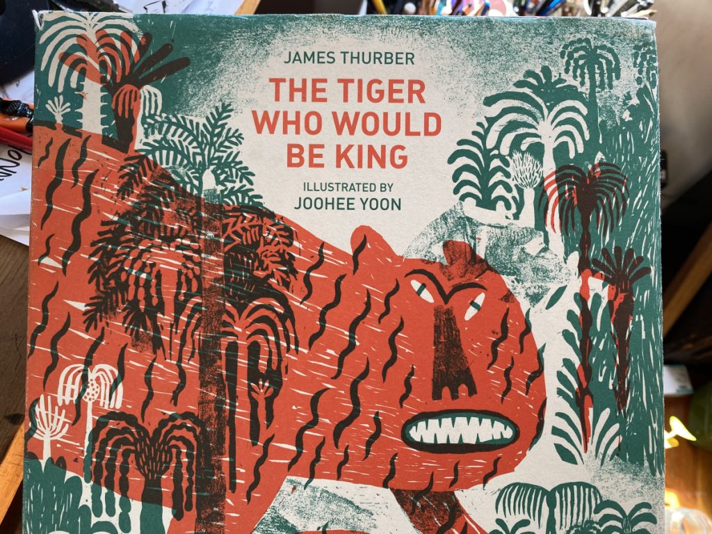
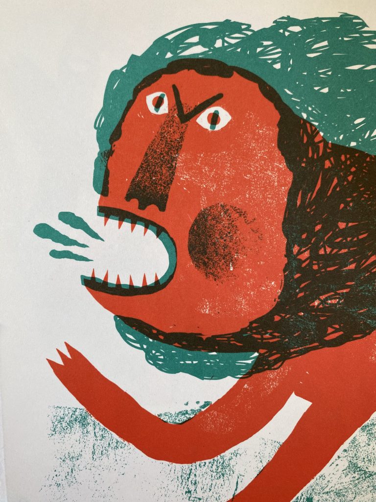
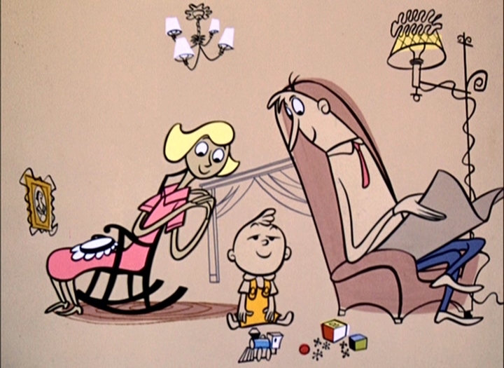
Maybe it’s too gritty, indie, or artsy but I don’t think silkscreen/risograph is making headway as a dominant style for the 20s. That’s okay, I’m used to being wrong (I thought pencil was going to take over the 10s solely on the incredible appeal of Benjamin Chaud and Isabelle Arsenault’s works and it didn’t). Digital gouache, which some might call the “Procreate” style, stole the show. You see a lot of it and I think it’s poised to stick around for a while. To be clear, I’m not throwing any shade at those works! I have a fondness the style, it pairs really well with humor and a mid-century modern design sensibility. I will say, though, that I think few people do it as well as the OG (Original Gerald).
I’m interested to know what you think. Do you agree with my breakdown above? Have I overlooked an entire style or maybe missed the boat entirely? Hit me up in the comments. For now, I’m off like the the Moth, to go grab a late lunch. See ya!
UPDATE: To clear up a question from the comments: The Gerald Mc Boing Boing comparison was in reference to the style, rather than the medium. A better way to put it might be to say gouache/digital gouache looks really good with cartoonier characters. A lot of animators working in the early part of the 2000s were drawing inspiration from artists like Mary Blair. Gouache was getting a lot of play in Pixar concept art, for example. And given that there’s always some cross-pollination between animators and illustrators, it’s probably inevitable it would make its way into picture books.


Let’s get the comments going! Ten comments and I’ll digitize that CD and post some MP3 excerpts in a new post. Who doesn’t want to hear Jeff Goldblum say “The Emperor is naked”??
Fascinating! I know very little about illustration and learn so much every time you write about it. As a child of the 90s, I definitely recognize the style in a visceral way that transports me back to my childhood.
But that book. What a 90s time capsule. General Schwartzkopf? Dr. Ruth?! JTT?!! That is a cultural document, and I, for one, *need* to hear Jeff Goldblum say, “The Emperor is naked.”
I love that. My childhood books are a bit older than yours but I know the feeling. These illustrations took me back to a very specific place, though. I used to think I might be a cartoonist and I was obsessed for a year or two with Bloom County. Then sometime after wrapping up Bloom County, Berkeley Breathed (featured in this book, illustrating Robin Williams’ story) started doing picture books and I was like “YOU CAN DO BOTH???”
re: Jeff Goldblum… He does “The Imperial Wizard” (of course) and omg you can totally hear his voice in your head when you read his story.
I’m hoping for a return to ink and watercolor myself. However, color pencil would be refreshing too.
Yeah, those are my two favorites too. I’m working towards being more proficient with both, but they require patience and maaaaaaan, is that ever a challenge for me.
You weren’t joking when you said ALL the celebrities! I think Jeff Goldblum saying “the emperor is naked” needs to become a ring tone.
Fascinating breakdown of the dominant illustrative styles. As someone who is a fan of illustration but not in the know from a craft perspective, this kind of stuff is really cool to me!
I’m trying to imagine who would be on a contemporary version of this project but the notion of celebrity has changed so much. There’d probably be a few YouTubers, a BookToker, and, of course, Jeff Goldblum. I can tell you one thing, we’d be more mindful of representation.
And thanks, I’m glad you enjoyed the post! I can’t claim my breakdown is accurate (it’s mostly based on my memories which is going to favor my favorite books) but I think it’s got to be pretty near to this.
Jeff Goldblum is evergreen!
This is EXACTLY the kind of thing I wish existed in a podcast but the visuals are necessary for this to work. I for one, as an illustrative no-nothing, would love to know more about what exactly these styles are or how they are achieved. What the materials are, etc.
Like, what exactly is digital gouache? How is it done? And silkscreen and risography — what is that?
I suppose I could Google it but, you know, ten comments.
I thought (and still think) the YouTube version of this discussion would be good. The Cartoonist Kayfabe channel will look at a comic panel by panel and discuss choices the artist made. I’d love to do that but it would require me to a) have more knowledge of each artist’s methods and b)have a *lot* more time on my hands. To your questions!
Gouache is a paint that’s like a more opaque watercolor. It has a very matte look and is often used with kind of a dry brush so you get these wonderful textures. Think of the Little Golden Books from the 50s (in fact, I could add that to the list above). “Digital gouache” is what I’m calling Procreate because I find most people working in it are emulating that Golden Books style. On top of that, I think Procreate’s gouache options are the more successful brushes (as in looking like its analog counterpart, definitely more so than their watercolor brushes) and maybe the iPad color options more closely match a gouache palette. But again, I’ll say this is hardly a scientific survey. It’s just the vibes I get.
Silkscreen is a printing technique where you squeegee colored inks through a fine, fine screen stencil (as fine as silk, hence the name). Silkscreen designs tend to use large blocks of solid color, so you can imagine the picture book appeal. Risograph is a mechanical version of the above, essentially a one-color photocopier. To get a full rainbow, you’d pass your paper through the machine (swapping inks) several times. The registration is imperfect so your colors don’t line up perfectly and that’s totally the point. It has the look of being turned out in someone’s garage. I have several zines I think would make really successful picture books. I’ll post those soon.
And thank you! I appreciate the questions.
Very manly days of illustration, clearly! In style and actuality.
Right?? I did a quick count for a follow-up post and the numbers are shocking, even for such manly days. The celebrity side does pretty well with 12 men and 11 women. The illustrator side, though… yeesh. 20 men, two women (one of whom, Lou Fancher, shares credit as part of a husband-wife partnership).
And POC? None on the celebrity side, just one on the illustrators’.
Pingback: End of Month Wrap Up
Pingback: #PBwithJ: THESE OLIVE TREES and BÁBO