Alright. You’ve met Emotional Jerrold. Get ready to meet Angry Jerrold.
You ready?
JIM! received a review in which my illustrations were described as “digitally enhanced ink and watercolor artwork” and when I tell you I bristled at that wording…
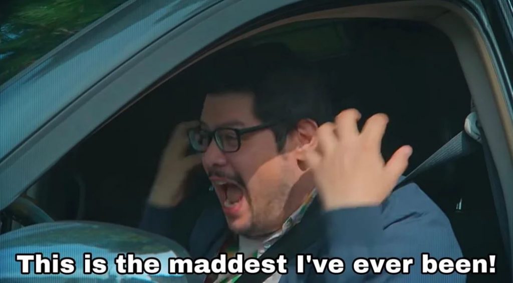
Yeah. I was livid. To me, the implication is that I passed an AI filter over my drawings and (deep breath, Jerrold) even typing that now brings a heavy, throbbing pressure to my neck. I can actually feel my blood pressure rising and in general I have been in a terribly distracted state since I read this review two weeks ago. I want to deal with my anger, so with your indulgence, I’m going to try and figure out just why it is I am as upset as I am. Let’s dig in!
To begin, I will own the fact that to some degree I brought this on myself. Included on the copyright page of JIM! is an art note. It reads:
The illustrations for this book were drawn with a Winsor and Newton Series 7 Kolinsky sable brush and colored with Kuretake Gansai Tambi watercolors. Digital enhancements were added in Procreate with the Adilson Farias watercolor brush set.
First of all, why include this? Well, it’s a convention I enjoy seeing in picture books. As a note, it’s small and unobtrusive enough that I don’t think it spoils any storytelling magic, but to an art nerd this little extra information adds a level of appreciation otherwise missing. In writing mine, I wanted to let the reader in on what I felt are the most important parts of my process. It’s simplified, of course, but a full description of these steps would be:
INK
I think my greatest strength in illustration is my inking. I’m confident in my linework and have worked hard at becoming so. Here’s a piece from the first chapter of JIM! where Harry Allard is visiting Jim’s home to drop off his manuscript for Miss Nelson Is Missing!
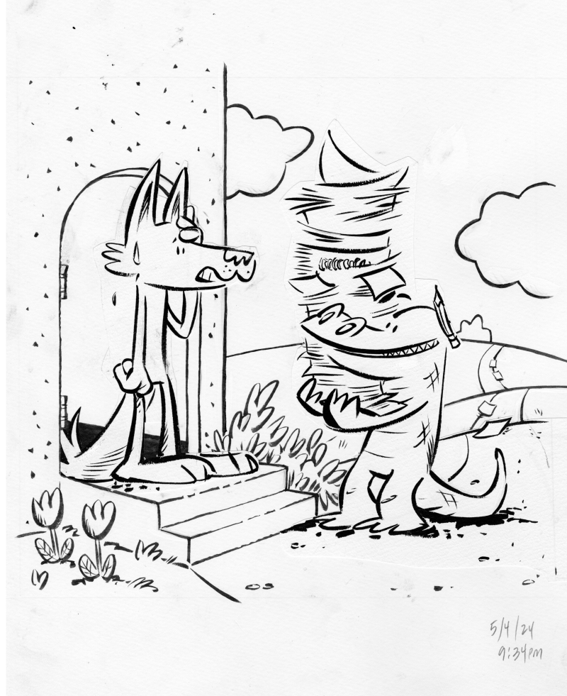
One of the greatest challenges in inking is finding that place where you are using your rough sketch as a guide without deliberately tracing each and every pencil line—at its best, the ink drawing should have a life of its own. Sometimes, there will be a part of the drawing that didn’t quite, to my eye, meet that criteria. In those cases, I’d ink that piece on its own, cut it out and paste it to the illustration (you can see this with Jim’s head and with Harry’s entire body). It’s important to me to get the ink as final as possible, which is to say, I don’t like cutting and pasting on the computer. It really bothers me, for some reason, to have two “final” versions of an ink drawing. It’s silly and it’s immaterial, but I’ve always felt that way.
COLOR
I wish I had the confidence in watercolors that I do in inking, but I don’t. I am too hesitant (and, paradoxically, too impatient) to be a good watercolorist. I admire people who watercolor directly over their ink drawings. I don’t trust I won’t ruin the ink drawing so I trace the lines onto watercolor paper and then color it there.
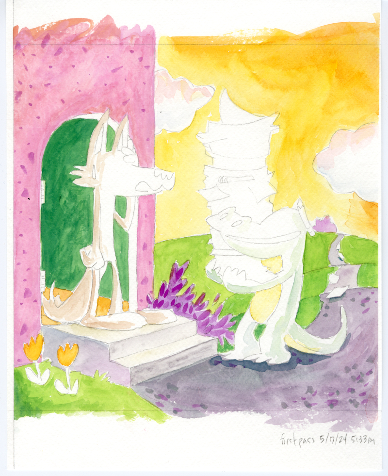
A saving grace for this project was my late-in-the-game discovery of Kuretake Gansai Tambi watercolors. Watercolors, used properly, require a painting, drying, overpainting, drying, overpainting again technique that brings out the luminosity of the media. BUT, as I mentioned above, I’m way too impatient for all that. Gansai Tambi watercolors are somewhat like gouache (in that they are much thicker and don’t require so much layering), but they retain that watercolor “look”. They felt, to me, to be the perfect media to have a painterly quality but be reminiscent of Marshall’s own watercolor work.
As a side note, Marshall himself usually colored directly onto his ink drawings, though not always. For Nosey Mrs. Rat, he colored the back sides of his ink drawings. A very peculiar technique, unique, I think, to this one book. I’ll talk more about this on a future post.

MERGING THE TWO (not mentioned)
A step I left out of my pub-page art process blurb was “The ink and color drawings were scanned and composited in Clip Studio Paint”. I actually wanted to include this to throw a shout out to Clip Studio Paint, an app I adopted after abandoning PhotoShop and all Adobe products after Adobe’s acceptance of AI scraping. I didn’t list it, though, because it felt a bit too obvious (also, would I start listing every single step? drawing scanned with an Epson Expression 13000XL scanner, files uploaded to Drive etc etc etc). Anyway, here’s how they look merged:
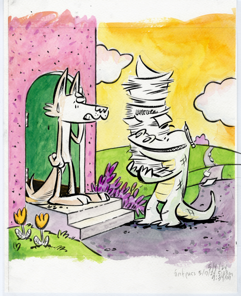
I will say that Clip Studio Paint did come in clutch, though, because I was working with a lot of layers. If you notice that Jim and Harry aren’t colored (besides having a slight indications of shadows), that’s because I colored them separately. Elements that required special attention (eg. color consistency in the main characters) were usually colored on their own pieces of paper, scanned and imported individually into their own layers.
STARTING OVER (also not mentioned)
There’s a trick employed in animation where scenes are animated out of sequence so that if the art style morphs over time, that distortion becomes less apparent. It’s sort of insurance against having the main character slowly grow a foot taller between the start and the end of the movie. The scene of Harry at Jim’s door was the second illustration I did for JIM! and towards the end of the project, it became apparent I needed to redraw it. I hesitate to share it here because I want to keep it a surprise for the book’s release. However, I’m mentioning the step because it’s relevant to the next point.
DIGITAL (shudder) ENHANCEMENTS
So, another—and the real—reason I didn’t include Clip Studio Paint in my art process is that as a step, it doesn’t really add anything new to the piece. It’s a merging of two existing drawings and if there was any change (say a clean up of misaligned edges), it would be subtractive. The reason I did include Procreate as a step was because new elements were added to the drawing at this stage. For example:
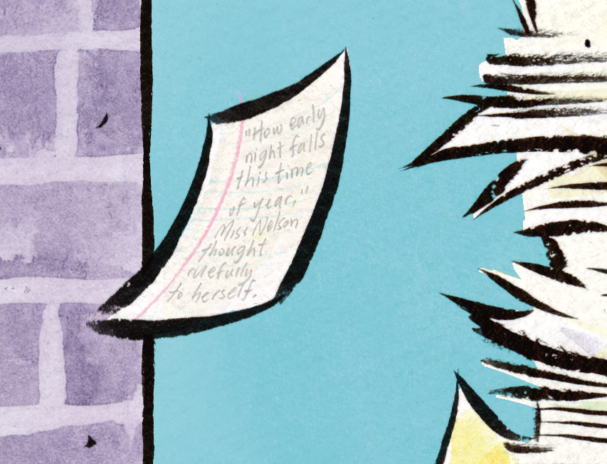
That single sheet of falling loose leaf paper… I drew the lines on it in Procreate. There are small elements like this on many (probably all) the illustrations in the book. It might be a spot of blush on a character’s cheek, a shadow under a vase holding a single tulip, or a shine on a medallion. I think I could have called these embellishments instead of enhancements but I do think they add to the art and to the story. In the case of this note, it adds a detail that hints to Harry’s eccentric energy and gives a nod to Harry’s self-published fourth Miss Nelson book (I’m paraphrasing a line from that story, not that anyone would know).
As a step, this provides a set of unifying details across all the illustrations (see the above point about consistency). Could I have drawn these lines on paper and scanned them in? Sure. The writing on that page is. But, fact is, doing it directly in Procreate allowed for some of that spontaneity I described in the first step (eg. not tracing).
PROCESSING ALL OF THIS
Well, the throbbing in my neck has gone down (a little) and it’s apparent to me now why that “digital enhancements” hit me as hard as it did. It’s the erasure of the human element. When you’re in the process of making a book, or at least when I was in the process of making JIM!, you might not be fully aware of just how much work you’re putting into each and every drawing. At the same time, I’m not trying to paint myself (on several separate sheets of cold-press paper with Japanese watercolors) as a tortured artist. Each of these steps, even the most tedious, was a joy and there’s no point subjecting even the most steadfast art lover to a process note that reads:
The illustrations for this book were drawn with a Winsor and Newton Series 7 Kolinsky sable brush and traced with pencil onto three to four separate sheets of Strathmore cold press watercolor paper where they were colored with with Kuretake Gansai Tambi watercolors. The ink and color pieces were composited together in Clip Studio Paint, where any misaligned edges were cleaned up. Finer details and various highlights were drawn in Procreate with the Adilson Farias watercolor brush set. The creator took a lot of naps but nonetheless suffered two crises of confidence where he became bed bound for a total of four hours which may not sound like a lot but is actually a big deal to him. Oh yeah, he also had Covid at one point.
Although, I will admit, that might have been funny.
It’s also clear to me that much of my anger is fueled by the world right now and how the world’s richest, most obnoxious tech bros are constantly in my face insisting I employ AI assistance in every aspect of my life even as they dismantle everything I love, from National Parks to libraries. I’ve spoken out about rejecting AI art and I’ve lamented the disappearance of analog ephemera so to have “digital enhancements” attached to any part of my work, however it was intended, just felt like a particular kick in the teeth.

I was lucky enough to get some behind-the-scenes peeks of this process, and it was very cool (and at times nerve-wracking! I’m thinking about one tree placement in particular…) to see these illustrations come to life. Absolutely a labor of love and uniquely human craftsmanship that AI could never even get CLOSE to touching.
Ha ha ha! I AGONIZED over that tree. Probably worth its own blog post (“See, pecan trees don’t grow north of Kentucky but I really needed to put one in Manhattan. In the late FALL, no less…”).
AI could never!!!
<3 <3 <3 Thing is, it's not impossible that AI eventually *could* but until it does I'll happily celebrate our ink-stained fingers, our paint-splattered smocks and even our sleep-deprived eyes. In fact, it's probably all the MORE reason to celebrate us humans.
Eeep, Jerrold..I am here, new to your blog (sorry so belated!) because of wonderful Stephanie Lucianovic from BlueSky. I totally hear ya re your pains about seeing that description of your work which I know is incredible craftsmanship that like others have said, AI could never touch. Sigh..I think I called my process “digital finishing” in my last book..now I wonder what people may think of that in this age of AI. You definitely have me thinking about this..thank you again. But nonetheless, I can’t wait to add JIM! to my collection! And sorry to hear you had COVID during the process, sheesh!!
“Digital finishing” is a great descriptor and, honestly, probably the most concise and accurate. It might just come down to the ongoing (and growing) lack of media literacy and the need for us illustrators to talk about our processes more. And thank you for the kind words and thank you for visiting the blog! So fun to see you here 🙂
Bravo.
But also I’d love if you put that full “art was created …” note on the CR page of JIM!. It’s history and your work/words/art mean so much.
Thank you. It’s definitely growing on me! Maybe for the second printing…
Honestly, that review sounds like ChatGPT wrote it.